Someone recently asked me “how do I take good photos of my wristwatch?”
Good question. A lot of people have hobbies that they can practice while quarantined at home. And two of those are (a) nurturing a wristwatch collection, and (b) photography. So the combination of the two is a logical thing to engage in.
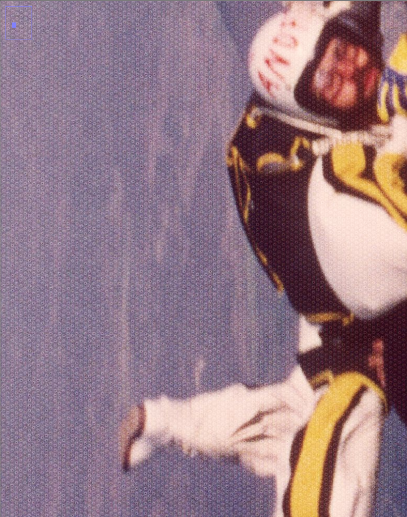
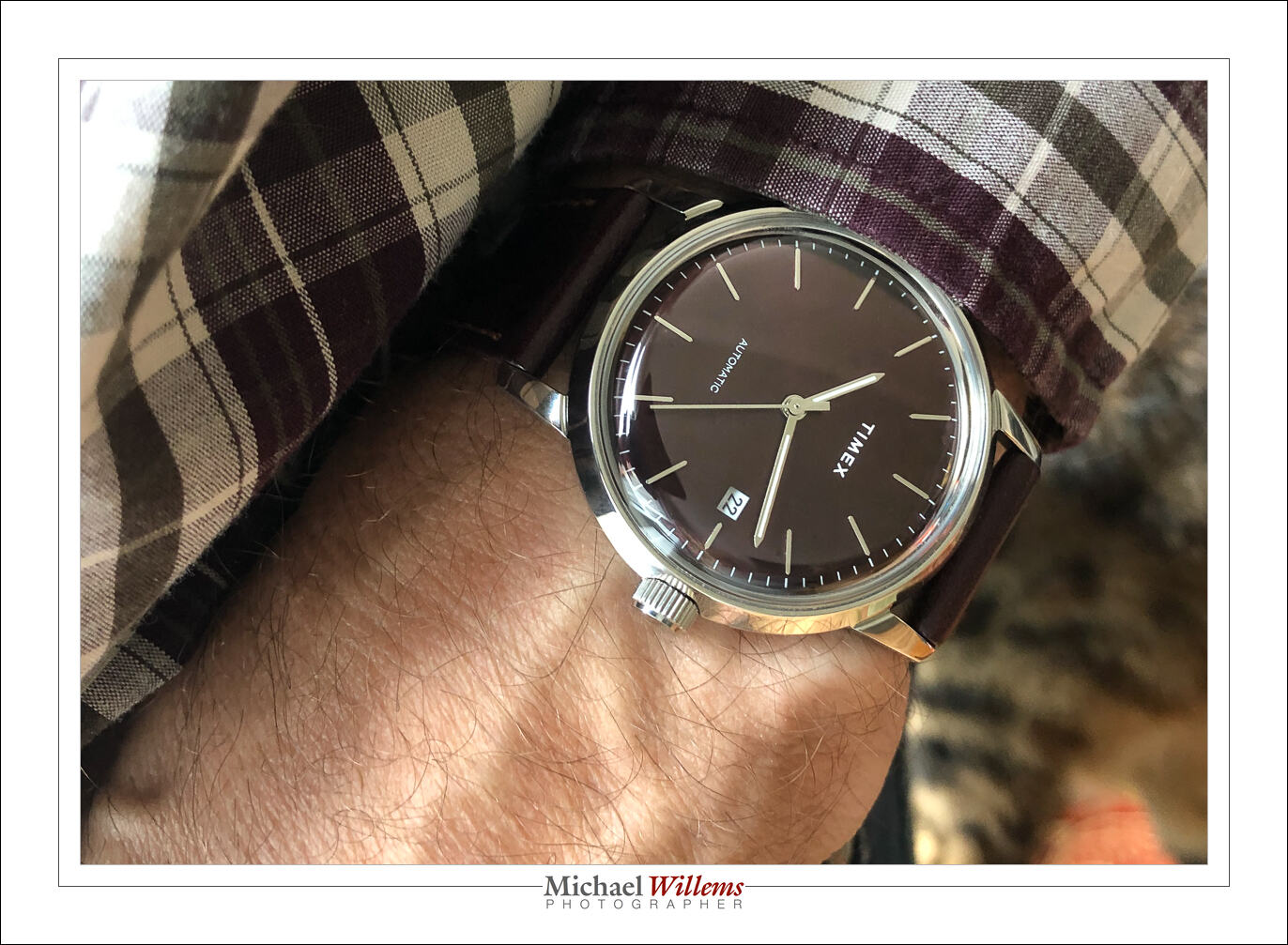
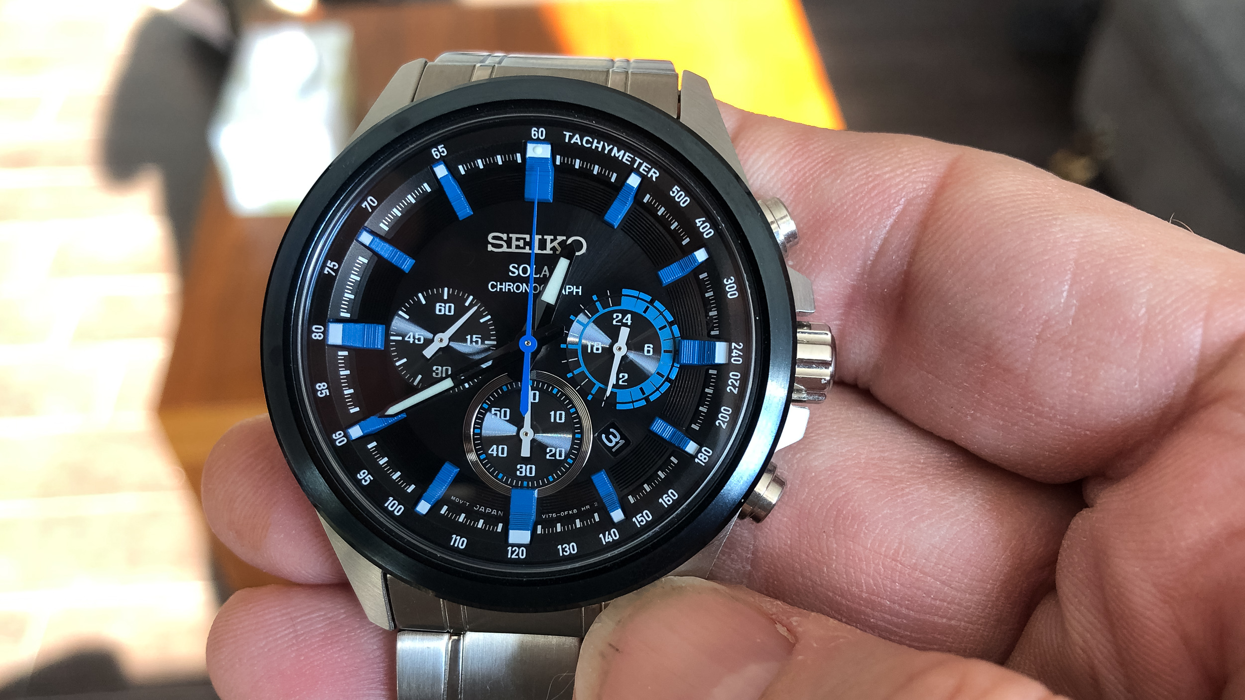
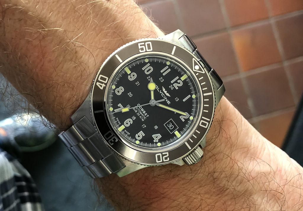
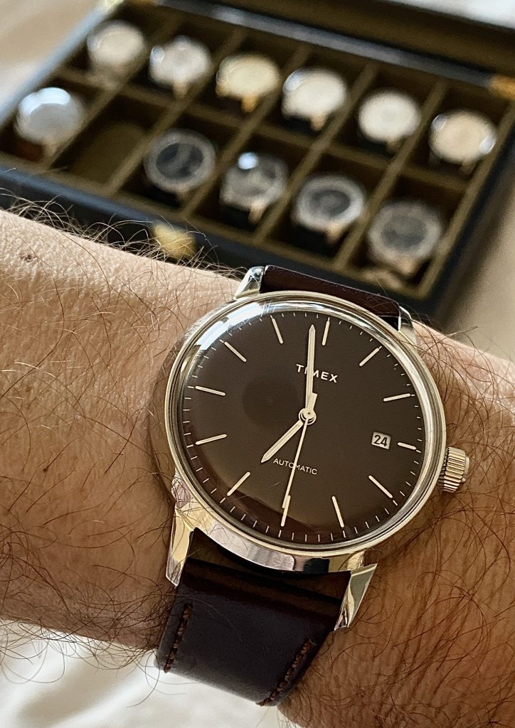
Here, for the record, is what I am wearing on my wrist today:
So how do you do it? As so often, there’s not one answer: there are a few. Here are some of my quick recommendations. I will give you technical tips for SLR as well as for cell phone cameras; a few composition tips; and a few words about post-production.
Technical: SLR
If you are using an SLR or other sophisticated camera, especially using flash, these are my technical recommendations.
- Use a macro lens if you can, so you can get closer. But not too close, because that will give you limited depth of field and image distortion.
- Use an aperture of at least f/8; when using a macro lens, start around f/16 if you can.
- If you are not using flash, especially if using a macro lens, you must use a tripod.
- Using available light? Make sure there is lots of good diffuse light, e.g. from a north-facing window (no direct sunlight).
- Use an ISO value as high as you need: when using flash, 200-400 is fine; when not using flash, you may need to go up to as much as 1600 ISO or more if not using a tripod.
- Using flashes: Use off-camera flash, modified by softboxes or umbrellas; or use an on-camera flash by bouncing it off a white ceiling/wall behind you. Use manual exposure mode. 1/125 sec.
- if using a tripod, focus manually (using live view preview).
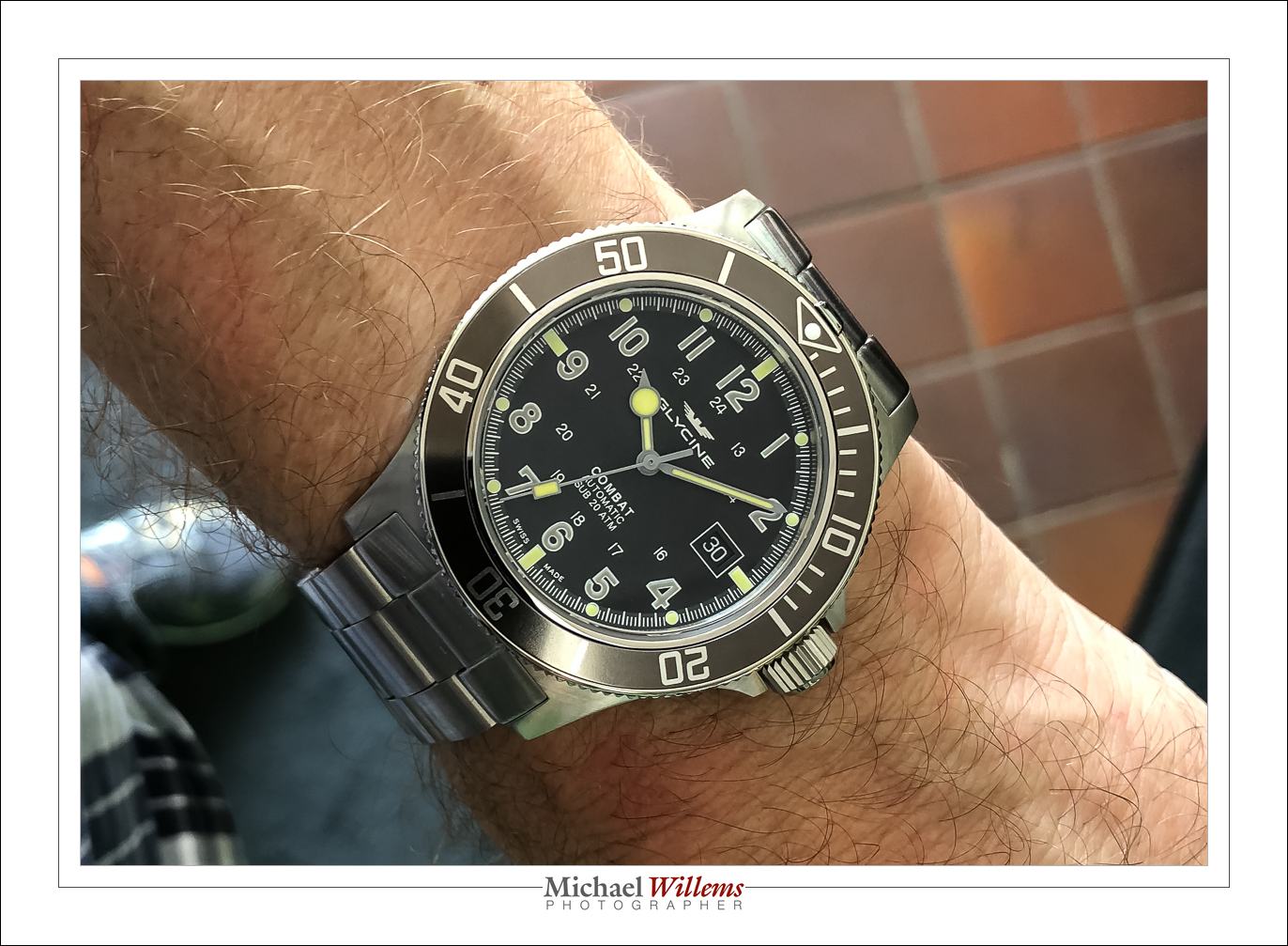
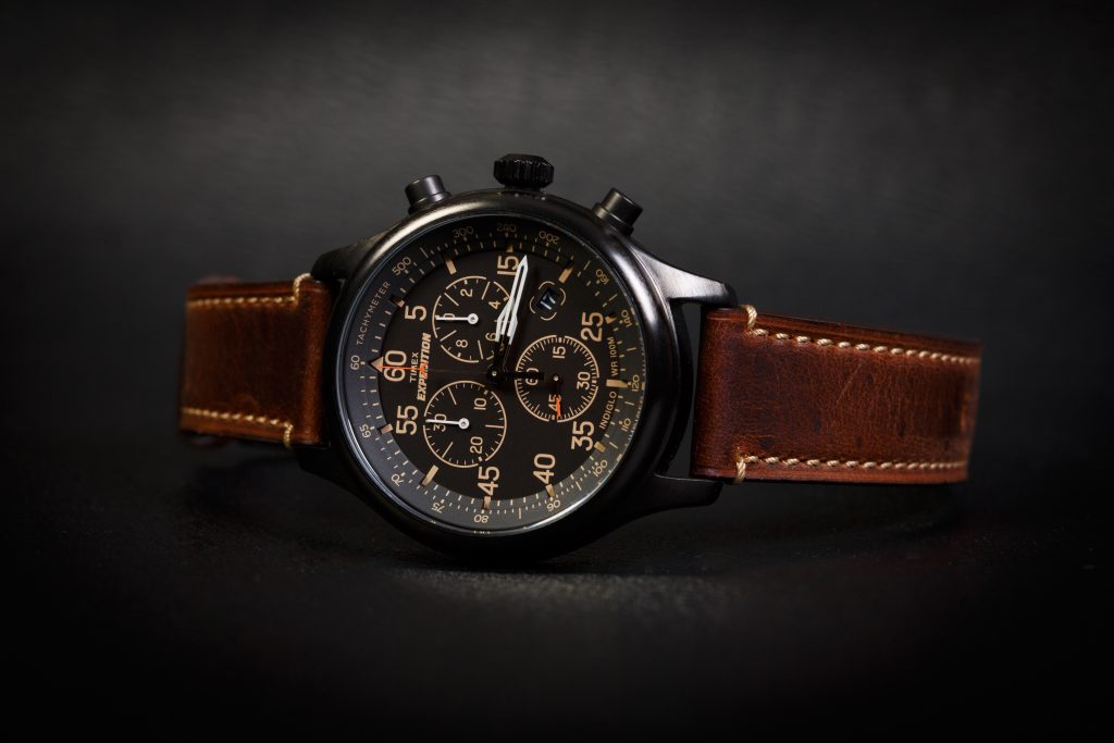
An example, lit with two flashes equipped with softboxes, both 45º above the watch:
Technical: Cell Phone
It is perfectly possible to use a hand-held cell phone, as long as you do the following:
- Light, light, light! There’s no such thing as too much light. The brighter your room, the better your picture. Why? Because when it is bright, the resulting faster shutter speeds result in less motion blur, lower ISO results in higher quality, and smaller apertures result in more depth of field).
- Avoid direct sunlight, though.
- Shoot from a little distance away and crop later. This gives you easier focus with less error, and greater depth of field. If you are close, focus is unreliable and depth of field is usually too shallow.
- But sometimes you will want to be close in order to get a blurred background; see the compositional tips below.
- Focus on the watch, if necessary by tapping it on the phone screen to tell the phone “focus on this”
- Hold the phone – and the watch! – very still while you do all this.
Compositional:
Composing a good picture is the most important thing you can do after the technical requirements are met. Some tips:
- A good picture is a simple picture.
- Did I mention: A good picture is a simple picture. “Simple” means everything in your photo is there to tell the story – or else it should not be in there. “Simplifying” is the most important difference between a snapshot and a “professional” photo. Crop off anything that should not be in the photo. You’ll see the difference!
- Consider using the “rule of thirds” (look it up) – although watch photos can also have the subject in the centre. make it look good.
- 10:09:31 is the prettiest time for a watch. All watch adverts have the watch set to this “aesthetically most pleasing” time. Just saying.
- Turn the watch, turn yourself, reposition everything to minimize the refections in the crystal. Especially with watches without anti-reflective coating, this is important. Find a simple dark background, like a neutral dar wall, if the watch reflects it.
- Have background objects help you “tell the story”. Your car, your suit, your hand.
- Consider blurring out the background. You can do that without portrait mode, by being close to the watch, perhaps in slightly subdues light. (Yes, that flies in the face of the prior advice: yup, life is complicated and you have to decide what is more important for you!)
For example;
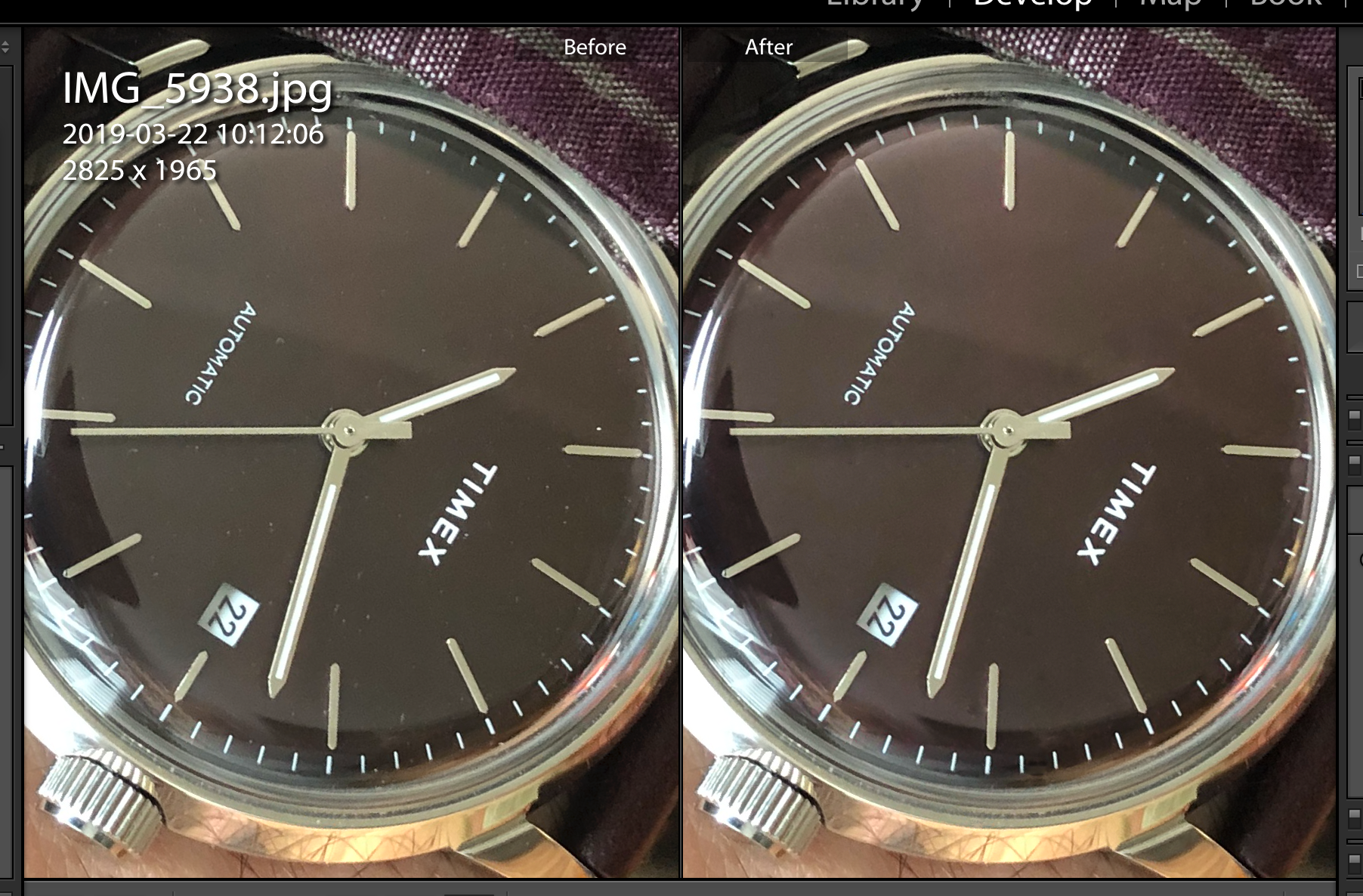
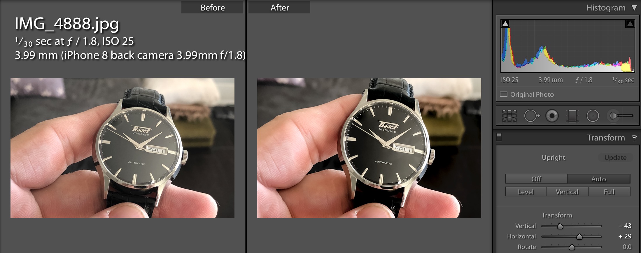
Post-processing
It is very important to post-process your image. This includes cropping and exposure, but also white balance (colour temperature), definition, and sharpness. Your phone can edit photos very nicely: especially recent iPhones do a truly excellent job.
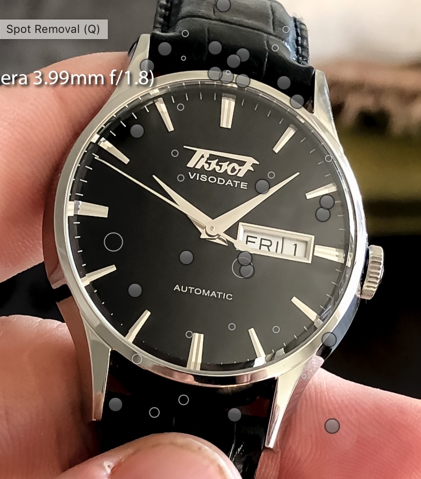
but for a “pro” photo, dust removal is also needed. For this, use Adobe Lightroom or similar. See this post for more about this essential step: https://www.speedlighter.ca/2019/11/05/product-work/
Conclusion
It really is not difficult to make good photos of your watches, jewellery, or other small objects. Follow the tips below and go have some fun. I am looking forward to seeing your results!
Michael is an experienced photographer and educator, who teaches photography courses that are now available live, interactively, online. Check them out and learn more about Michael, his books, and his courses at www.michaelwillemsphoto.com