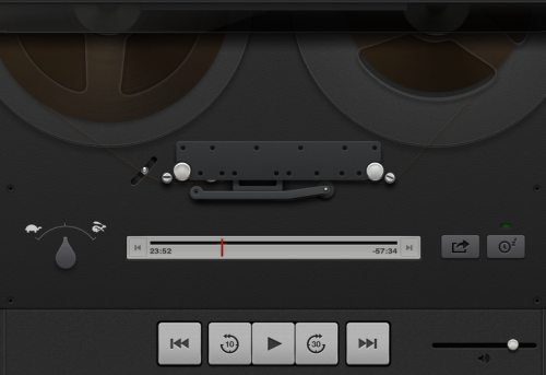
As you will have read, Apple’s internal political battles have recently led to the firing of Scott Forstall, the person behind most of the “skeuomorphic” design in the Apple operating systems and apps: i.e. making things on the computer of phone look like real-life equivalents; and the consequent promotion of Sir Jony Ive.
Skeuomorphic Apps include things like calendars with torn off paper, podcasts players that look like tape decks, wooden bookshelves, the desktop metaphor in the first place; and so on.
Apple has now dropped the skeumorphism that made it big. More than dropped: in a near Stalinist move, the good is now the bad: “we’ve run out of virtual felt”, “no virtual cows were harmed in the making of this calendar”, and so on, at the recent developer conference.
Way to go, dissing your clients, the clients that chose your OS and made it big precisely because of that design. Thanks, Apple, and for the record, I despise your recent examples of taste too, and will make fun of it in public whenever I like.
I loved that tape deck. It made me listen to podcasts; I have not listend since Apple killed the deck. Because the Apple Supreme Soviet, in its infallible knowledge of what is good for me, dropped it without even leaving it as an option.
The tape deck is a good example of why these interfaces can make sense:
- It showed me that the podcast was actually playing. Near impossible today.
- It shows me how much was done, and how much left (yes, the quantity of tape slowly moved from left reel to right reel). Not easy to see today.
- It showed the speed of fast forwarding, etc. No way you can see this today.
- It was the same for each podcast (now, you watch a company logo, or a portrait, or whatever graphic is embedded in the Podcast)
- It was active (now, 90% of the screen is dead, static; most of the screen now doesn’t do anything).
- Above all, it was fun.
In the 1980s I could never afford a proper tape deck; now I had one, for two weeks, until Apple killed it in favour of something technically inferior and bland and boring.
Skeumorphic design is a dead idea in today’s Apple and Microsoft world, but I think we ignore it at our peril. Was windows 8, which forgoes the desktop metaphor in favour of flat squares, a great success? I didn’t think so. Abject failure.
So why the criticism? Most of the thinking, it seems, is that the metaphors we use (desktops, paper waste baskets, reel-to-reel tape decks, legal paper pads, drop shadows) are for old fogies, like 50 year olds, who have no business thinking about interfaces (much of the criticism, of course, comes from 22 year olds who have never yet worked in an office).
The criticism is missing the point in many ways.
- The metaphors are much easier to learn than bare “flat” interfaces. Even if you have never used a paper notepad or a reel-to-reel tape deck, it would not take you long to figure out the interface. The same cannot be said of “flat” interfaces, whose user interface is up to the software writer, and for 1,000 software writers, you will get 1,000 interfaces.
- We learn by touching – have you ever seen a baby learn? Have designers forgotten this? The metaphors have physical equivalents you can go and actually see and hold at Staples/Office Depot.
- The skeuomorphic interfaces are often more functional than their flat equivalents. Like the tape deck above, or a desktop with hierarchical “folders within folders” and paper baskets, and so on.
- They are often clearer, since their design idea in the first place was to make it clear. In the new “flat” world, clarity is not a design goal; coolness and scoring political points is.
- The metaphors impose some kind of a standard.
- They are fun.
- They show that loving care was taken in the apps’ design.
So it seems to me that the current trend to dismiss them out of hand is not a great example of clear thinking. It’s not gone; it’ll be here fore a while; you cannot ignore your clients because you are so cool, witness Windows 8.
I just downloaded a Yamaha audio recorder app onto my iPad:
Not as good that the Apple player was, but not bad.
In the long run, however, the skeuomorphism pushed for by Steve Jobs is probably dead. But not all progress is good. We used to have Concord, now we have 737s. We used to eat ion individually owned restaurants; now we have McDonalds and other chains. Welcome to tomorrow: get ready for a flat and humourless future and buy glasses to be able to see the illegibly thin Helvetica Neue font that will power all i-device icons.
Would you like fries with that?


Well put, Mike. I fear the young generation, who take credit for the web they did not create, may yet ruin it. I hope I am wrong.