In my series of “travel tips”, here’s a thought or two about colour.
Colour is often nice when used very deliberately. And the good news: there are tricks to doing that.
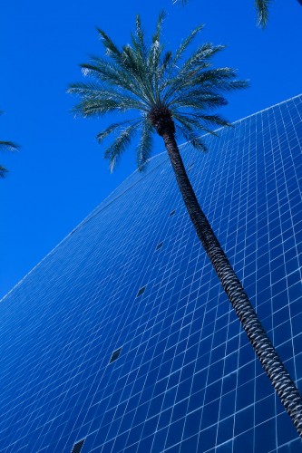
Like using single colours. Whenever you see a strong primary colour dominate, consider whether this might contain a picture:
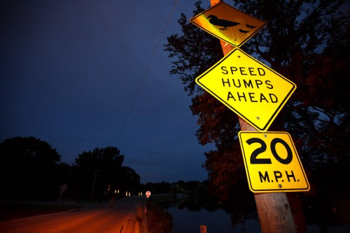
Or when you see opposite colours – like blue and yellow together:
(Can you see the use of flash in that image?)
Warm colours are good too – think about a sunset. Think of adding a little CTO filterin front of your flash (a gel – I use the Honl gels, which like the rest of the Honl range of modifiers, has made my life much easier).
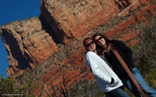
And I especially like the combination of all three main primary colours, red, green and blue, all in the same image:
You will see this in many of my images: here’s another one, an on-request snap of a couple of tourists in Sedona, AZ (can you see I used a long lens for this? Why?)
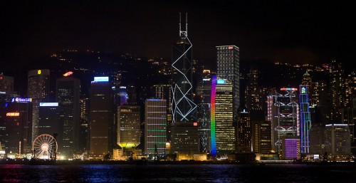
Finally, candy colours can be fun too: we look at them, our eye is drawn to them:
So my lesson for today is: think about colour: how are you using it? Are you getting the best out of it?
Foot note: I mentioned David Honl above. Dave is coming to Toronto – he is my special guest in a three-hour course on “Event Photography and Creative Light”, on Saturday, 19 March 2011. The location is to be announced but it will be in, or right next to, Toronto. Let me know right now if you want to reserve your space.


Michael,
Definitely save me a spot!! So excited!! Also I would like to thank you for the travel tips as they will come in handy while I am in Myrtle Beach!!
Pingback: Daily Digest For Thursday, January 27, 2011 | Henry's Photo Club