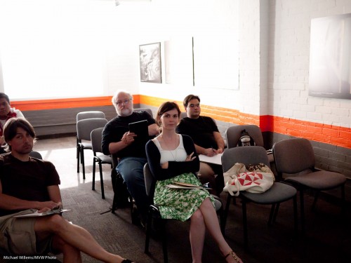
A repeat of a favourite subject – repeated here because it is so important. Namely – avoiding “being Uncle Fred”.
I see a lot of snaps like this, when I look at people’s photos:
Ouch. OK, I took that – but only, I assure you, to demonstrate the point.
What is wrong with that image?
Other than everything, you mean? (Photographically speaking: the kind volunteer student is fine).
- The subject is in the centre.
- She is small in the image
- The image is cluttered
- I shot down at her
- I exposed the image badly
- I have bad “tension points”, where I cut off feet, etc.
So then I did it properly.
I chose a subject and got close. Chose a long lens (the 70-200, a portrait favourite). Then got closer (by zooming in as well as by getting physically closer). Got down to their level instead of shooting down. Avoided clutter. Shot at f/4 to blur backgrounds. Used the rule of thirds – his face is centered one third from the top.
Bingo:
Same light. Same room. Same time.
View the original image (click!), and then view at the original large size, to see how good that is.
You see, sometimes it’s just about composition. “Filling the frame” often dramatically improves images.


Nice portrait, Michael. Thing is, you lose context. How could Uncle Fred take a picture of the class? That’s my dilemma. I’m always faced with large family gatherings and group shots.
Really enjoy your website, btw!
Oh but that too is very doable! A future blog post coming up, I feel it.
Isn’t the head being cut off also a “tension point”?
Not if you cut a lot of it off. If you are very close. An edge of anything, then yes.