A quick portrait lesson today.
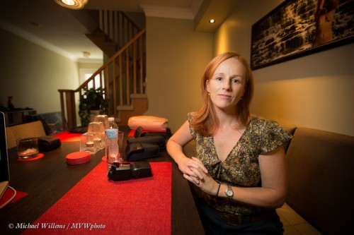
Here’s student and photographer Emma, in a coaching session on Friday:
For this photo I used a 16-35mm lens, set to 16mm. On my full-frame Canon 1Dx camera, that is a proper wide angle lens – like a 10mm lens on your 5D, 60D, Rebel, D90, or similar.
So first, let’s put paid to the adage that “you cannot make portraits with a wide angle lens”. Yes you can: environmental portraits, where you do not fill the frame with the subject. Distance between subject and photographer is the only important thing, not lens angle. A wide lens gives you that wonderful “wrap around” effect that we love in this type of portrait – the subject in, and as part of, her environment, rather than as a standalone object.
So that out of the way, what about camera settings?
I used the “Willems 400-40-4 rule“ for indoors flash. Since our indoors environments are often roughly the same brightness, a manual setting of 400 ISO, 1/40th second, f/4 will give you a starting point that is ambient minus two stops.
Which is what I want if I want to see the background, but not too brightly: just like Rembrandt, I want to make my subject the “bright pixels”. Because as a reader here you also know Willems’s Dictum: “Bright Pixels Are Sharp Pixels”. So that means a slightly darker background.
OK, so that is the background taken care of: -2 stops, give or take. How about Emma?
I used an off-camera 600EX speedlight, driven by an on-camera 600EX that was set to only command the other flash (using the new radio interface). I equipped the flash with a Honl photo Traveller 8 softbox for that wonderful light – and that wonderful circular catchlight in Emma’s eyes:
Good, so we are set.
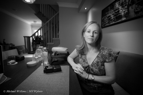
But what about the idea of making it a monochrome image, to stop the red distracting us? In Lightroom, simply select “B/W: in the Develop module:
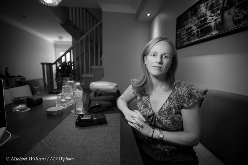
You may or may not prefer that to the colour image. If you do, then consider dragging the red to the left a little in the B/W module. That means red light will be used less in the conversion, i.e. it will be less bright in the black and white image:
Now we have gotten rid of the red place mat almost entirely, allowing us to concentrate on Emma. That is often a good reason to go to black and white: you get very extensive creative options.
Mission accomplished, in a very simple-to-do shot that is miles beyond a snapshot.
Yes, simple – once you know how (this is what I do, and it is also what I teach). Invest some time and effort in learning these techniques – you will love what your new photography allow you to do creatively.


