
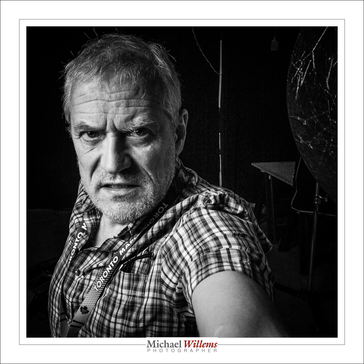
Black and white, or B/W, or Monochrome, is underused. Much, if not most art portraits are B/W. And why?
Well – colour, especially when desaturated, is not bad at all. Here’s today’s self portrait:

Not bad.
But the B/W version shows the mood better.
 \
\
B/W reduces an image to its essence. And coloured items do not distract. And white balance is not an issue. So for both creative and to a lesser extent technical reasons, try some B/W. Shoot RAW so you can do the actual conversion in Lightroom.
Here, finally, is another one, of one of today’s students, using a beauty dish:
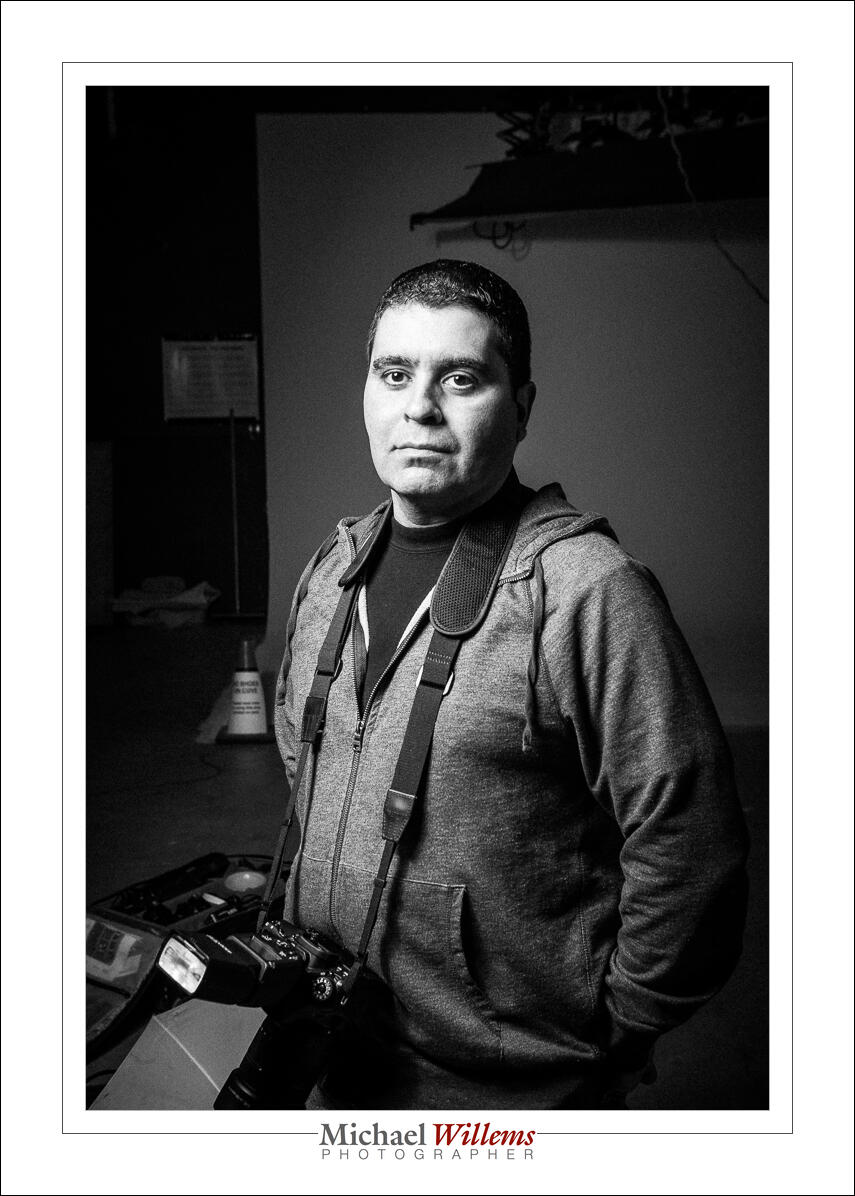
Stands out, no? I love that beauty dish.