I always try to use colour appropriately. What that means is up to me – and up to you. Photography is art, and there is no arguing over art. But there are some simple things to keep in mind.
First, consider using colour, period.
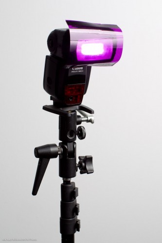
You do this with gels, when you are using flashes. For small flashes the gels are simple: you use the affordable, simple-to-use and extremely sturdy Honl Photo gels, like this one on my speedlight:
Simple. And I often use to use such colour in my backgrounds. To do that, the steps are as follows:
- First, make sure the background is dark enough. “Saturated colour” means “colour not mixed with white light”. Either move back from the wall, or use a dark wall or backdrop.
- Test this.
- Then add background light. Choose your colour well. I use complementary colours, usually.
So here’s an iron with no background light and a dark enough background (Step 2):
And here it is with a bit of complementary colour added (a gridded speedlight):
For that sea green, I used Rose Purple as a background colour.
Tomorrow, Saturday at 11AM in Toronto, David Honl, the inventor of those gels, joins me as Guest Star for my signature “Advanced Flash” course. You can possibly still book, I think here are a couple of spaces left: click here.


