…of a photo is that it should be simple. That is:
Anything that is in the photo is in the photo because it needs to be in the photo; else, it should not be in the photo.
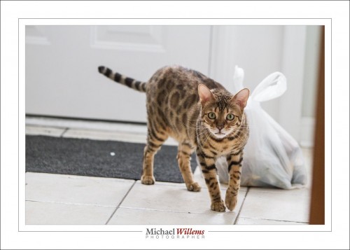
Take, for example, this shot of Shiva:
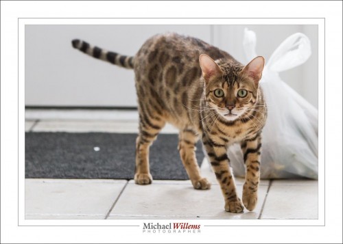
Mmm. It has potential, but it’s not straight, another big no-no, and it could be cropped tighter. That way, we get more emphasis on Shiva and we simplify: we lose the doorpost on the right, the door panel elements on the left, and various other “stuff that doesn’t belong”. And every non-needed element that you take out of a photo makes it better! So we get:
Much better. But the first thing my eye is drawn to is that white piece of paper on the mat. Can you see it? It is almost all that I see. So… healing brush, remove! The same for the black piece of dirt in the foreground.
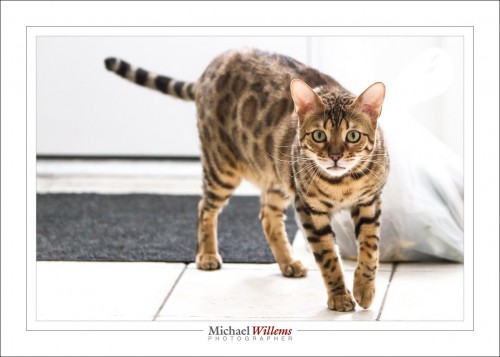
Then, it’s a little dark, so let’s brighten it. That has the additional effect of removing much of the garbage bag.
And now we have the final shot:
When you compare that to the original first shot you see that simple changes made this image a gazillion times better. And that is the official term for it.
Cropping is a major element of my changes here, and cropping/rotating is, as far as I am concerned, allowed.
___
Learn all this and more in my e-book collection. In six e-books, you learn pretty much everything I know. See http://learning.photography for more information, tips and tricks. See you there!


