I always marvel at the lack of sense when engineers (or perhaps marketing departments?) design numbingly dumb user interfaces. All through our lives.
Things like:
- A “no right turn on red” sign used to say “no right turn on red”. Now it is a picture with a traffic light showing red, and an arrow underneath that, and a line through the arrow. Such pictograms are not optimal in conveying meaning: they make you waste brain cycles on working out what they mean. If you mean “no right turn on red”, just say that, not code that the reader has to decipher.
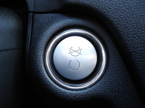
- The keyless on/off switch in the American Mercedes Benz M-class says “ENGINE START / ENGINE STOP”. On the Canadian version, pictured above, alas, we get the pictogram combo in the picture above: an almost complete circular arrow above, and a similar almost complete circular arrow with a line or two through it, below. Or the other way around if you insert the key fob the wrong way – there’s no guide as to how it goes. Huh? (Personally, marketers, I could not care less about Quebec: I do not want to waste my time working out what these things mean.)
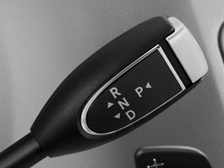
- And Mercedes’s gear lever – also so confusing I am amazed it has not yet led to lawsuits. See below.
- And the button for closing the rear lid has two buttons – one of which says STOP, followed by a pictogram. Huh? I have never not hesitated before closing the lid. And that is dumb. I have these cycles only once in a lifetime, guys, don’t make me waste them.
- Same for the front and rear window heater buttons we all have in our cars. Anyone else here never know whether the square one is front, or whether the slightly trapezoid symbol means front? So help me God, I have been driving over 30 years and still do not (and will never) know. Tell me FRONT HEAT and REAR HEAT. If aircraft had these stupid icon symbols, do you have any idea how many terrible crashes we would see every week?
In aircraft, sense often prevailed. In WW2, when inexperienced pilots flew, the engineers who made aircraft changed the flap lever to look like a flap, and the gear lever to look like a wheel. Now that is clever.
And why this ramble about dumb interfaces? Because cameras have them too.
- Nikon menus with tabs on the left: no-one gets that, Nikon. And worse – more functions than screen space, so there is a scroll bar. Only no-one knows it’s a scroll bar. The local Nikon rep once said “no-one has ever told me that”. Well, I have trained 10,000 more people than Mr Nikon there, and let me tell you, I am right and he is wrong. That interface is dumb.
- Nikon and scales that are the wrong way around (+ 0 – rather than the usual – 0 +).
- Sony and its incredibly poorly designed menus where one tab turns into three tabs when you scroll right.
- Canon’s terminology – “AI Servo” (really. “AI Servo”. We discuss artificial intelligence and servo motors in consumer devices, in a world where most people cannot multiply 1,000 x 1,000) and “One shot”, when you mean “Continuous focusing” and “Lock focusing”. Who on earth designed this jargon!
- Canon and Nikon and the interfaces on the flashes – I have been operating SB-x00 and 430/580 EX flashes for many years and the interfaces with all the buttons that do multiple things depending on the order you press them in still make me tut-tut-tut.
- Fuji with dials that all turn the wrong way… anticlockwise for higher ISO and exposure, and clockwise for lower ISO and exposure.
The list goes on, and on. So if you sometimes think you must be dumb for not getting it: you are not dumb. If the system seems confusing, that is because it is confusing. A truism, perhaps, but it’s true. (* Yes, that was humour).
The sad thing is that this poor design is avoidable. A few focus groups should do it. Or at least hiring a competent UI designer. Cancel a few corporate lunches and you get your money back.
I await the day that Apple designs a camera. Of course it will only be able to be operated in Apple’s prescribed manner, and you will need annual licenses to use it – but at least it will be logical.
What other poor design have you seen in cameras? And how would you improve it?


Funnily enough, Apply did design a camera back in the mid 90s. however, they built them in partnership with Kodak and then with Fujifilm, so I guess it wasn’t all them. (It was called the Apple QuickTake….look it up!)
I do understand the point of this post and I completely agree….every camera maker should be doing something to simplify their cameras.
True, wow, last from the past. Mmm… Was that in the Jobs days?
Yes, simplifying just by creating clearer interfaces, no by creating even more modes. Do focus group tests, and find out what hear and see in my daily teaching.
Apple has been producing cameras for years. Its most popular camera model is called the “iPhone”.
Sadly, we seem to be reverting back to hieroglyphs.
Exactly. I really don’t get it. Political correctness? Laziness? Lawyers?