Simply simple.

I had lunch with a student today – this student is bright, and is doing a private one-week full time crash course with me, something I recommend for anyone wanting to do real photography (tomorrow, we do a studio shoot).

Over lunch, we brought our cameras. Of course.

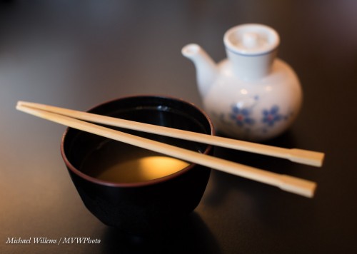
And I made this shot of my Miso soup:

A few questions. Like: “what was I using”? And “What makes this shot effective”?

I was using a full frae camer with a 50mm prime lens. My student, a crop camera with a 35mm lens. Equivalent, therefore. The prime lens allows those nice blurry background, and it allows fast shutter speeds at low-ish ISO values: I shot this at 1/80th second at f/2.8, at 400 ISO. With a non-prime lens I would have had to use slower shutter speed (motion blur) or higher ISO (grain), and I would not have obtained the nice blur.

What makes this image work, though?

  • The simplicity. The original shot was just a little wider but had some “stuff” in it. A pro shot is good is if has no “stuff” in it that should not be there – and generally, “stuff” should not be there!
  • The blur. Only part (around the chopsticks) is sharp.
  • The contrast – the dark table really helps.
  • The 45 degree angle.
  • And finally that wonderful sunlight reflection in the soup. Yes, that was deliberate: I angled the shot until I got the reflection.

My student did well, too: here’s his shot:

Well done, Jeff. Here, again selective sharpness, combined with the backlight, makes this an effective shot. In this shot, too, we cropped to get rid of distractions.

So the lesson today?

Keep. It. Simple.

That is so often the secret to one of those “wow, that one worked!” shots. Everything that is in a photo should be in that photo because it should be in that photo, or else it should not be in that photo.



Point of view: yours for the choosing.

New photographers often ask me “but how do you compose?”.

I give them the simple rules (and they are simple – like the Rule of Thirds), but I also point out one very important thing: where you are, and where and how you are looking, is everything in defining what your photo will be.

Take this scene I shot on Lake Ontario a few months ago:

Impressive, no? All you have to do is be there!

(Oh, and know how to expose. oh, and know when to – I had about thirty seconds of this sunset. Oh, and see the possibilities. Oh, and have the right lens.)

Can you see what kind of lens I used? Yes, a very wide angle lens (16mm on a full frame camera, corresponding to a 10mm lens on a crop camera).

Now look at this shot:

Ah, a different scene altogether. But guess what? Same time, all within those thirty seconds. This time I used a 200mm lens on a crop camera, and aimed at the ship in the bottom right.

Yes, one moment can result in two entirely different shots. It’s all in how you look at the world. And that’s what photographers do: show their vision. A photograph is more about you than about the subject!

With that in mind, a very successful 2013. Take some training (you know where to find me!), have your work reviewed, and especially, practice. Have fun – this blog will continue to help you in many ways. All I ask is: share (the little clicky thingies above each post) and tell your friends!


Darkness…. can be good

Advice: don’t “correctly” expose all your photos!

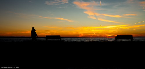
Two examples here; first, “Beginnings and Continuity”, Port Dalhousie, ON:

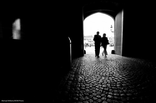
Followed by “Continuity and The Now”, Brugge, Belgium:

Both these images use darkness as a device. The top one does this in order to saturate colours and to silhouette the pregnant couple. The bottom one, in order to emphasize the stone and the stark cold strength of buildings built to last many centuries, as well as to anonymize the people who come and go in the “now”, while the “continuous” lasts.

In all these cases:

  1. Look for strong back light, and a subject that is not lit by that (or any other strong) light.
  2. Expose for that back light (e.g. spot meter off the sky).
  3. Adjust to taste.
  4. Do any remaining work in post producrtion – but if you do this well, there is little or no such post work to be done.

And Bob’s your Uncle.

Try it now!


As Standard As It Gets… or?

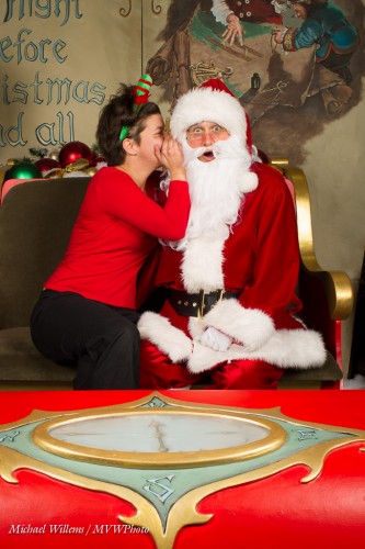
As you will have read, I spent the last few weeks having enormous fun with the kids and their parents shooting mall pictures with Santa.

Usually, these are normal “pictures for grandma”. Standard smiles. Nothing wrong with those, but why not shake them up a little?

Like a scarily fast sleigh:

Or real emotion:

Or personality:

Or interaction:

A Back-to-back pose:

And here’s me (without the beard), giving Santa Props:

There’s so much you can do with a simple, simple setup.

And if you want smiles, then here are my tips of the day:

  • Avoid telling boys (and some shy girls) to smile! Rather, try to make them laugh. Anything fun is good.
  • Alternately, tell them to laugh. This often gets you smiles.
  • Have parents stand behind you, so the child looks at you when looking at the parents.
  • After a few smile pictures, do something else – anything. Ask for grumpy faces. Ask for silly faces. Say that smiling is forbidden. Anything to relax them a little. Then go back to regular smiles.
  • For little ones, do a game of peek-a-boo behind the camera. This sometimes works quite well to raise a smile.
  • Try  toys – Trish, my co-shooter, brought a colourful rattling toy and a cookie monster, and these worked well.

Out of the hundreds of kids I photographed, only one or two were devoid of any expression or personality. Most came out of their shell – some with some effort, but all except a couple worked.

I prefer “fun” and “real” portraits to standard shots, but I shoot both. And I had great fun coming up with some great poses for the parents. They may not buy them, but often do – and at least they get a choice.

Merry Christmas!


Simple does it.

Shots are good when you take them using simple means – and when the shots are simple themselves. And your life is easier that way.

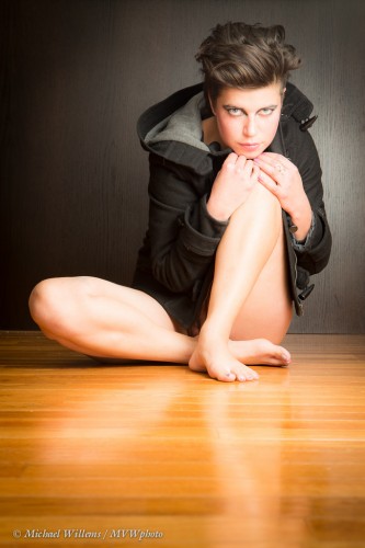
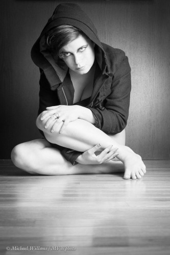
Like this shot from the other night. We started with a great outfit and great make-up, done by the model herself, and hair by Francis. Then we added a simple setting and great technique:

And another version, perhaps even better:

What did we do here?

  1. First, we adjusted the shot to the available space. A floor. A floating wall. But the floating wall had a TV on it. So we had the model sit down below the TV.
  2. Then, I got on the floor. I wanted the floor to lead to the model, and that meant I had to be close to the floor. I suppose I work out to be able to do this stuff!
  3. Then, the light. I used one off camera flash, shot through an umbrella, on our right. I made sure we had a nice reflection – reflections rock. The camera was set to manual exposure mode, and for the flash I used remote TTL. I used a prime 50mm lens. (That would be a 35mm lens if you had a crop camera).
  4. In post-production, I cropped, and gave the image a slight vignette; and in the second image, I made it black and white and popped up “orange” just a tad.

The entire shoot took just a few minutes. Learn technique (I teach pro flash courses, remember?), keep your compositions simple, and think about the light. And Bob’s your uncle: pro shoots with simple equipment and little time spent on the shoot and on post- production.  Go try it: your camera is for more than just snaps.


Mood in a portrait.

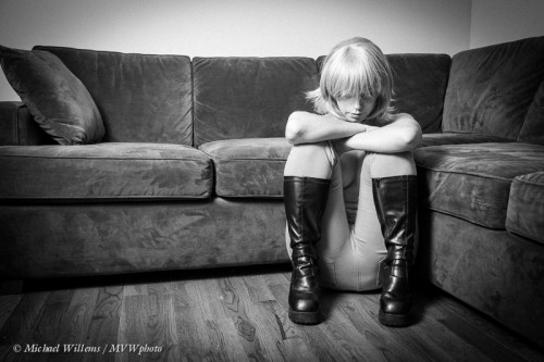
Here’s a portrait I made a few days ago. A portrait I am very proud of; very proud indeed:

This portrait shows a young woman apparently reflecting. It raises questions – and as I have said many times, raising questions, in stead of spoon-feeding the answer, is what makes an image effective and interesting.

Here, the questions include: “On what is she reflecting? Why is she sitting there? Why is she looking at the floor? Is she sad? Is she waiting? For what?” Those questions are what matter, more than the answers, which you have to come up with. Her apparent loneliness is emphasized by the empty space around her, the bare couch, her guarded pose: existential loneliness, or just a break?

We do not know. But we can all identify. An image like this makes us think about our own lives, and the experiences we have had. The human condition is deliciously complex, sad, and wonderful; and sharing it with others is what art is about.

The composition also helps. I am not sure analyzing art is all that productive, but if you asked me I would say the following are effective technical elements in this image:

  • Bare couch. Simplifying any image is key!
  • Simple setting; negative space.
  • The use of the rule of thirds.
  • Simple black and white.
  • A slight vignette.
  • The subject’s face is not looking at us and is mainly hidden.

In a technical sense, this is easy. The use of off-camera flash is effective in creating just enough shadows. I used a Canon 1Dx, with an off-camera 430EX through an umbrella. Camera in manual mode, 1/200th sec, f/5.6, 400 ISO; with the flash in remote TTL mode. I used a prime 35mm f/1.4 lens.

You really can take images like this using a very simple setup, so think about subject, story and composition, not about the technical settings.


Speakers

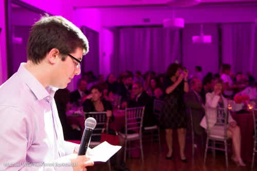
You will often shoot speakers. Speeches. Announcements.

A few suggestions:

  • Shoot from behind the speaker, not just from the front. You want to see the crowd the speaker is addressing!
  • Wait for pauses. Speakers keep speaking, and every shot has funny distorted mouths, unless you wait for natural pauses. Which can be frustratingly few and far between.
  • Try to get some back light (as I did here).
  • Consider using a long lens also, with natural light.  But not for the “behind the speaker” shots – those need a wide lens with bounced flash.

Those few very simple tips will make your “speech! – speech!” shots much better. Better than before, and better than Uncle Fred’s shots.

And now some sleep: I am teaching a full day workshop in Timmins, Ontario today (Sunday).


Detail, detail

When travelling, I like to take snaps, like any other tourist.

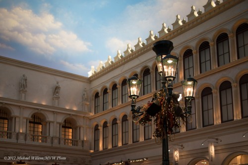
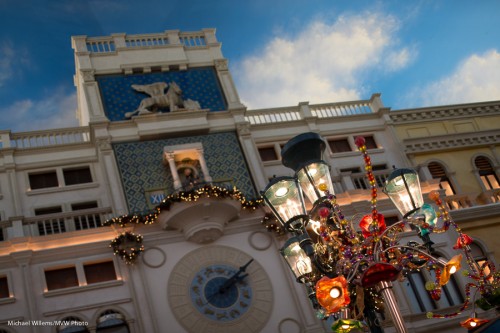
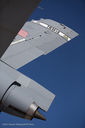
But I often make sure I get no other tourists in the snaps. I do that by tilting, zooming, and moving myself. Like these, in The Venetian:

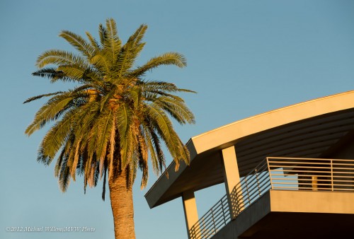
And this, the sky in Henderson, NV:


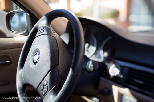
And some more:

These are nto your travel images per sé. But they are great as background, “storytelling” images. The kind you use in your book, when you make a book of the trip. Perhaps as supporting or even background images. Remember, above all: keep them simple. Simple is good. Blurry background, zooming in, tilting, all great ways to keep them simple!


Not Immediately Obvious

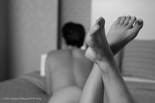
In a good photo, it is often good to not make your message too obvious. It is better to “talk without saying much”. A photo like this, taken yesterday, “model reading book”, is often more effective in conveying a situation or mood than an explicit image that tries to lay it all out:

Make the viewer put it together. That way the image is much more effective. In the case of the image above, the image benefits from the following elements:

  • Black and white.
  • Blurred subject, while foreground is sharp.
  • Face not visible.
  • Rule Of Thirds composition.
  • Action (“what is happening here”) is not immediately obvious.

The “not immediately obvious” is key. Are your images always immediately obvious? Like “Spouse Standing in front of Eiffel Tower Smiling at Camera”? Then I suggest you may try some of these techniques to make them more interesting.


Red

One thing I have always told my students: “Include something red”. OK, that is a little exaggerated. But there is a grain of truth!

Look at today’s image, of the Hoover Dam:

Hoover Dam (Photo: © Michael Willems Photographer)

Hoover Dam (Photo: © Michael Willems Photographer)

What makes this a good image? Well.. I would say: the wide angle, the colours, the tilt, the rule of thirds, the curves, and, as the cherry on top, the red car. A little contrast like that is great. Juxtapositions. Contrast. Storytelling. And red, in a green and brown and blue nature scene.