A Business Portrait

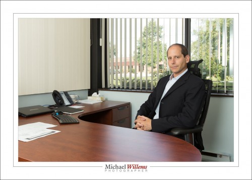
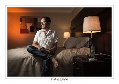
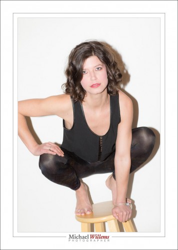
Today, I shot another business executive portrait. Or rather, a series of portraits. I needed both formal and informal.

What are the needs for an executive portrait? What does a photographer need to be able to do them well?

Equipment—so I have a full studio in the car. And at least two cameras, five speedlights, four light stands, softboxes, umbrellas, and so on. Fast lenses, too. Clasps, brackets, modifiers, “thingies”.

Knowledge—clearly, you need to know your stuff. Especially, know about light; light direction; flash; standard portraits; portrait “gotchas”; and balancing flash with ambient.

Composition—this is the most important need: quickly spotting the opportunities in an office environment, which was not designed for artistic portraiture. If you can learn this, you can do successful business portraits. You need to be able to see context: an environmental portrait is also known as a “contextual” portrait. The “background” needs to be meaningful. This is what separates the men from the boys, i.e. where you use your experience.

Detail—you need to be able to see detail, especially “stuff to remove”. You do not want things coming out of your subject’s head, you need to avoid including garbage cans, and so on. Keep your eyes open!

People skills—you need to see what the person you are shooting is all about, what makes him/her tick. You need to establish a relationship quickly. Be reassuring and be confident: any hesitation will be seen as a sign of weakness. Exude the sense that you know your business.

Post—you need to know what you can do in post-production; and you need to be good, and quick.

So let’s take a look at today. The challenges were the usual: no space, no obvious places to shoot. No space for formal, and no obvious places for informal. The office was small, and there was no time for a long walk-around. Normally I would like an hour by myself to find good spots; but this time, the walk-around had to be done with the client showing us.

Challenges. But that’s why I am a photographer.

Of course we did “formal” using a door as the backdrop, a speedlighter/umbrella as key, ambient light as fill:

Good. Well lit, nice catchlights in the right place.

Now, the environmental portraits.

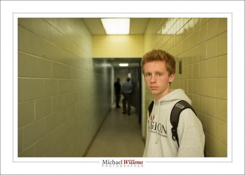
The first thing I noticed was a nice hallway with converging lines. I put my assistant, intern Daniel, in it, for a test shot:

Yup. That works. That is not a finished product, but when I see that, I know what I can do. In the end portrait, I de-saturate the yellow, to get this:

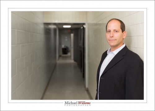
But the other side appeals more, because of the visual interest and because of the “work” it implies: this is a manufacturing facility, after all. See that other side here:

(1/200 sec at f/2.8, ISO 400, bounced-behind speedlight)

That I am happy with.

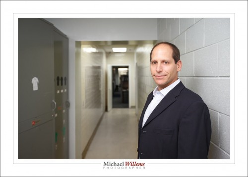
Next, more converging lines: the test kitchen. I did the same there:

(1/250 sec at f/5.6, ISO 400, “bounced-behind-me” speedlight plus ambient)

Or vertical:


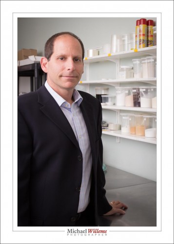
And finally, a more traditional office shot.

There, the challenge was to expose the green background properly. Not much of a challenge: all you need to do is pay attention. Expose for that background, then add flash. 1/250 sec at f/5.6, ISO 400.

As you see, a simple “executive headshot” shoot can actually be fairly complicated and can need a whole range of skills. On the plus side, this kind of shoot is fun, and can allow you to get really creative.

___

Want to learn this stuff? Yes! Take some private training from me, and read my books, from http://learning.photography.


 

Develop yourself

Today’s post is about style in photography.

There are many, many styles. And they are all very different.

For example, photojournalism (as I plan to be doing in Israel, see here) is very simple: no edits. Colour or, often. black and white. Flash is allowed, but other than that, it should look as it looked to the eye.

IV - Intravenous, by Michael Willems

Photojournalism: from "IV - Intravenous", by Michael Willems, on 180mag.ca

Or there’s this; I would call this “Annie Leibowitz’s style”:

Then there’s the “amateur aesthetic”, made popular by Terry Richardson. Harsh light with a direct flash, overexposed a little:

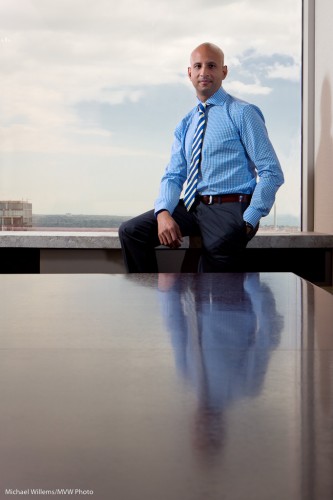
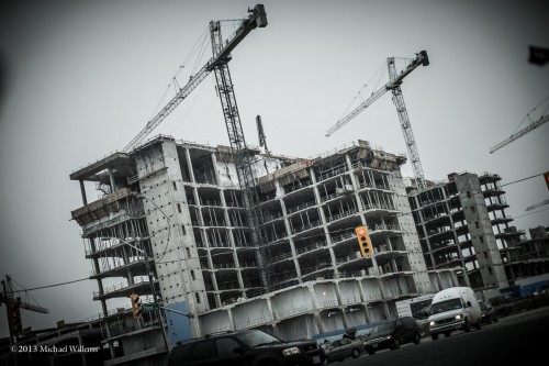
Or business “annual report style”:

Reflection, photo by Michael Willems

Reflection

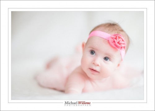
Or the natural soft light style we use with babies:

Or “desat”, very popular today:

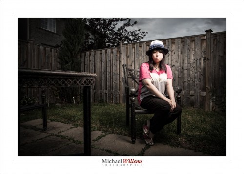
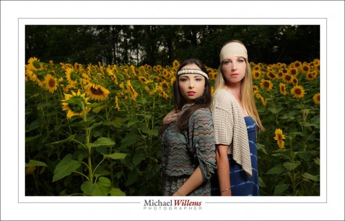
Or my own “dramatic portrait lighting” style, which is an adaptation of earlier Dramatic Portrait techniques:

I could go on. There are almost as many techniques as there are photographers. Almost, not quite. And as a photographer you should be able to master any and all of them. “It’s just technique”, as a friend once said to me.

But it’s when we get beyond that that some of us are lucky enough to develop our own styles. My style is unique to me. And the last picture is a little more my style than the others are.

So the photographer who recently told me that my work was “wrong” and “it looks like your models are photoshopped in:” and “you must open the shutter for longer” is just plan incorrect. It’s my style, and it’s recognizable as my style, and you don’t need to like it. But if you do, great. Your style is yours. If others like it, good for you. If not, it can still be just fine, as long as you like it.

____

Need Help: Scroll to yesterday to see my Israel project proposal and go here to support it.. every bit helps.


Event

Event shooting is difficult, because things are not under your control. In addition, there is never enough light; bouncing may be tough; there is not ebnough time.

But it can be done, and it can be done well. Especially if you remember you are a storyteller.

You start with an establishing shot. This sets the scene for “where”.

Then you proceed to the “what”…

Then the “why”, “when”, and “how”.


As you see, plenty of detail, plenty of the event, plenty of “background” (the “B-roll” you hear me talking about so often).

In all of this, remember to be roughly chronological; and remember above all to make the viewer work it out. The ideal photo is a photo that makes the viewer take several seconds to tell the story in his or her mind.

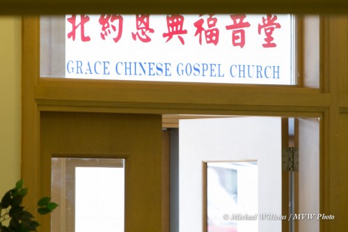
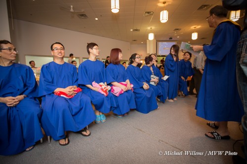
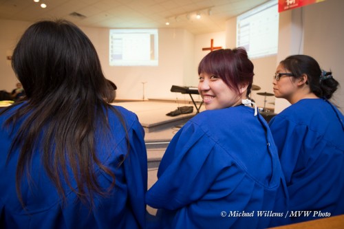
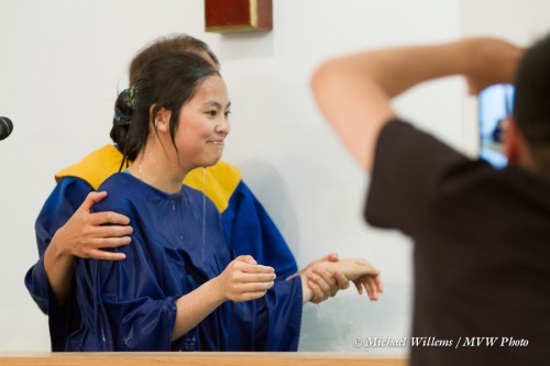
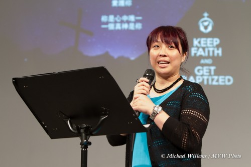
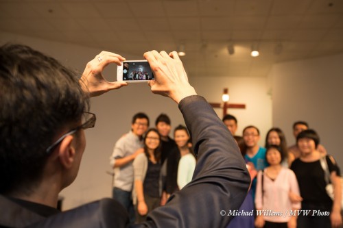
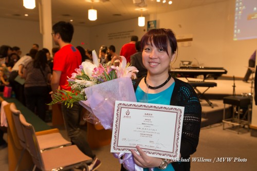
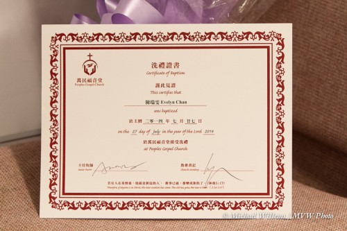
The photojournalism story above is already quite good, in just 8 pictures, at working out what is happening. The full shoot consisted of 314 photos. You can imagine that this tells more of the nuance, more of the detail: but in essence, these 8 pictures tell it all (yes, I know, I chose a different person for the post-baptism shot here).


Lighting a face: a small detail

The title says it. Detail, and attention to it, are what makes you a pro.

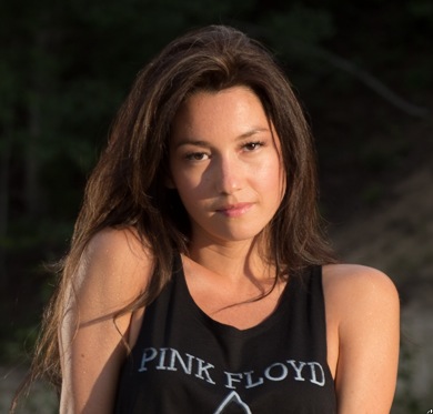
Look at this image, from last Friday. The lovely and talented Vanessa Scott, whom I photographed in Timmins, Ontario:

(ISO100, 1/60 sec, f/5. Lit with two flashes, direct, no umbrella. Left flash gridded 1/4 power, right flash unmodified 1/2 power.)

Not bad. But look closely at Vanessa’s face. Closer!

See the two little bright areas next to her mouth? My right-side flash was as little too low, so the shadows are not quite right.

Let’s start up Lightroom and make it better with the Develop module’s healing tool. Two little clicks and I fill those light areas:

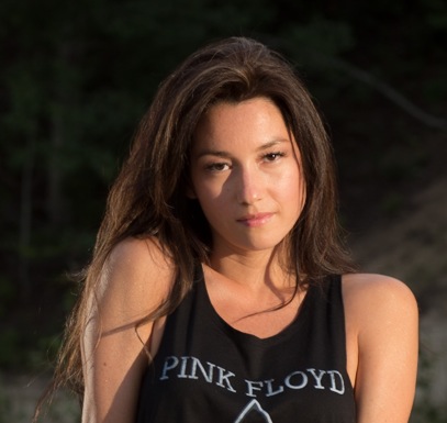
Proper Rembrandt lighting. So the whole image now looks like this:

A subtle change, but much better.

And as said, that’s what makes you a good photographer. Attention to detail. When you hire a pro, like me, this is the kind of thinking he or she will engage in to get you the best possible images.

___

I have amazing deals for portraits this month. From corporate headshots to family photos: give me a call or send me an email to hear the options.

To polarize or to ND?

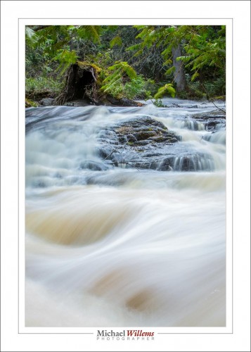
Saturday, I shot water details in Timmins:

When shooting water, like rapids, a polarizer is the obvious choice of filter. Turn the polarizer until reflections disappear.

But sometimes,  you need a neutral density filter, because it is darker. The shot above is an example of that: even with a dark (factor 8) ND filter and at f/32 and 50ISO, I could only get a shutter speed of 1.3 seconds. Which, as it happens, was fine; it’s exactly what I wanted. Any slower, and the flow lines would disappear.

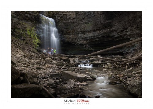
For a waterfall I would have wanted even slower. Much slower: 20 seconds.

If I had used the polarizer, I would not have done that, this time.

Why? Because I was shooting on a bright sunny day. Too much light.

Lesson: the best time to shoot water motion is on an overcast day. Bright overcast is fine!

___

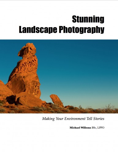
My “Stunning Landscape Photography” learning e-book is available now from http://learning.photography.  Use discount code “Speedlighter” at the end to get an additional 10% off all orders!
New Book Released!

Big news: the all new e-book “Stunning Landscape Photography” has just been released.

If you have always wanted to try shooting landscapes, or if you want to become better at doing it, this is the e-book for you. In my latest e-book, I includes information on technical requirements, tripods, bags, filters and other requirements; required photography knowledge; timing of shoots and location finding; shooting technique; lenses; basic and practical composition; and post-production. I include many specific landscape techniques, from night scenes to flowing water photography. The ultimate guide to finally mastering your landscape shots.
This extensive and richly illustrated 117 page e-book is $19.95 plus applicable taxes: it comes as a PDF file, conveniently optimized for freely viewing on iPad, your computer, and similar platforms. Head on over to the store at learning.photography to obtain your copy right now!


Closer

“If your pictures aren’t good enough, you’re not close enough” (Robert Capa)

You have heard me on this theme many times. Getting close can often make your images better. You get close and intimate with the subject, your images have more impact. Like in these two, from that recent shoot:

Now of course you can do this by getting close. But be careful: closer than a couple of metres means you distort faces.

A better way is to use a longer lens. My favourite lens for this work is the 70-200, therefore. That has the additional benefit of not forcing you to be “in your subject’s face”. Yes, you have to have space, but that’s the entire point!

An alternate way is simply to use a somewhat long lens and then to crop for the rest. Those two were taken with the 85mm lens and cropped afterward. That is why you have all those megapixels, after all.

Next time you shoot anything, do yourself a favour and shoot the way you would normally shoot, but also shoot closer. Then when you look at the results, consider carefully which ones you like better. Where you like the close-up better: why? Where you like the wider view better: why? This is how you become a better photographer.

There’s still space on tomorrow’s Travel Photography session in Oakville, Ontario: 10AM-1PM, Sat 12 April 2014. $125 and it’s virtually private tuition!

If…

Robert Capa said: “If your pictures aren’t good enough, you are not close enough”.

OK, he was talking about war photos, but he was right in general. Often, pics are better when you get close.

And you can get very close. Here’s student Chantal during Saturday’s flash course:

We call the above an “extreme close-up”. Yes, you can cut off half a face. The result: you get closer than ever, and the photo has a very intimate and personal feeling.

Your homework: try to do some close-ups and extreme close-ups.

___

Lines

Lines, in composing pictures, are important.

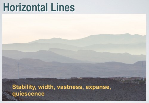
Horizontal lines are the main type of line we see – the horizon being the main horizontal line we encounter.

And here’s what they do (in a slide from my composition workshop):

Can you see how this looks silent, stable? I can imagine sighing, almost, when I see this. Layers of horizontals do that. Keep that in mind when composing pictures. Use horizontals when you want to emphasize vastness and quiescence, e.g. by taking pictures in landscape mode.

A tip: avoid having a main line in the very centre since this divides the image unnaturally; and keep the horizontals overall horizontal: a slight tilt is annoying.


Of colour and detail

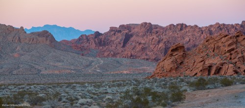
Look at this shot of the Valley of Fire, Nevada – and watch closely: click until you see it full size.

Taken with the 1Dx using a 70-200mm lens at 1/80th sec, f/6.3, 1000 ISO.

What I see there is more than just some rocks.

I see vastness, even though I am using the long lens. Usually, I would prefer wide, but in this landscape, long is good: compressing the vastness makes this look as huge as it is.

And as a result, I also see layers: foreground, middle ground, and background. Often a recipe for a good composition.

I see curves, elegance in a composition.

I see detail: sharpness, a good lens stopped down, is essential here; and if you are using a slow shutter speed, then a tripod is a must.

I see balance – the crop was needed both to increase the sense of size (horizontal lines emphasize size and quiescence and vastness) – and to balance the composition.

And finally, I see spectacular colour, even though this was taken just after sunset. The blue background is essential here, to offset the reds and greens. The pink sky matches the pink rocks, which contrast against the green vegetation.

And putting all that together, I see a good landscape photo that does justice to a spectacular Nevada view.  What do you think?