Black and Why?

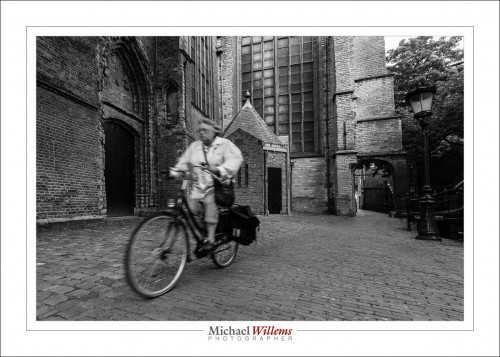
Black and white (or monochrome) is underused nowadays. Yes, colour is great–I love colour, as you see in much of my work–but “mono”, as in the picture below of a cyclist on Gouda, the Netherlands, has something going for it in several ways.

The colours do not distract from the subject. Unless the colours are the subject, avoiding this kind of distraction is a good thing.

Mood can be enhanced: mono can be a storytelling device. Mono can also evoke the past. Mono is thus used in much photojournalism.

But there are also great technical benefits to using mono, and that is what I want to briefly talk about today.

You should shoot RAW and set the camera’s “image type” to monochrome, so you see a preview that at least looks somewhat like what you will get in monochrome, but the RAW file contains all the colours.

First, white balance is unimportant. Whatever you set it to will be fine.

Second, quality of a converted file will be better; or rather, deficiencies will be less noticeable. And third, you can make changes afterward by emphasizing or de-emphasizing individual colours. This is like using coloured filters in film photography (e.g. a yellow filter to make the blue sky darker); with the difference that you can do it afterward, so you can try different “filters”.

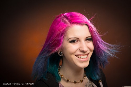
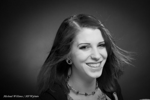
Take model Khoral:

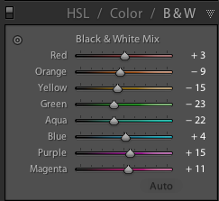
If I do a standard B/W conversion in Lightroom’s DEVELOP module, using its “HSL/Color/B&W” pane, I get this weighting of colours:

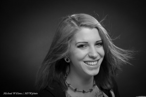
..which gives me:

Which of course looks fine.

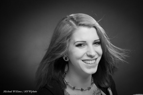
But if I turn down Magenta and turn up orange (= skin colour) a little, I get:

Alternately, I could turn up both magenta and orange:

…which gives me:

Can you see how powerful a tool this is? You can try any combination of colour weighting to get the results you want. A distracting colour can be made as bright as the surrounding area so it no longer distracts. Skin can be improved (making orange a little brighter makes skin brighter, which looks clearer).

I hasten to add, of course, that if you are actually doing photojournalism, you should not mess with the original other than a standard conversion, unless your photo editor allows you to use standard colour filters, say – but this would have to be a very explicit agreement, and any edits should not alter the appearance of the scene materially. Why? Because we need to trust that what our media show us is in fact “what there was”. That’s one reason I am not a great fan of “citizen journalism” taking over the news.

But if you shoot art or commercial or family portraits, go wild. OK–maybe no going wild, but you get the idea.

One more thing. Lightroom also allows you to add “film grain”, and that can be very nice in B&W too, to give that old look – and it smooths out skin imperfections. Film grain, unlike digital “noise”, can look good.

OK – lesson over: go shoot some B/W!


Three Feet

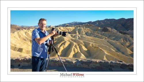
When exactly do I use a tripod, as I am doing here at Zabriskie Point, Death Valley, California?

As little as possible, because I have to carry the darn thing. Except, every time I do, it’s better.

  • I do not have to raise ISO values in order to get a fast enough shutter speed.
  • There is no motion blur (important, since even at faster shutter speeds, it CAN occur).
  • I can do panoramas.
  • I can do HDR images.
  • I can leave focus alone once it is set.
  • I can leave zoom and other compositional elements alone once set.

Here’s a panorama I made in Las Vegas the other day (view it at the original 3000-pixel wide size by clicking through):

You make a pano like that by:

  1. Using a tripod.
  2. Mounting the camera on the tripod so that it swings around its focal plane (i.e. mount the plate below the camera, not below the lens, as you otherwise might do with a long lens);
  3. Set manual exposure, white balance and focus (avoid days when the sun comes in and out);
  4. Avoid close by objects, except in they first and last pictures;
  5. Take pictures from left to right. Ensure that they overlap by, say, 30% (more is OK too). In this example, I took six pictures.
  6. Use software to put them together at the required size.
  7. Adjust and, where necessary, crop the final result.

What software? You could use Adobe Photoshop. Canon Photostitch, or a host of paid and free applications. I am not the best to advise on which one is best (anyone? Feel free to jump in with well-founded advice).


1Dx update

For fellow owners of a Canon 1Dx: there’s a firmware update that offers new functionality. Autofocus and exposure controls as well as customization settings have been enhanced.  Go here to download.

Details of the upgrade here. And the upgrade works: I did it this morning.

For others: always check that your camera’s firmware is up to date. At least a few times a year, check, and if necessary, upgrade. Else you lose out on bug fixes and new functionality.

Do it in style (or not)

Another page from my upcoming book, Mastering Your Camera – The Ultimate No-Jargon Guide To Using Any DSLR (ISBN-978-0-9918636-2-4) whose release is imminent. Planned for January 14, but it may well be earlier: STAY TUNED. I will announce release here and on https://www.facebook.com/CameraTraining.


Most cameras allow a “Picture Style” choice. This choice allows you to set the camera up to produce photos with a particular “look and feel”, like Standard, Portrait, Landscape, Monochrome, and various others:

This setting effects sharpness, contrast, saturation, and colour tone. And again, as in previous “in-camera editing” options, this only affects JPG pic- tures and a RAW image’s built-in JPG, i.e. the preview you see on your screen. So when you shoot JPGs, yes, do explore these options and how they all look.

Even if you shoot RAW, if you use your camera maker’s provided software (e.g. Canon’s Digital Photo Professional application), you can then have the RAW image “tuned” the same way on your computer, so in that case there is some utility to this. You can even make your own styles. Nevertheless, if you shoot RAW, I think the advantages versus the drawbacks of not using Adobe Lightroom or similar weigh towards not doing this, and just leaving it on “Standard”.

If you shoot JPG, I would not use the “Monochrome” setting—as discussed before, this will throw away all colour info and make it impossible for you to adjust the B/W conversion later.

Play with styles if you shoot JPG; else, my advice: leave the camera on “Standard” and do all editing in Lightroom. And: you can emulate most cameras’ styles in Lightroom in the DEVELOP module, in the CAMERA CALIBRATION pane, by changing the PROFILE setting. Play with that!


Review!

You all press the “playback” button to review your photos, of course. But do you also benefit from the extra information you can see?

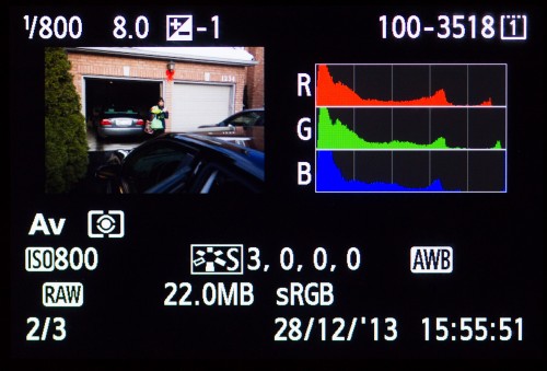
Additional Info (EXIF data): You can see additional information about your images (such as the image’s date and time; image name and number; the histogram (an exposure graph); detailed exposure and settings data. Like in the picture above.

To see such important data you press:

  • Canon and similar: the INFO or DISP button. Press it repeatedly, and you will cycle through the different views.
  • Nikon and similar: the UP or DOWN controls. Press them repeatedly, and you will cycle through the different views.

Try it now: press the Playback button, then repeatedly press INFO/DISP or UP/DOWN. What do you see?

Blinkies: some of these review modes can (or can optionally, when enabled) show blinking “highlights”. These blinking areas are the areas that are, or are close to, overexposed. Are blinking areas a problem? Not necessarily, but when half your subject’s face is blinking furiously, then, yes, of course.

___

These words are from my next e-book, “Mastering Your Camera-The Ultimate No-Jargon Guide to Using Any DSLR”, (ISBN 978-0-9918636-2-4) which will be released within the next couple of weeks.


Learning the tools

If you have not yet looked at my Adobe Lightroom and other photography videos, then head to my YouTube video channel: www.youtube.com/user/cameratraining. Regular new tips and techniques. Today’s tip: Secrets of the Healing Brush. A few things I bet you didn’t know.

Note: there’s one spot left on tomorrow’s Oakville Advanced Flash course. Contact me if you are interested.


Looks so good, but…

A reader asked me this:

Okay so the last few times I have loaded an image into lightroom, the colors changed from the initial great preview to some weird blah shit when it loads in the develop window. Grrrrr: do you know why it’s doing it?

Yes.

Many cameras by default have the “Auto Light Optimizer” (Canon) or “Active D-Lighting” (Nikon) set to “ON”, which is a mistake. If you shoot RAW (as you really ought to), turn those ALO/ADL functions OFF.

Why?

What does ALO/ADL do to your RAW image? Nothing. And you shoot RAW. So why does it matter? Here’s why.

If you set ALO/ADL to ON, your camera will, where necessary, apply “fill light” to the data that comes from the sensor, and use the result to make its little embedded JPG. That will make dark areas lighter. In other words, the camera makes your not-so-great images “look better” by, if you will, “photoshopping the preview”.

So, the RAW image is bad, but the little embedded JPG is “photoshopped”, so it looks great. And that little embedded JPG is what you see on the back of your camera. \

So when you look, you will see a well-exposed picture. Happily, you shoot more. But in fact, unbeknownst to you, the actual data is darker: you are in fact underexposing the dark areas of your picture!  And you wonder why when you import your image into Lightroom (which does not honour that same “fill light” setting) it looks so much darker than on the camera. Or rather, you wonder why the histograms are so different (you should probably not judge exposure just by the image on the LCD).

So when you turn ALO off, the camera no longer shows you an “enhanced mini JPG”; instead, it shows something closer to the real RAW image. And if that is dark, you can fix it by adding light, not by tweaking bits (which can add noise).

In other words:

Making a bad image, but using in-camera “photoshopping” functions to make it artificially look better (at the expense of quality): BAD. Making a good image: GOOD.

In addition, read this previous post. And you’re welcome.

___

I have one spot open for my Flash course on Saturday, 10AM. If you are interested, let me know now!

Rating your images

It can be quite useful to rate your images, in order to later be able to reduce the number you are working with to the minimum required, and in order to quickly find good images. But when you rate them, you need an unambiguous system, one that is always the same. Otherwise, don’t bother.

Here’s mine, and here’s how I use my method in Lightroom:

Have you subscribed to my YouTube Video Channel yet? There will be more videos regularly, so check back. And comment, and feel free to request subjects. If you want to learn Adobe Lightroom in detail, contact me: I can help you in a personalized session.


You Need Protection Against Yourself!

Or rather, you don’t.

A somewhat advanced Lightroom tip for studio photographers today.

Adobe Lightroom, since version 4, has protected us from ourselves. Any overexposed areas are automatically brought back as much as possible as part of the RAW conversion, so that they appear not overexposed.

Fine. Until in a studio portrait, you try to deliberately overexpose the background, so that it becomes pure white. Fine, except Lightroom stops you.

Until you change the RAW conversion back to the older, 2010 version. Then you can overexpose as much as you wish.

I just posted a short video about this here:

TIP: Sign up for my YouTube channel, so you hear when I post a new video.