Portraits

I taught two studio/portrait courses at Vistek Toronto today. Great students, lot of fun. The take-home message: it’s not as complicated as it seems; in fact, it’s easy. Especially with the right equipment, I used a mix of studio strobes (two Elinchrom monolights) and speedlights (my Canon 430 EXII and 600EX speedlights, set manually, i.e. used as studio lights).

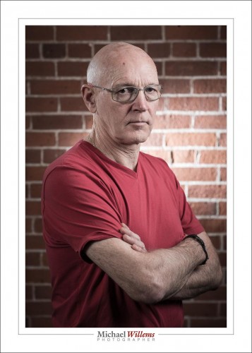
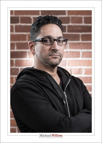
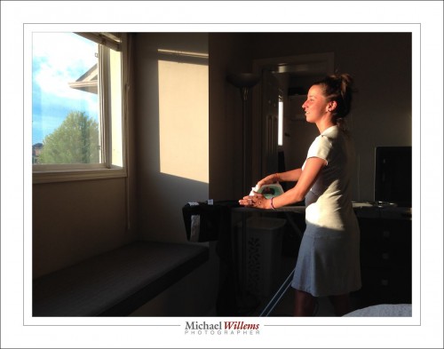
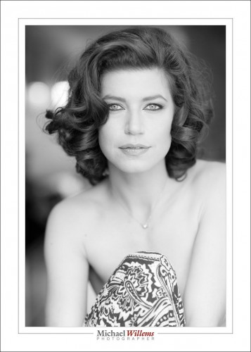
Here’s a couple of “standard” four light portraits (key light, fill light, edge light, background light), slightly desaturated in post:

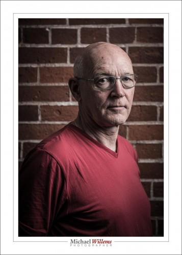
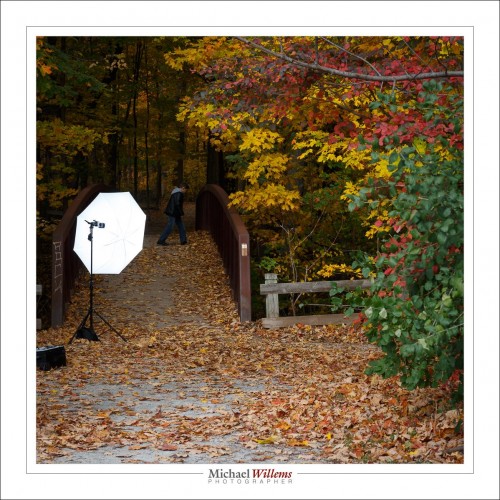
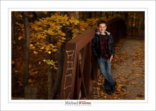
That’s the standard. But you can do with less. Like here:

I happen to like that kind of drama in portraits a lot; it shows character and mood— and that’s just one studio light with an umbrella. Really? One light can do a character portrait? Yup. It can. F/5.6, 1/125 sec, 100 ISO)

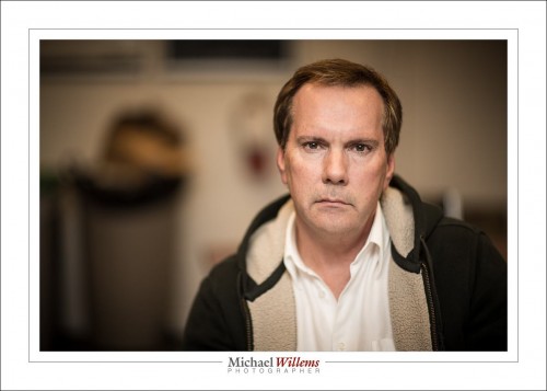
And here’s a one-flash bounced portrait, shot at f/1.2 to get a blurred background. Yes, f/1.2! and you can call me courageous or mad, whichever you prefer.

(f/1.2 at 1/160 sec at ISO 100)

Bounced off the ceiling behind me, and using TTL (i.e. automatic flash) with an on camera flash. Simpler isn’t possible, and yet you can do great portraits.

The message: make lots of portraits. Set yourself challenges, and one challenge should be: show mood and character. See how many flashes you need. Note the techniques that work best. Often, as one student today noted, “less is more”.

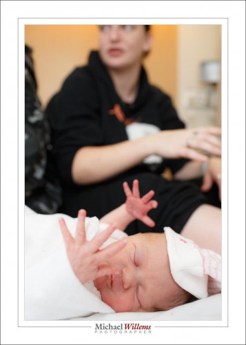
And on that subject, I finish this quick inspirational post with one more picture taken with jkust one flash; this time again of my granddaughter, just a few hours old:

(1/125, f/3.5 at ISO 1000).

That’s a storytelling photo. And a character photo, I suppose: Addison is showing character at only a few hours old.  Also one bounced-behind-me flash.


Art Discussion, Continued

After yesterday’s post, a reader left a comment (and you are all invited to leave comments and engage in discussion on this blog!) that I consider interesting enough to republish, and to answer/discuss, here today.

1. “More please! please! this stretch into art and feeling is terrific and welcomed in your subject matter here on speedlighter.

>>Do you see them? And do you feel them ?<<
Well no. I have no awareness of Hopper. where do I go to gain more of this, just the museum? But you have provided one here. More please! please!

2. You have written about IP and ownership before. How are you able to post a Hopper photo on your site? no (c), no reference, no link?”

Great, let me answer those in turn.

First, art. Yes, I think photography is part craft and part art, and the art component is something we do not talk about quite enough. Photography is not about bits and bytes and f-numbers. Those are just tools. It is about what you do with them.

Photography is a serious art form. My favourite artistic photographers include such people asNan Goldin, Annie Leibowitz, Mike Disfarmer, Sally Mann, Edward Weston, Richard Avedon, Diane Arbus, Andreas Gursky, Jan Saudek: their images fire up my imagination, speak to my emotions; evoke places and times; and that is what art is supposed to do.

And for painters, Hopper comes an easy number one for me. This is entirely personal, of course, but there is no painter whose work speaks to me more than Hopper. You have not heard of him? I bet you have seen Night Hawks, his most famous painting:

Can you feel the alienation and loneliness?

To learn more about Edward Hopper, my first stop would be here, and of course Google. In general, as a photographer, I recommend you also look at paintings, go to museums, read about art. The various arts have much in common, after all.

Why do these artists resonate with me? I do not know, but I do try to analyze that a little. Part of the fun.

And me? Do I produce art?

I think that is the wrong question; or at least it is one that I do not feel qualified to answer. I do try to put feeling into my work. Like into this self portrait:

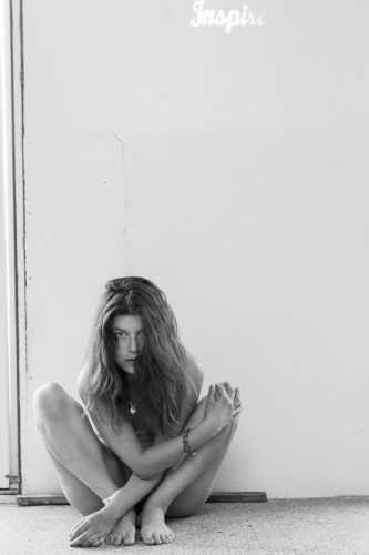
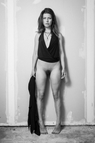
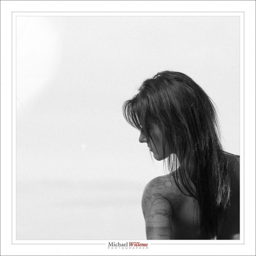
…and into my art nudes, like these three examples:

Inspire

“Panta Rhei”

“Nude Against Drywall in Garage”

And into shots like these two:

“Sailboat on Lake Ontario”, 2013

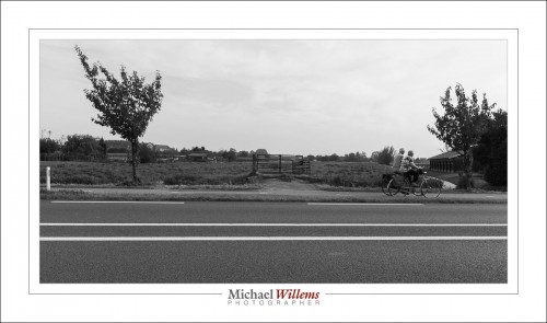
“Bicycle in Schoonhoven”, 2013

…and there’s much (much) more. I occasionally showcase some of it on www.michaelsmuse.com.

Am I comparing myself to those greats? No, of course not. Comparisons are not useful, anyway: what counts in my work is that it touches me. And if it does that, it has achieved its goal. If anyone else likes it too, that’s great. If someone wants to call it art, good. If not, fine. I do these for me. Or perhaps more accurately, for having done it. Creating an artistic photo is a satisfaction all of and by itself. A tree falling, and I was there to hear it fall.

Finally, then, copyright. On some, or perhaps all, of Hopper’s work, copyright has run out and has not been renewed. But it’s a moot point, because it is generally agreed that under the right circumstances, art can be used under Fair Use rules, and I am sure that this, a teaching blog, constitutes exactly the right circumstances. Hence, no problem.

Analyzing which artists of the past or present inspire you can be a very useful exercise for a photographer.


Seat of the muses

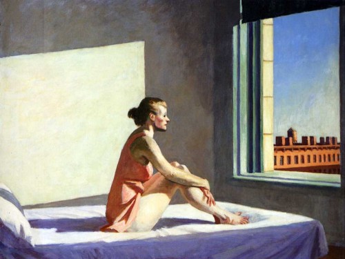
The muses inspire us, and we each have our own muses and inspirations. My inspirations include the work of painters, notably John Singer Sargent and Edward Hopper, two American painters of, respectively, the 19th/20th and 20th century.

Here’s a Hopper, “Morning”:

And when I say I am inspired by Hopper, I mean not that I copy him, but that he evokes certain feelings (like a combination of “alienation” and “nostalgia”), and places, and times in me. Hopper is an easy artist to admire.

But it is also easy to recognize similarities. Like in this recent photo:

The moment I took that I was struck by the many obvious similarities to the above Hopper: similarities in shapes, colours, and subject; even in mood.

Do you see them? And do you feel them like I do? Perhaps, and perhaps not. The first one is a good thing: that is what learning art is all about. The second one, feeling them a I do, is not necessary, not even desirable: we should not all be struck by the same things.

But seeing them, that is what “learning” art is about. And appreciating the basis of good art, like simplicity. Since the above picture is art, not photojournalistic, I feel free to make changes in post-production. What change did I make to this picture? I removed a line in front of the subject’s face:

Can you see how distracting that is? So the objective part of creating art is that sort of thing: no-one can argue with me that that line is not distracting: it should go. The subjective part is the appreciation of the art itself, and there we can differ.

Oh, and that “seat of the muses” in the title? That is what “museum” means, and that is where you will find Hopper and Singer Sargent; and that is where you can go for inspiration.


Deep.

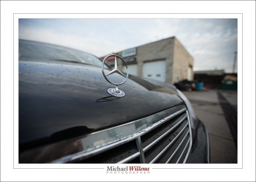
Deep. As in, “this photo has depth”:

One of my cars, outside the mechanic’s yesterday.

So how do you get depth? You know!

  1. Have a close-by object (we call this: “Close-Far”);
  2. Have diagonal lines in the image (the foreground needs lines or texture, preferably)
  3. Use a wide angle lens.

The wide angle lens facilitates 1 and 2, and also has two other advantages: it is easy to get everything sharp if you wish (here, I did not wish); and it is easy to shoot at show shutter speeds.

So pack your 16-35 lens if you have a full frame camera, or your 10-20 or similar if you have a crop body, and go shoot some depth pictures.


REMINDER: Have you thought of a training gift certificate for a private custom lesson with me as a gift for this coming season? A gift which is not only fun, but leads to your loved one making better family photos. And you’re done with shopping immediately. So everyone’s a winner. Go to http://learning.photography to order your gift certificate now.


Sic transit gloria mundi

Thus passes worldly glory… we are here for a limited time. Hence, make the most of it while you can. And especially, make photos. Or better, have them made, by someone who does it for a living.

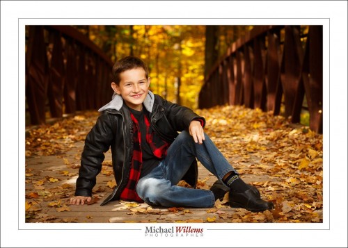
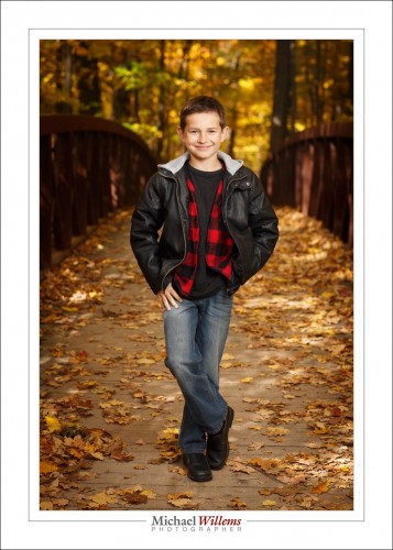
This kid’s mom is a very good photographer, and I shot her boy with her yesterday:

(As usual, I used an off camera flash, and the speed was the usual “outdoors starting point” of 1/250 sec at 100 ISO; the aperture needed to match this was f/4.5, which also gave me the blurred background I wanted.)

I often hear “photography is dead”, “from here on, we are all just doing iPhone snapshots”, and so on. But looking at these, do you believe that?

I am sure that there will always be a market for great photos, photos that this young man will treasure when he is my age. An iPhone cannot give you blurred backgrounds, sharp images, lens choices, or the use of flash.
For this image we want a dark background to get saturated colour. That is the 1/250 sec at 100 ISO and f/4.5.

Then for the subject we want a flash: after all, “bright pixels are sharp pixels”.

To be bright enough, the flash was set to half power shooting through an umbrella, so:

A single speedlight is enough in this kind of light. If we had been in the bright sun, the speedlight would have to be very close and/or unmodified.

In any case: please have images like this made, or learn how to make them. After all, you can never travel back in time to do it over again.

Tomorrow, a special technique you can use when you have to shoot a subject in the bright sun.

High ISO on a Canon 7D

You know, forget using a Canon 7D (original) above 800 ISO: it’s just too noisy.

Oh? So how did I take the picture above at 3200 ISO?

Simple. By exposing right. I.e. by exposing bright.

Bright is right.

Bright pixels are sharp pixels.

If you expose on the bright side, noise is not nearly as bad as you may think. Just avoid muddy, murky, noisy pictures. “3200 ISO and bright” is much better than “800 ISO and dark”. Cockroaches hide in the dark. As do millipedes, politicians and noise and grain.Bright is good; “extra bright and then pulling the picture back in post” is even better.

The moral of this story: Do not be afraid to go to high ISO values if you have to. Just do it right: and expose brightly.


Experiment with aspect ratios

Your camera produces an image in the aspect ratio 3:2 (or 4:3, if you use a four-thirds camera). But why not let go of that, and use your own ratios?

Like square.

Or like wide.

Or odd-shaped.

I am a firm believer in “make the picture whatever shape you think fits the picture best”. Not “whatever the frame-makers in China or the paper-makers in Switzerland have decided for you”. Make the picture the way you like, and then cut white edges off paper, and have custom frames made.

On that note: no, you cannot print a 4:3, say, on 3:2 paper without either cropping the picture or cutting off white edges. It’s the reality of life.

I have found that often, people do not understand this: “yes but I want my 4:3 picture to fit on this 8:10 paper and no, I won;t accept cropping or white edges”. Well, here’s news: you have to. To understand why, imagine you have a square picture. Try fitting that on an 8×10 piece of paper, and now you will see why it cannot be done. So you either crop to the paper aspect ratio prior to printing (Lightroom is very good at that), or you print with white edges, which you then cut off. It’s one of those “it is what it is” things.


Symbolism in your photos

Photos tell stories. Some stories are good, or at least, are allowed. Like the end of the summer in the southern Netherlands, the other day:

All these help tell the story and are very evocative if you’ve been there.

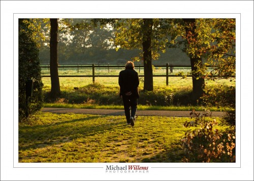
Other types of symbolism are best left alone. Like an 85-year old walking away into the sunset, and worse, unmistakably in the centre:

This is not the kind of symbolism you should strive for—at least not unintentionally.

The moral of today’s post: ask yourself: “what does my photo mean”? If you cannot answer that, you have a snapshot.

I would say more, but I am about to board a flight to Reykjavik and thence, to Toronto.


Add Light

If there’s one thing I know, it is that there’s never enough light. So for a portrait like this, from April 2014, I need to add some.

1/200, f/2, 800 ISO.

So that is one and one-third stop more than the usual 400/40/4 (400 ISO, 1/40 sec, f/4); i.e. almost the same; except a blurrier background by using a larger aperture, and hence, the need for faster speed.

And the flash was pointed where?

Behind me.