Print pricing

Following up from the “printing” post, I want to give you a little perspective on print pricing. Both for the buyers (companies and individuals) and for the sellers (the photographers and artists).

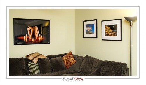
Professional art prints cost money. To give you an idea, a professionally made image printed on 13×19” paper, ready to frame, will cost $249. A 13×19” print framed ia $536 (you see two in the picture below). And a 40”x24” (approx.) metallic print, framed: $1435. (that’s the one on the left).

“Why? I can make a print for $20, surely?”, is an objection I have heard many times.

Well, no – that is not the way to look at this. And there are three ways to understand this. I thought it might be useful to go over those, today.

One way is by analogy. Sure, the print may not cost the sale price. But that is like saying “I went to the law office and I got my will done. I’ve got it here: it’s a piece of paper made by an HP printer, typed by a secretary. The paper and the typist time are no more than $15, so why should I pay more?”. Or perhaps it is like saying “Rembrandt’s brushes, canvas and paints cost him 2 florins, so that is what I’ll pay for that Rembrandt painting over there”. You see the silliness of those ways of looking at it, presumably. Printed photographs are the same. They are, in a term I have heard recently, “high-end wall furniture”. Any furniture designed for you and sold in limited numbers (“we’ll only make 20 of these couches”) will be worth money. And more than the cost of wood and cloth, of course, if we stay with the analogies.

The other way to understand is by looking what goes into a print. A framed art photograph for your wall contains, of course, a lot more than the paper and ink (just as the will contains more than just the paper and ink):

First, it contains, if you will, “intellectual property”:

  • Most importantly, the artistic taste, vision and ability that led to the image.
  • The photographic expertise. It takes 10,000 hours to become an expert at anything, and that is certainly true for artistic photography. You pay the lawyer for his experience and ability to deliver; same for the artist.
  • The printing expertise. Any idea how long it takes to become good at printing with the right colours, contracts, and so on, and to create prints on the right kind of paper, and prints that last?

A story, probably apocryphal, has it that Pablo Picasso was sketching in the park when a woman approached him. “It’s you — Picasso, the great artist! Oh, you must sketch my portrait! I insist.” So Picasso agreed to sketch her. After studying her for a moment, he used a single pencil stroke to create her portrait. He handed the woman his work of art. “It’s perfect!” she gushed. “You managed to capture my essence with one stroke, in one moment. Thank you! How much do I owe you?” “Five thousand dollars,” the artist replied. “But, what?” the woman sputtered. “How could you want so much money for this picture? It only took you a second to draw it!” To which Picasso responded, “Madame, it took me my entire life.”

Second, the photograph contains “real cost”. That is, of course, not your problem if you are buying, but it is nevertheless perhaps illuminating to see that there’s a lot that goes into a wall photo:

  1. Proper photographic equipment – at last $20,000 is needed to have a proper photographic setup. And that’s really just the cameras and lenses. Yes, proper equipment is important. When you blow up that image, imperfections due to cheap cameras and lenses will be noticed.
  2. Printer and computer equipment. Again, this is not cheap. You cannot expect permanent prints from a cheap inkjet printer or from a Costco machine. Proper printers have ten inks, not just one or two; and they are pigments, not dyes.  The computer equipment, software, disk space, etc also cost money, and proper high-end calibrated screens are essential.
  3. Supplies. Proper art paper and pigment inks are not cheap. My printer has 10 cartridges for the different colours, and it seems that every three minutes one of them is out. And they cost $22 each. And the paper: $50 will buy you a small box – and again, they’re constantly out.
  4. Time. The time to make the photo in the first place. But also, the time to finish that photo. And then the time to print. It takes two minutes to even feed a sheet of paper into a pro printer, and that’s without the printing having started yet!
  5. The frame. Handmade frames and custom-cut mats are a real cost. Go to an art supply store and ask to have something framed and you will see.
  6. Time to put it all together. By the time you see a work of wall art, the artist has made the photo, set up the equipment, finished the photo, made the print, driven back and forth to buy inks and paper, driven back and forth to have the photo framed or wrapped, and so on.

So buyer: while it may not be your problem that a lot of real cost goes into wall art, I think it may be enlightening to realize exactly how much. Your artist is not getting rich over your back. And seller:  when you do the math, on a simple spreadsheet, you see it is not viable to sell for less than “standard pricing”, unless you want to work for less than minimum wage, of course. Importantly, both buyer and seller should realize there is real, true, value in a piece of wall art.

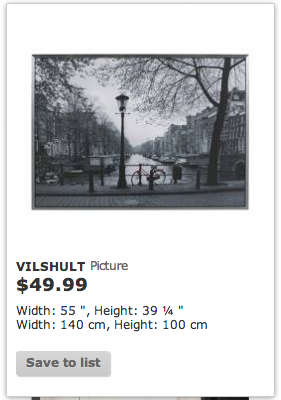
And finally, the third way to understand print pricing: a product’s value is defined by its scarcity. This is, presumably, interesting to any buyer! And this is why we tend to print in limited editions. You can go pick up a piece of wall art at Ikea, but apart from the cheap printing and eventual fading, more importantly, approximately 8 million other homes or offices will have the exact same print. And that’s just in your town.

So yeah, you want the same Amsterdam canal pic that families from Toronto to Trondheim, from Stockholm to Singapore, from Israel to India have in their living room? Go ahead, here it is:

But if you want something unique, that not everyone else has, that is handmade, autographed, and produced in limited editions, then you may want to come to me and other wall art makers. That’s real value added to your environment.

What’s more: I can produce this image at any size you like, on any paper you like, with any frame you like. To fit you, instead of you having to fit the print.

So – head on over to www.michaelsmuse.com and similar sites, or go visit a gallery, and buy your own unique wall art.  Now you know it’s worth it!


Print thoughts

As I have said, printing your images is a great idea. Here’s a few on my living room wall:

It is also complicated – that’s one reason prints cost real money – and time-consuming. But – worth it. Here’s a few decision points for you, when you consider printing.

What tool? I print straight from Lightroom. No intermedia file with colour spaces to worry about, no loss of tines, and great functionality. More about that in future (and past) posts.

When you print, the first question is: “how large”. The two prints on the right in the image above were made on 13×19″ paper, and framed. If you use that kind of size, you will want to hang multiple prints. The image on the left is approximately 40 by 24″. That is suitable for a wall all by itself. Prints up to 13×19″ can be made on a printer like the Canon 9500 MkII.

The second question concerns the printer. Dye or pigment? Most inkjet printers are dye printers. A few, like my 9500 MkII, are pigment printers. The difference? Basically, dyes combine with the paper they are printed on; pigments form a suspension on top of it. The reason to go for pigments is that they last longer and will not fade or shift colour. Dyes, although they are getting much better, will usually fade within 25 years. When I sell, or hang, a work of art, I want it to last for centuries – which pigments will do. If you want your prints to last as long as photo lab photos, pigment is the way to go.

Then, the type of paper. Matte or glossy? That is often a judgment call. Glossy is “like a photo”, matte is “like a painting”. Some photos work best on glossy, some on matte. This is where taste and experience and preference all come together. I recommend that like me you settle on maybe four types of paper; learn what they do; and stick to those.

If you want resistance to fading, use natural fibre paper (such as the Hahnemülle papers). These are not coated, so they are not as white as brightened papers – but brightened papers will lose their brightness.

You can also, of course, go for metallic (like the print on the left in the image above). This is wonderful, sharp, glossy, with a great silvery shine. In addition, metallic prints do not need glass, so they can use a very simple frame. You can even wipe them.

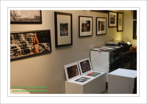
Then, the aspect ratio. No, no, no: your prints do not have to be 3:2 like they come out of the camera, or 8×10 because that’s the only frames you can find.  make your prints any aspect ratio that please you. Even square, or long and thin like the print on the left here, from a gallery exhibit I did last year in The Distillery District on Toronto:

Finally, then the frame. A photo, like a painting, generally looks much better framed. Be warned that framing is not cheap – but it’s worth it. A custom frame, with a custom-cut mat, means your print can be any size. You frame according to the print’s needs. As a result, you will have a unique work that reflects your taste, environment and needs.

Do have a look at some of the pictures I am currently selling in limited editions, all handprinted and individually autographed: www.michaelsmuse.com. Interested? I ship worldwide.


Light tip

A lighting tip: when shooting groups, keep the light simple. One light on the right, one on the left. Powerful,  if outside, and modified with softboxes or umbrellas. No hair lights etc. – that does not work with groups.

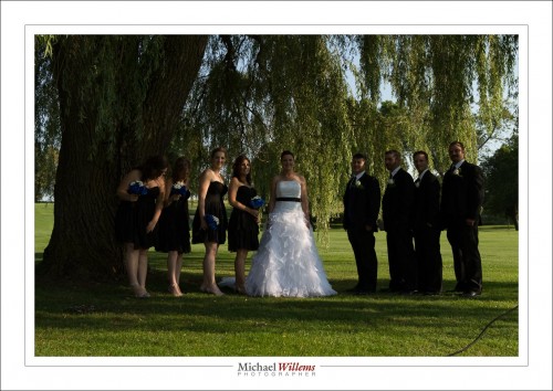
Take this:

Too dark, of course.

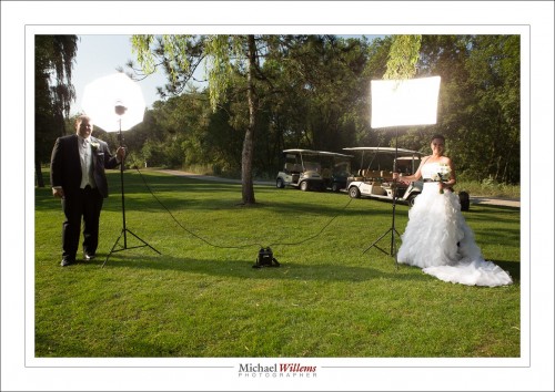
Lighting it up with the usual (‘higher ISO, lower f-number, slower shutter” would blow out the background. Me no like. So instead, I add lights. Two simple lights:

Powered, as you see, by a travel kit (lead-acid battery).

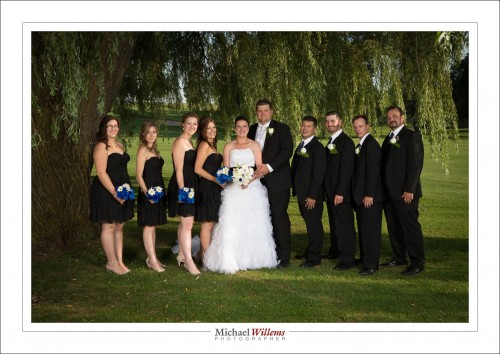
And that gives me this:

See: simple light can do a lot of good. Sure, if you have extra time and lights, add one behind the group, to give a little rim light, but that is a subtle little extra, and with large groups, not always practical.

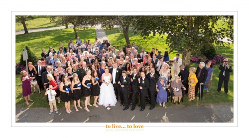
When the group is very large, ensure that everyone gets lit by the light and watch carefully for shadows: as soon as someone is in two shadows, they are dark.

Even large groups are possible this way: although I did have to lighten up the very back rows just a little, that was a minor adjustment.

Simple can be good.

___

Course starts tonight: 5-week fundamentals of photography course in Oakville. 416-875-8770


How much is allowed?

How much “editing” do we do as photographers? I don’t mean just editing some supermodel’s images, but I mean real people.

I do not call it “editing”. I call it “finishing”. Because I am on the side of “not much”: I hate making someone into something they are not. At the same time, however:

  • Temporary blemishes can be fixed, as far as I am concerned. They will not be there tomorrow anyway.
  • Anything I can do with light, I can do with Lightroom, I feel.
  • Anything a make-up artist can do with make-up, I can do with Lightroom, I feel.

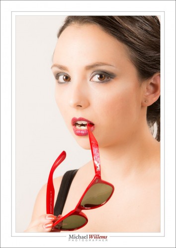
In the following portrait of the other night, of the lovely Liz Medori, I did little except:

  1. Adjust exposure – because my light meter and camera disagree with Lightroom.
  2. Adjust white balance.
  3. Crop.
  4. Remove stray hairs.
  5. Fix temporary blemishes.
  6. I also adjusted Lightroom’s “clarity” a little, however. This is akin to choosing a different, less contrasty film.

That led to this:

What I will not willingly do is change shapes (remove fat), move things (like noses) and change sizes of things (like noses and breasts). I think people look just fine the way they are, and I feel uncomfortable contributing to the fiction that the world’s actresses and models are perfect, while you and I and all other real people are not.

What do you think? When so much of the market demands changes, should we make them?


Two landscape tips

First, this: Have you considered learning photography from a world class pro? If you live in the GTA: the all- evening Flash course on 3 Oct, and the 5-evening fundamentals of photography course with a weekly evening lesson starting  2 Oct. both have open places still, but you need to book soon. Like now.

Now, on to today’s second post: two landscape tips.

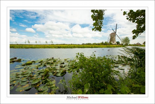
First Tip: Make sure you have sufficient depth of field. You do this by ensuring that you use: (a) a wide lens, (b) a small aperture, and (c) a focus point one third into the desired depth of field sharp area. That ensures it’s all sharp where you want it to be – and in landscapes, you want it to all be sharp.

Second Tip: include a foreground object of interest. That makes the picture, well, more interesting, but it also provides perspective, depth. And thus, a sense of reality. Like in this scene of Haastrecht, the Netherlands:


Go practice those next time you shoot any landscape scene. Enjoy!


Repeat post

A repeat, for once, of a post of almost four years ago, today. Here’s a young me in Nineveh, in what today is northern Iraq:

And the spiral minaret in Samara, which was very scary to climb:

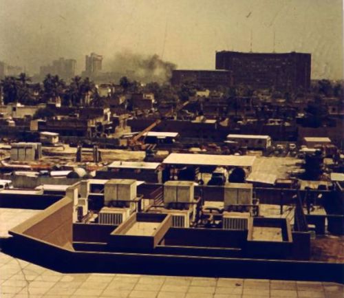
And a shot I took in Baghdad, after a ministry suffered an explosion (= was bombed, one presumes):

That picture, taken from my room at the al-Mansour Melia hotel, got me interrogated by security… but they were kind enough afterward to actually give me back my developed slide film. I must be the only person to have had their film developed by Saddam’s security men.

The moral of this post: images do not always have to be technically great. Those are scans of faded old prints, made in turn from slide film. And yet, as documents, they are important to me, and irreplaceable. Sometimes having the image is all that counts.


A little something, Nikon users.

I cannot escape it any .longer: I need to point out something to Nikon camera users.

When you adjust things like exposure compensation and flash compensation on a Nikon, you normally get adjustments of one third of a stop. So you would get

  • 1/3 stop
  • 2/3 stop
  • 1 stop
  • 1 1/3 stop
  • 1 2/3 stop
  • 2 stops

…and so on.

But on Nikons, this is shown not as fractions (“1/3”) but as decimals (which would be “0.3333”, but is expressed as “0.3”. So we get

  • 0.3
  • 0.7
  • 1
  • 1.3
  • 1.7

..etc. And the number of new Nikon users who get this wrong is incredible. I so often hear ” I cannot go to one stop, I can only go to 3 or 7 stops”

An easy mistake to make, if you overlook that “0.” preceding it.  But now you have been warned.


Photographers: 16 web mistakes to avoid

Those of you who want to make a living as photographers, I have some advice.

Apart from the obvious “Don’t!” or its opposite “Follow your dreams!”, I am going to give you some very simple practical advice. About your web site.

This is prompted by me addressing interior decorators and home stagers in my town, and in doing so, seeing their web presence. And it is very clear to me which ones I would never hire. Ever. In 100 years.

A common but fatal web site mistake...

And that is the ones that:

  1. Have an overall amateurish web site. A starting page with just a “Click to enter site…” button is dumb. Seven fonts on one page is dumb. Spelling mistakes on a web site are dumb.
  2. Have a Flash web site, i.e. one that you cannot copy/paste from. That is not searchable by Google. That takes time to load.
  3. Have a web site like “www.wonderfulphotos.com” but that then have an email address like “jenny.wonderfulphotos@hotmail.com”. Come on… get an address at your own site already!
  4. Have a bad snapshot portrait. Whoosh, there goes the illusion of professionalism.
  5. Use bad photography in general. Your front page had better have a perfect photo.
  6. Have no email address that you can copy/paste (i.e. it is a picture).
  7. Have no email address at all, but a “contact” page. You should not inconvenience your potential clients for your benefit. They will not have a record of what they asked you; they need to do extra work; and it shows that you do not respect them.
  8. Even worse, have a contact page form submission that does not work – that is a totally deadly sin.
  9. Have only an “info@” email address. As a photographer, you probably want to be known by name, yes?
  10. A domain web site. “My site is www.blogspot.ca/jennysinteriors”. That sort of thing.
  11. have other pages that do not work. A contact page that gives you a 404 error – “page not found”. Yes, I have seen that several times in the last few hours.
  12. Have an anonymous site that has your photo. but not your name, only a company name. What, you’re afraid of your clients finding out who you are?
  13. Music. Puh-leeze… need I say more, as I am suddenly startled by whatever you think is cool blasting out of my speakers?
  14. Having NO web site, just a phone number. God help me, there are people like that out there trying to build businesses. Trying being the key word.
  15. Having your web site die. Ouch.
  16. That use amateurs to design their site, to save money. Many, many of these mistakes are due to such amateurs. Just like in photography, it pays to hire a pro.

Expired five days ago, and no-one noticed?

And there’s more – I am stopping here, at 16 mistakes, because it is depressing enough. I need to see no more. And these are basic mistakes. I have not talked about the marketing. Marketing is tough. But the stuff in my list above is dead simple.

Dead, which is exactly what your business will be if you make those mistakes. Just saying.


Kill Spill!

No – not “Kill Bill”… “kill spill”.

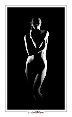
What I mean is this: if you want to shoot pictures with dark backgrounds, the essential trick it to keep light from lighting up the background.

I mean shots like this, that depend on not lighting things that you do not want lit (strategic bits, as well as the background):

A shot like that is easy if you do five things:

  1. Set your camera up so that the available light does nothing. I.e. set your camera to manual exposure mode and the “studio setting”: start, say, at 1/125th second, 100 ISO, f/8. Try a test shot: it should be all black. If it is, good, proceed.
  2. Use a flash, but avoid flash light spilling onto the background. You do that by using flash modifiers such as snoots, grids, or gobos.
  3. Move the flash close to the subject if possible. The Inverse Square law makes sure the background receives little light.
  4. Move the subject away from the background; as far away as possible.
  5. Try to use a dark background.

That’s how you Kill Spill!

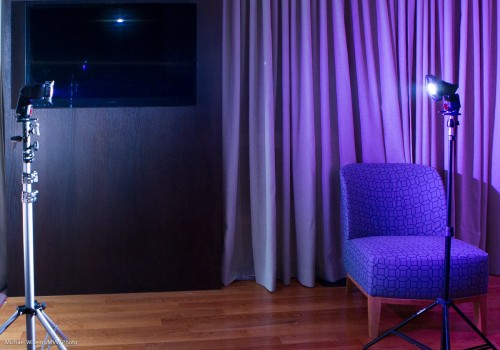
So in this case, the setup was:

Both flashes have a grid – this is essential, or the shot simple will not work.  I used Honl Photo 1/4″ grids. The distance of the model to the background is not great, but the background is black, so things will work out.

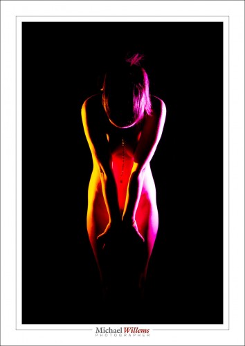
The flashes also have gels, because I wanted colour. But: a free tip here: when using multiple flashes, also use gels to analyse what light is spilling where!

And I wanted colour, so I get:

You see, as Antoine De Saint-Exupery said: perfection is achieved not when we have nothing left to add, but when we have nothing left to take away.

___

End Notes:


Anatomy of a portrait

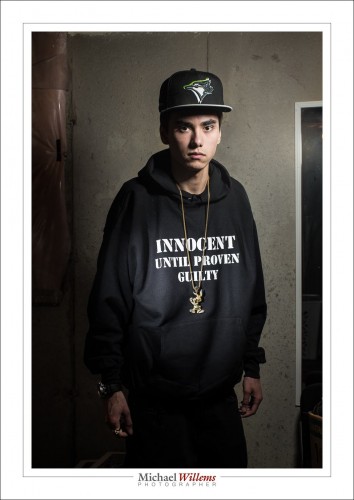
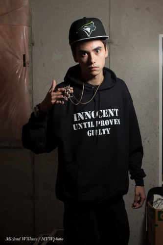
My younger son, who is a rapper, told me tonight, on his birthday, that he needed  a new portrait for publicity for his new album. So I obliged, before cooking dinner and while simultaneously doing laundry. Here he is:

That image took maybe twenty minutes, half an hour tops – but a lot of experience and thinking and equipment goes into a portrait like that.

First, what is required? We discussed, and he clearly wanted a serious, dramatic, look. In a grungy setting. The T-shirt text and the bling should be clearly legible and visible, respectively.  So OK – the briefing being clear, I used the basement studio, and freed just enough space to do a half body portrait.

Then the light. Speed was of the essence: I was about to make dinner. So I used speedlights. First, I set up a light stand with a 430EX flash set to manual, 1/4 power, and driven by a pocketwizard. I equipped it with a Honl photo 8″ softbox. I feathered the softbox to get the right amount of drama in the light, and to get Loop Lighting, almost Rembrandt Lighting, on his face.

The camera was a 1Dx with a 50mm f/1.2 lens, set to 1/125th sec, f/11, 100 ISO. I knew the 50 was perfect for a half body portrait in a small space.

I tried, and the photos were OK:

Not too bad, but we wanted a little more emphasis on the writing. And more texture of the shirt. And clearly visible bling. So I added a second speedlight, this time with a 1/8″ grid, for a tight line of light, and aimed that at the shirt. Also equipped with a pocketwizard, and set to lower power (1/16th). Not having had time to prepare, I took my time finding things like cables and a bracket that fit the flash – all part of the fun.

I set the lights to the camera’s desired settings of, if you recall, 1/125th sec, 100 ISO, f/11. I used a light meter to verify that.

And there you have it. A few pictures – I took a total of 30, and we chose his preferred one, the one at the top. I could have done the light thing, the vignetting, in post, but call me crazy: I call that cheating if I could have done it in camera.

As a result, almost nothing needed to be done in post, but that still takes time: selecting, removing the odd bit of dust, any perspective correction, and so on.

Total time taken, as said, less than half an hour including getting things ready, setting up lights, moving stuff, and the entire discussion and post work. But that’s only because I have done this before. Experience is important. The good news: you can gain experience too and it costs very little.


___

If you want to learn, and you live near Oakville, Ontario: evening Flash course on 3 Oct, and 5-evening course with a weekly evening lesson starting  2 Oct. – both these small courses have open places still.