Show your work!

As readers here know, I am a big proponent of printing your work: a photo isn’t a photo until it is printed and framed and hung on your wall.

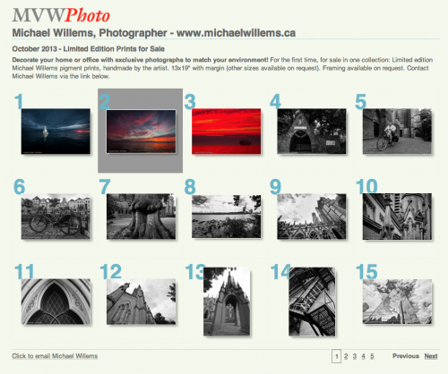
That said, web shares can make sense too. Like this one here, which I made in minutes using Lightroom:

The URL is http://www.mvwphoto.com/PrintSale/

So how do you do this in Lightroom?

The Lightroom part is easy. There are several ways, but here’s how I recommend you do it:

  1. Make a collection of your intended photos.
  2. Sort them into the order you like (that’s one reason you use a collection: you can sort in collections, but not in folders).
  3. Go to the WEB module.
  4. Select a starting layout on the left side.
  5. Now tune that to your liking with the fields on the right side – they are pretty self-explanatory. Just see what each one does.
  6. When done, EXPORT your site. I expert to my desktop, and I call it something meaningful, say “PrintSale”.

Now the more difficult bit. You need:

  • A web site you manage.
  • FTP access to that site (you need a username, and a password, and the ability to upload stuff to your site using that username and password).
  • The ability to create directories in your site, which then will become added to the URL.
  • An FTP client, such as Cyberduck. Which is free.

Ask your provider about this, quoting the stuff above, or direct them to this post.

I manage all my sites on 1and1.com, but there are many other excellent providers too.

So now you upload your new pages:

  1. I start my FTP client (Cyberduck)
  2. I log into my site using its URL and the FTP username and password.
  3. I navigate, if needed, to my site’s root (basic) directory.
  4. I now drop the afore-made folder (e.g. “PrintSale”) from my desktop onto the site.

And I am done! My site is http://www.mvwphoto.com, and when I upload the folder I just made, called “PrintSale”, I can now navigate to http://www.mvwphoto.com/PrintSale/!

This is one if Lightroom’s very cool features, so I recommend you get to know it. Or you upload to Flickr or Facebook, more about which in a future post – but then you get less control.

Two more notes:

Yes, I am doing a special print sale: Back to prints! Follow the URL and contact me if you want one of my works. Details and pricing also on www.michaelsmuse.com, but note, I have special pricing in the period leading up to Christmas.

I teach Lightroom in private coaching sessions, to beginners as well as to pro photographers. In a few hours you learn all you need to kickstart your productivity.

 

A few snaps

Today, just a few old images. Why? Because I am printing, for an art council awards ceremony on October 10, where I will be selling some of them.

But since this is an educational blog, let me add at least a couple of words of explanation to the shots.

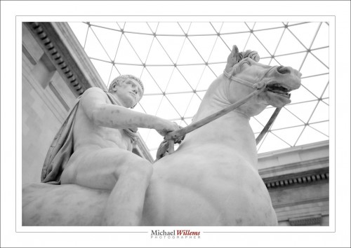
Julius Caesar (not “Ceasar”!) at the British Museum in London:

I got close and aimed up in order to get rid of distractions.

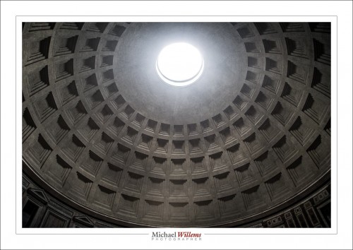
That takes us to Rome and the Pantheon:

I laid down on the floor to get the shot. I do not care what I look like.

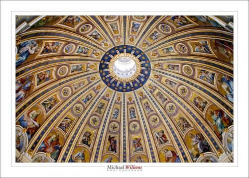
And since we are under Rome’s domes… to the next one:

St Peter’s Basilica’s dome. High ISO, since no flash is allowed, of course. And best shot from the gallery half way up the dome. A lineup, but worth it.

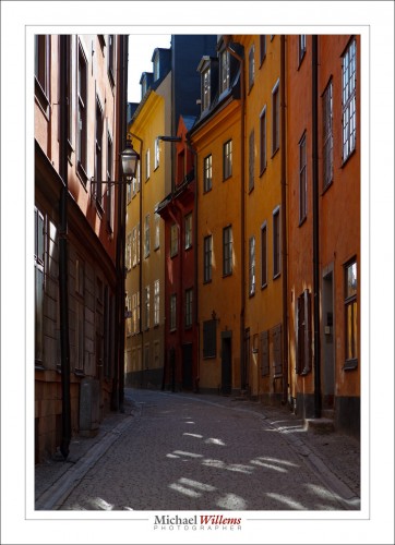
Off to Sweden: Stockholm; old Stockholm to be precise (“Gamla Stan”):

The thing here is to balance light in the dark street with the sky and reflected skylight. perhaps bracket. And to wait for the street to be empty.
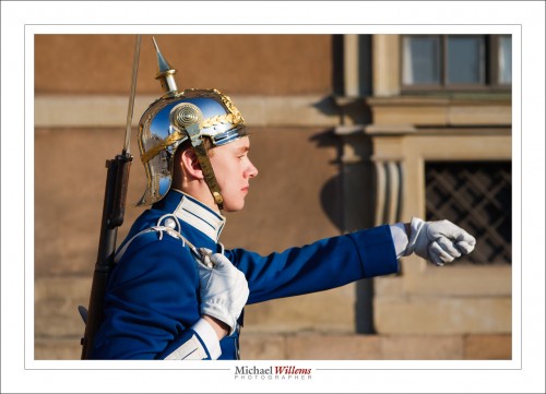
Not empty: the royal palace and its guards.

Here, the trick was to get close enough to crop out other tourists, cars, etc, and yet not to be bayonetted. And – to get the right light (onto his face, with the sky in his helmet).

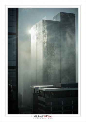
ZAP! We are in Melbourne, Australia, and the backlit morning fog is dancing around the city’s tall buildings. All I had to do is avoid flare (remove any filters, beware of window reflections) and expose accurately.
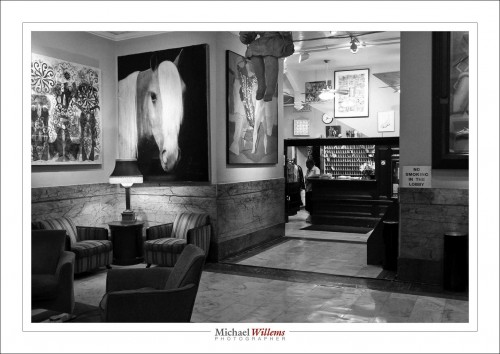
Not -zap – we are in New York, at the Chelsea Hotel:

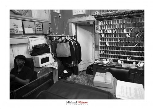
That calls out for B/W, as does the reception desk:

Nothing to do except high ISO, snap, and leave before being challenged. Either that or just ask for permission.
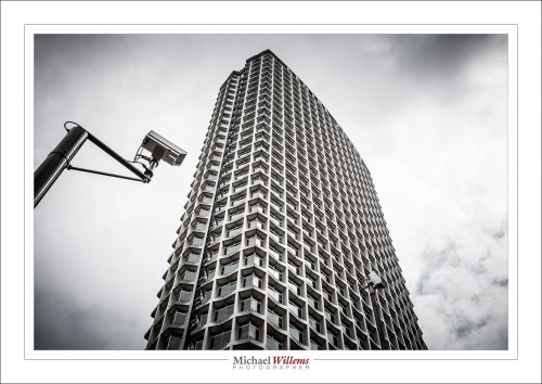
And one final ZAP – back to London, where Big Brother watches:

And to leave just as the cameras swing towards you (yes, they do – eerie).

That was a quick world tour, wasn’t it? And that is what photography does: take you to different worlds. Take you back there long after you were there. Time travel. If I can perhaps paraphrase Mad Men’s Don Draper:

Your camera isn’t a camera, it’s a time machine. It goes backwards, forwards. It takes us to a place where we ache to go again.

Word.


A specialty lens worth playing with

A repeat for those new to this blog: one of the coolest lenses you can try is the tilt-shift lens. It basically turns your camera into a view camera, where the lens element can tilt and shift with respect to the film, or in our case, sensor.

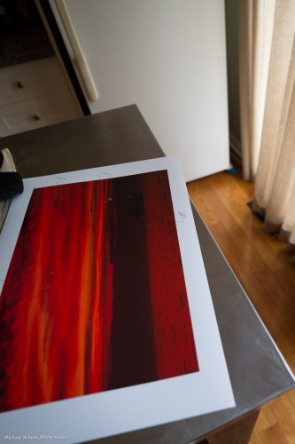
This picture, at f/3.5, shows only the back of the print in focus:

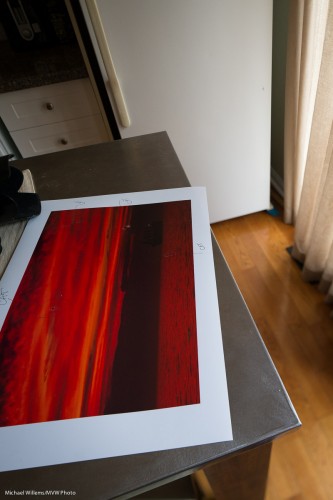
To get the entire picture into focus I guess I could stop down the lens, or move back. But with a tilt-shift I can avoid this: I can just tilt (=angle) the lens down, and I get:

Now the front of the print is sharp, but so are the drawers and fridge in the background; while the curtain is still blurred. I tilted the focal plane to where I wanted it; not just perpendicular to the lens direction (and parallel to the sensor).

Shifting (up-down) allows me to correct for perspective. When I shoot this, aiming the camera up, I get things converging at the top:

Keep the camera parallel to the ground, and shift the lens up, and I get this, straight out of camera, no Lightrooming needed):

(Those were done with the Canon 24mm TS-E f/3.5L lens I have for a few days from GTAlensrentals.com. I own the 45mm TS-E f/2.8 lens, but the wider one is nice for architecture).

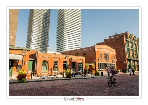
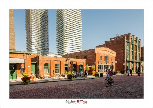
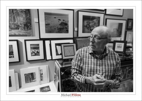
Of course you need to expose manually and focus manually with a tilt-shift lens. But that is easy, and a small price to pay, so I have a tilt-shift on my camera rather often. Like the other day in Toronto’s historic Distillery District, above. Here’s Gregory Talas, owner of The Kodiak Gallery in The Distillery, which held several of my exhibits, and still has a few of my pieces on display.

There’s a lot of specialty lenses, like Macro lenses, fish-eyes, and so on, but the tilt-shift is a special specialty lens worth playing with, especially if you have never operated a tilt-shift camera.


B&W is alive and well

When you look in art galleries, what do you see? Black and white prints. Although this is sometimes silly – in the 1970s, colour started to be seen as art too, so let’s get with the times – sometimes it’s a good thing.

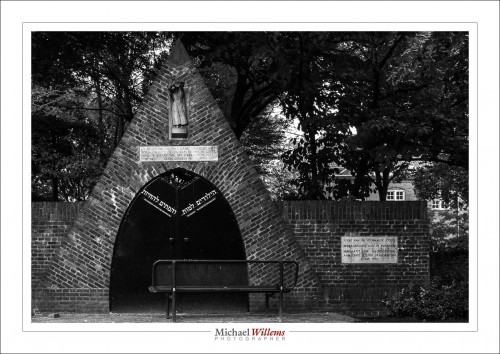
Here’s the rebuilt gate to the Jewish cemetery in Gouda, the Netherlands. The city I went to high school in.

This gate was rebuilt in 1980, long after the Jewish cemetery itself was moved – since no Jews lived in Gouda anymore after the war. One terrible example:  Friday, April 9, 1943, the Jewish retirement home in Gouda was raided by the SS, assisted by Dutch police from The Hague and Gouda. All residents were deported; none ever returned. The Dutch have always “respected authority” – order is order.  Awful, and there’s a lot to make up for. Fortunately, many Dutch families sheltered and hid Jews at severe risk to their own lives.

Incidentally, I believe I am wanted in The Netherlands, for not paying a speeding ticket from last year (they time you on the freeways and then do the math and send you the fine, no trial, no argument. Over my dead body would I ever live there again!). Problem is, they send the ticket to you even in Canada without a payment method, unless you are Dutch and in Holland. No credit cards, no cheques. So of course I did not pay. So I shall be arrested next time I enter that country. All because I drove like 5km/h (3 mph) over the limit on a freeway. Blind and inflexible adherence to “law”. Have they learned nothing since the 1940s? The Nuremberg laws were “law”, too.

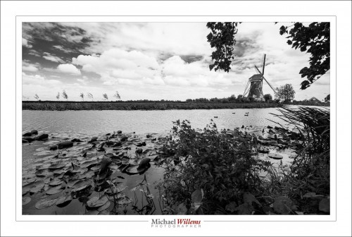
Just outside Gouda, this is what things looked like then, and it is what things still look like today:

You see those trees? That’s what I remember, riding my bicycle westward to school every day, fighting that damn wind.

Black and white pictures are a great way to convey such moods.

Here’s how you do this:

  1. Shoot RAW – this is essential
  2. Set your Picture Style to B/W. (“Monochrome”)
  3. Your previews are now B/W – but the pictures are still in colour.
  4. Now use the B&W tab in the HSL section of the DEVELOP module to convert. That way you can tweak the relative strengths of all the colours. Like adding colour filters in the old film days.

    An added benefit: you can change your mind and so colour if you choose. This only works, of course, if you shoot RAW.

    Try to shoot some B/W. It’s cool.

    ___

    Admin news:

    • Courses still open: Flash (Oct 3, all evening) and the 5-evening fundamentals course (weekly, starting Oct 2). These are in Oakville, and small – max. 6 students, and I will run them with as few as two. So, book soon.
    • I have the 24mm T/S f/3.5 tilt-shift lens for a few days, from GTA Lens rentals. But better still: I have arranged a 10% discount for my readers, from the already low prices. Click on the logo on the right. Renting a lens is a great way to try out a lens you’ve always wanted.


    Why use Lightroom?

    Why do most photographers use Lightroom now, instead of, say, Photoshop?

    I think this is for several reasons. One: we are photographers. Photoshop is excellent for illustrators who spend all day on one image, we spend time shooting and getting it right in camera, broadly, and then having to deal with many images. This is one area in which Lightroom shines.

    Second: LR is easy to learn.

    Third: LR works the way you work. Not the other way around. Your files can be wherever you like. And so on.

    Fourth: did I mention its speed when you are dealing with many images?

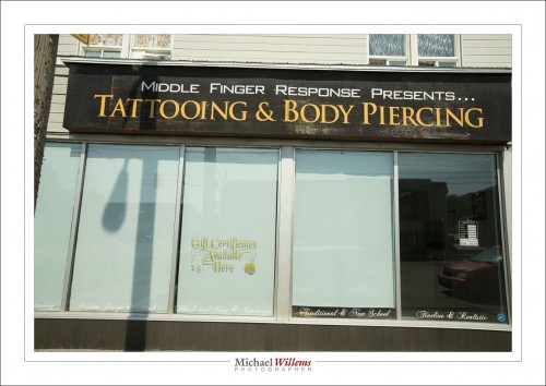
    Look at this example of an image:

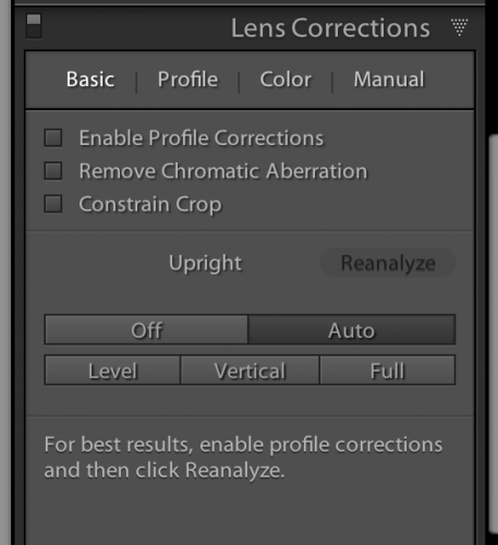
    Needs perspective correction. So.. a trip to DEVELOP module, and within that the LENS CORRECTION pane, and in that, click on AUTO:

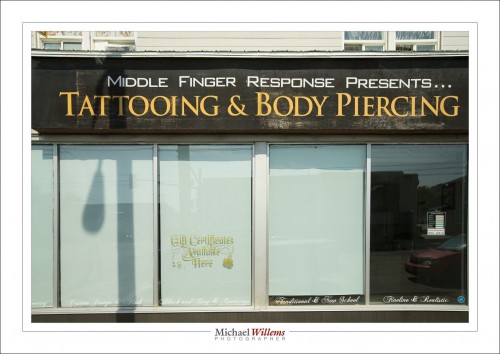
    That instantly gets me this:

    Wow.

    Of course it does not always work this well, this quickly, but even when manual intervention is needed, it’s still very, very quick.


    Lightroom 5.2 is out

    And it’s worth it. Lightoom is worth it in general but version 5.2 is worth it specifically. Why? Because it fixes some important bugs, some small issues, as well as introducing some new functionality that you will like.

    The healing tool is better: it has optional feathering now and it samples from within the cropped area.

    Full details on the adobe blog. But if you have Lightroom 5, go do the free upgrade now. These issues, bugs, and features are things that have actually affected me.

    The Telling Details

    Travel photo tip, today: often, it’s the little things that make the photo interesting. The telling details, as I like to call them. Not just the big things, the Eiffel Towers of the world.

    Can you spot what I mean here? What is the telling detail?

    Yes, the man.

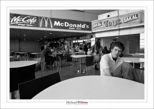
    And here, the Telling Detail is the Kosher McDonalds sign – because it was a Tel Aviv airport, a few years ago.

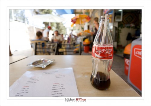
    And the telling details here are the Hebrew on the Coke, and the Middle-Eastern dishes on the menu:

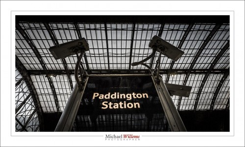
    And the “Big Brother is Watching You” dystopian cameras at Paddington station – a far cry from the cuddly bear in wellies:

    More travel info to come. And a tour: Wales, next year, 10 days with me teaching photography. Details soon, but keep the dates open: 20-30 June 2014. 8-12 students only, and a guide, and me teaching!


    Pro Print Precision!

    In my continuing series of posts for everyone – today, a post for pros, or amateurs who take printing seriously. Which you should: a photo is not a photo until you have printed it. And hung it on your wall, preferably.

    My advice today is this: print straight from Adobe Lightroom. This has many benefits over “just make a file and print that”:

    1. No intermediate file; no need to go down to the restrictive AdobeRGB or even more restrictive sRGB colour space file formats.
    2. No intermediate file also saves time, confusion, and disk space.
    3. Lightroom contains a very good print engine, with great print setting options.
    4. Set it up once, and it’s good forever.
    5. And most significantly in recent versions of Lightroom: soft proofing.

    Everyone who has printed seriously knows that each paper type is good for certain prints only. After you figure that out, you will use one type of paper for prints with a lot of black. Another type for very colourful prints. Another type for prints with a lot of shiny areas. Or a lot of reds. And so on.

    Lightroom to the rescue. This is not a full Lightroom course (for that, come to me privately and I will teach you). This note is for those of you who already know Lightroom and computers well.

    And for those people, in a nutshell, here’s what you do:

    1. SET UP PRINTING:

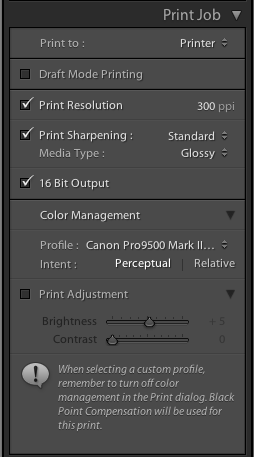
    Select your photo, and go to the PRINT module. There, over time you will create a print preset of your own or each combination of printer and paper type (and other preferences, such as layout, margins, etc). Update that whenever you make a change to your preset. That way you invent the wheel once.

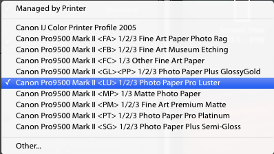
    In that profile, make sure under COLOR MANAGEMENT, you do NOT select “managed by printer”, but instead you select the printer paper profile for the printer/paper combination you are using (profiles which you have installed separately; from the printer or paper manufacturer).

    In my case, today, for a print that was Canon Pro Luster paper on my Canon 9500 Mark II pigment printer, so I selected that profile:

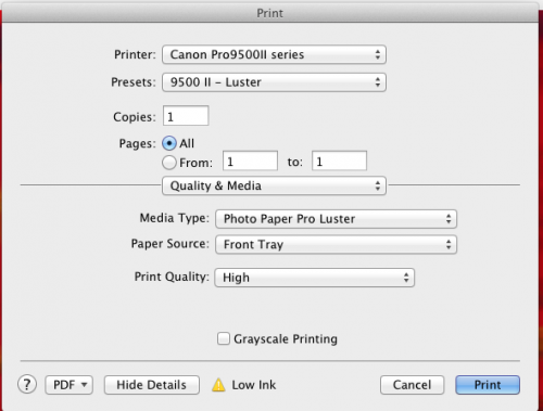
    Before you actually issue the print command, the computer’s PRINTER dialog will pop up. In that, be sure to select the same paper (under “Quality and Media”):

    OK, that is easy once you set it up, and prints will be reliable and predictable. And right.

    2. SOFT PROOFING:

    But here’s the fun part. In new Lightroom versions, there is an option called “soft proofing”. And that rocks.

    Look under your image. And activate the “soft proofing” option.

    You will be prompted to crate a soft proofing virtual copy; go ahead.

    And now you can see where the print does, or does not, reproduce well for your selected paper and printer type (or for your selected colour space, if creating a file)!

    See the top right, and select the correct profile for what you are printing to. In my case here, Pro Luster paper on the Canon 9500 MkII:

    Now, provided I have clicked the little paper mark top right of the graph ON, I see where this photo will not reproduce well on the paper selected.

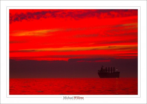
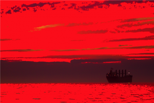
    For instance, take the print I was just creating. A lake Ontario sunset:

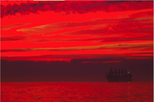
    Now, if instead of the printer profile I select “AdobeRGB”, I see the following in my soft proofing view:

    Ouch! All those pure red areas are where the colour is outside of what the selected profile can handle. I.e. they will not look good. So I do not even attempt to print this print the way it is via an AdobeRGB file (yes, now you see how bad AdobeRGB is compared to using a good printer’s entire gamut).

    if I select my paper type instead, I see:

    There is still a little pure red stuff going on at the top, but much, much less. (If your print is red itself, like mine here, simply turn the “problem view” on and off repeatedly to see where the problems are.)

    So now I can tweak my image in the DEVELOP module until this last bit of warning goes away. I can use HSL to reduce saturation or hue or luminance of the colour in question, or I can change overall saturation, or I can decrease exposure: I have all the options open. And my print will be good. And I do not have to make four test prints to finally find the paper that works well!

    The Soft Proofing function is amazing. One more reason to live in Adobe Lightroom, if you are not yet!


    ____

    Want to learn? I have scheduled a special all-evening Flash course in Oakville, Ontario on 3 Oct; as well as a five-evening basic photography course, starting Oct 2, aimed at novice to intermediate users who want to learn to use their DSLR properly once and for all.

    These courses are very special in that they are like private coaching: I will only take up to 6 students for each course. The Flash course includes the Pro Flash Manual, and the five-evening course includes course materials and homework. Both are now available for signing up on www.cameratraining.ca/ – see the flash course details on this page.


    Another basics tip

    As you know, this blog is for photography pros, but also for beginners. There’s something for everyone, and in that context, today another fundamentals tip. Namely: focus accurately, using only one focus area/focus spot.

    I can’t tell you how important it is to focus accurately. The camera has no brain. It cannot decide at what distance to make the image sharpest. Only you can.

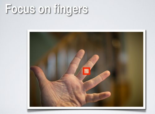
    Go to Program Mode (“P”), or Aperture Mode (“A”), Shutter Mode (“S”/”Tv”), or Manual Mode (“M”). Now set your camera to one focus point.

    Aim that at what should be sharp, and take the picture.

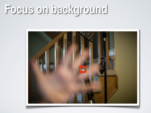
    So you can now aim that single focus point at anything, including background items. Then, they will be sharp:

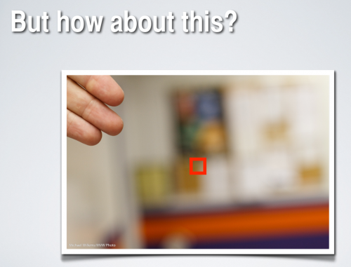
    But what if the subject is not in the centre, or where there is a focus point?

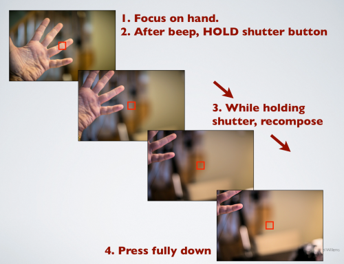
    Then you do this: “focus – recompose – shoot”:

    So the secret is to hold the focus while you recompose. Holding the focus means holding your finger on the shutter half way, without either letting go or pressing fully down.

    While recomposing, you can swing your camera left, right, up, or down, but obviously not forward or backward, because the “beep” after you focus means you have set a specific focus distance.

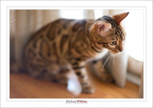
    And that is especially important when shooting with a prime lens “wide open”, i.e. at a large aperture (a low “f-number”). Like here, in this picture of Mau the Bengal cat:

    More pictures are lost due to inaccurate focus than to anything else. And it is surprisingly easy to do it right. So… do it right!


    50

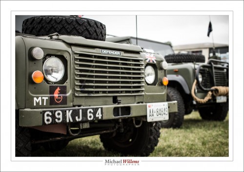
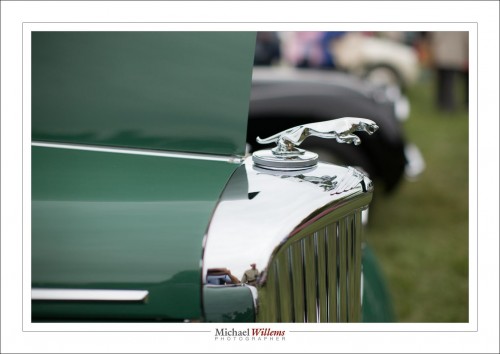
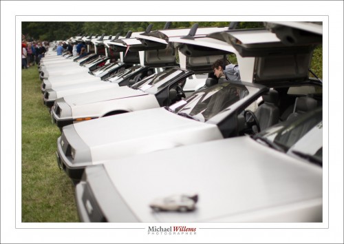
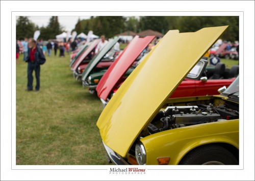
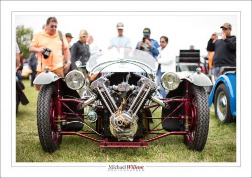
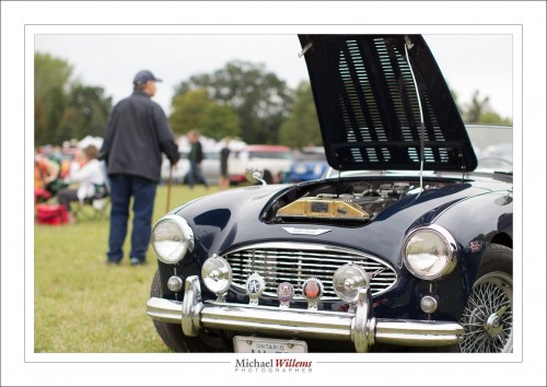
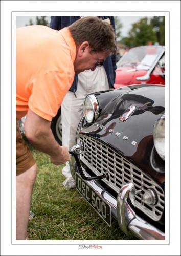
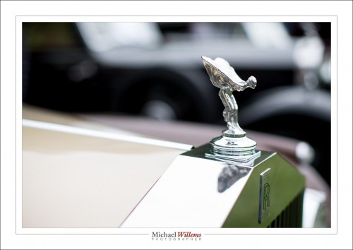
    Today, I took photos at the Classic British Car show in Burlington, Ontario. And apart form a few aerial shots, I used only my 50mm lens (that is, a 50mm on my full-frame camera; i.e. if you have a crop sensor camera, you would use a 35mm lens to get the same view).

    So, why a 50 (or 35)?

    • It imposes a certain discipline and consistency in the images. Sure, it is inconvenient to sometimes have to take a step back, but so be it. My images all have the same look and feel, which can be nice.
    • It is a nice “neither wide nor long” length. It used to be called a “normal” lens. Most of what I want to shoot, I can shoot with a 50, if it’s what I happen to have.
    • It is fast (1). It is an f/1.2 lens, meaning I get fast shutter speeds, if I want.
    • It is fast (2). It is an f/1.2 lens, meaning I get crazy blurry backgrounds, if I want.

    In practice, all that means that I can get perspective by getting close:

    And I can simplify, by getting closer:

    I can create diagonals, almost as if I am using a wide angle lens:

    And yet I can “get enough in”:

    I can even combine foreground and background (“old and old”, here):

    And I can get in close enough to show detail without showing other all the people crowding around:

    Um, and did I mention I like hood ornaments?

    I also save time by not having to decide zoom factor. So, primes rock, for me. But that does not mean I can do everything. A very wide “close-far” shot would be impossible. So I decide on a lens-  in this case the 50 – and take photos appropriate to that p[articular lens choice.

    And that is how that works, folks.