Rescue!

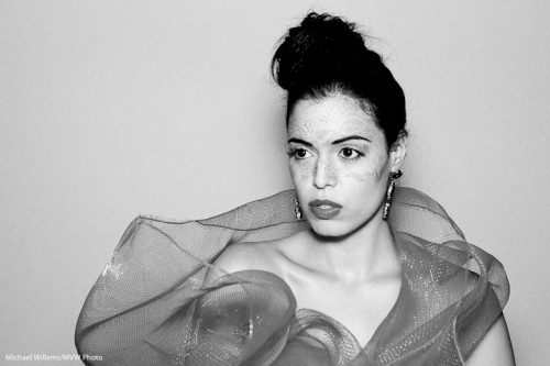
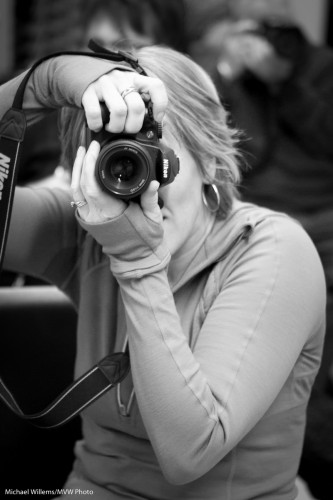
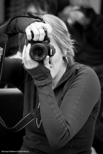
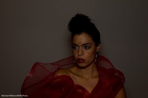
Black and White, as I mentioned yesterday, can also, as an additional benefit, come to the rescue when an image is not very good. Like in this image of Tara, where the flash failed to fire (my 580 EX II malfunctioned).

So since it is RAW, I can  convert to black and white, push it – wait for it – a full 3.5 stops (!), remove noise, crop, then add some film grain – and hey presto, a usable image:

So when you have a not-very-good image, try to convert to black and white, and see what you get.

Chances are, a very usable image.

The lesson: do not throw away “bad images. Shoot RAW. And convert to B&W when all else fails.

Black and white

Black and white is often under-appreciated. You are taking stuff away, after all.

Yes. Colour. Of course. But you are also adding stuff.

Model Lyndsay in Mono (Photo: Michael Willems)

Lyndsay in Mono

As advantages of a black and white image, you get:

  • Shades of grey. Everything becomes shades of grey. So while in a colour image you may have various little groups of shade, in a colour image, all becomes grey. So you automatically get shades all the way from black to white, if you like.
  • Emphasis on texture. Textures, which can be lost in colour photos, are seen clearly in black and white.
  • Emphasis on shape. The same is true of shape. You are not drawn to colour, so now the pure shape is what draws you attention.
  • Emphasis on light. In the absence of colour, it is all light. You can light dramatically, softly: Light is seen clearly, not as colour, but as light.
  • Ability to tweak. You can tweak colours in post (or when using film, by using filters. Like in the example that follows below.
  • Ability to create mood. You can add shade. Drama. Even grain, to create an old film look. I do this a lot nowadays.
  • Simplicity: it is also easier to shoot. No white balance to worry about.

So today, let me show you just one trick: the above-mentioned ability to selectively change colour.

An original image of a student the other day:

Student in colour

Student in colour

Now converted in Lightroom to “neutral” black and white:

Student in B/W (Neutral)

Now, I used the HSL/Color/B&W tool in the Develop module to selectively increase the brightness of her shirt:

Student in B/W (Light shirt)

But of course I want to de-emphasise the shirt, so her face stands out! Here’s the version I prefer, with a darker shirt:

Student in B/W (dark shirt)

Can you see how much more this emphasises the student, while in the original image, the colours stand out instead?

Here is one more example of how colour can distract, and how in the black and white version that distrction disappears.

So: I recommend you try some black and white. (And do it in “post”, not in the camera. Otherwise you lose the ability to tweak. You can set your camera to B/W as long as you shoot RAW, so you retain all the information).

Add a splash

Further to Thursday’s post, I thought I would brighten your day with some more colour.

You see, sometimes you need to shoot things that are a bit, well, drab. Like this wall – the screen is great but the wall is a bit dull:

Wall with screen

So then, as you also saw two days ago,  I shot it again, this time with two speedlites:

Wall with screen with gels

How was this rainbow effect achieved?

  • These two 430EX flashes were fired with TTL using a 580EX on my 1D MkIII.
  • They were aimed at the wall, one above the other, aimed in the same direction (good idea from my assistant).
  • They were fitted with Honl speedstraps and with a Honl gel each: red for the bottom flash, green for the top one. No other modifiers: other than the gels, they were bare.
  • The ratio between red and green was set on the back of the 580EX until I was happy.

That was simple, and I think you will agree it’s a better shot.

Home Studio Needs

A reader’s spouse just asked me:

My spouse had a few photography lessons with you and I am considering getting him some equipment to begin setting up a basic photography studio in our home.  Since it’s a Christmas gift, I didn’t want to ask him or her directly what he or she would need and was hoping you could give me some advice regarding the brands and equipment he or she  would need.

Sure, I would be delighted to help. Here’s what I think you need for a home studio.

Always:

  1. A camera, of course.
  2. A suitable lens (maybe a 24-70, or a prime 50mm lens. For available light it needs to be a fast lens, like an f/1.8; for studio, the speed does not matter. For a big studio, get a 70-200 – but at home you are unlikely to have enough space).
  3. Some kind of background. For simple portraits, this can be a white wall. Or an air mattress blown up as a nice patterned background. Or anything else improvised.

Then, if you want a proper background:

  1. A stand kit – these are very affordable at Henry’s: they consist of two stands and  three crossbars. all in one case. Mine is a Cameron kit and I recall I paid somewhere between $100 and $200 for it.
  2. A roll of paper to roll down from the stand kit (I like grey, since you can make it any colour you like). Wider is better but you need space, plus the ability to transport it home, so you may want to choose narrow.
  3. Alternately, you can use a curtain (or two), hung down from a curtain-rod you attach to the wall just below the ceiling.

For available light portraits:

  1. That 50mm prime lens I mentioned. Or a 24 or 35mm prime lens. Now the lens needs to be fast (have a low F-number, like 2.8 or lower).
  2. A reflector (it can be one of those that folds up when not in use).
  3. A stand for the reflector, so you do not have to hold it.
  4. A window that faces away from the sun (e.g. a north-facing window).

For studio portraits:

  1. A backdrop, again, as above.
  2. A main light. Like a Bowens light (avoid Opus, but pretty much all others are great. For a home studio 200 Ws may be enough, though normally I would try to go with 400 Ws just in case.).
  3. These lights come with stands, usually. If not, you need to add a stand.
  4. A reflector, as above.
  5. A way to connect a flash cable to your camera. The light should come with a cable, and if the camera has a PC-type flash connector output, you are set. If not, a small converter from hotshot to flash connector is all you need to add.

That is the minimum. But to do it well, you may want some of the following added:

  1. Preferably, a second light.  Fortunately, many lights come in kits of two, like the excellent Bowens Gemini kits.
  2. A light meter (this needs to be a flash-meter).
  3. Two Pocketwizards to fire a flash (any other flashes can be slave-cell followers).
  4. One or two additional lights. These can even be speedlights, as long as you can fire them. Four lioghts is ideal, but not necessary of course.
  5. Modifiers – like grids, snoots and gels. If you use speedlites (small flashes) you can keep this simple: use the  Honl Photo range of small flash modifiers. That’s what I do.
  6. A tripod.

Here are two previous posts that may be helpful:

Does this help at all? I bet many of you, with Christmas just a month away, will be thinking similar thoughts.

Doing the impossible

Often, as a photographer I have to do the impossible.

That is, of course, an overstatement. But there is a core of truth in it: photography is problem-solving.

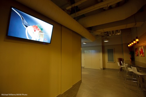
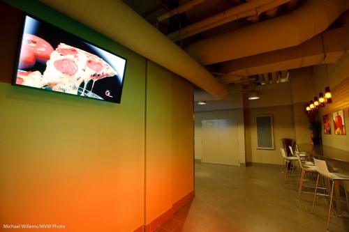
The other night I shot an excellent Digital Signage installation. Innovative screens, powered by EnQii software, in a self-service restaurant.

The problem is: the screens are bright and need to be seen. And the restaurant is dark compared to the screens. Expose for the screens and the restaurant is dark. Expose for the restaurant and the screens overexpose.

There are three potential solutions:

  1. Turn down the screens. Not an option here…
  2. Light the restaurant with flashes. Lot of work, and not practical in a working restaurant.
  3. Shoot RAW and bring bright and dark together in post-processing.

I used a combination of 2 and 3.

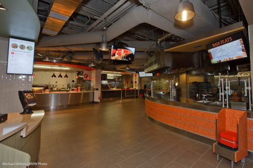
More 3 than 2 in this shot:

Digital Signage

Digital Signage

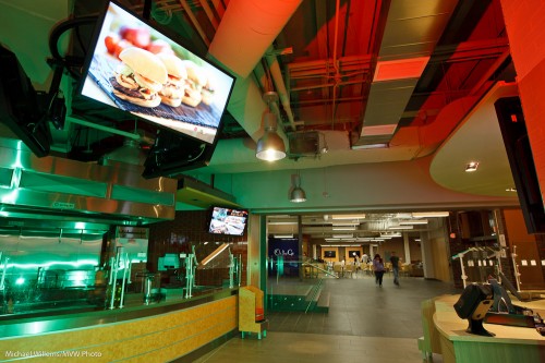
And more 2 than 3 in this shot – with coloured Honl gels on my speedlites:

Digital Signage and gels

Digital Signage and gels

As you see, an impossible-to-shoot scene is possible.

  1. Do a test shot or two, in some automatic mode. Ensure you shoot RAW.
  2. Ensure you use a tripod if necessary (and it will be).
  3. Now first, expose for the screens. Expose to the right, but do not lose detail. Use the histogram and the “blinkies” to gauge this.
  4. Use a tripod if necessary.
  5. Then add light if necessary.
  6. Then in post-production, use “recovery” to decrease brightness in the screens, and “shadows” to increase brightness in the darker areas.

Try it – it is really not all that difficult!

Repeat after me: Bright pixels are…

….sharp pixels!

When your subject is brighter than the background,

  • it stands out more.
  • it has more detail,
  • and above all, it has less noise.

Noise, like cockroaches and bedbugs, hides in the darkness.

I could give you engineering, math, signal-to-noise-ratios, and so on (yes, I am an engineer), but just take it from me.

And often, making your subject brighter is easy to do.

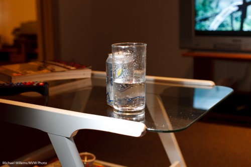
Here is a glass on a table, as you can see.

Glass, lit by general light

Now again, but this time with a TTL flash from out left, and no flash on the camera:

Glass, lit by side light

And as you see, the second one is more dramatic, the glass looks better.

Note that in the second image, I set ambient exposure to minus two stops. In other words, in manual mode, I adjusted ISO, aperture and shutter until the meter read -2. (Alternately I could have used program mode or aperture mode, and adjusted exposure compensation to -2 stops).

Why? Because I do not want the background to be totally dark.

My advice: try this yourself, right now. If it does not work, fiddle around until it does. Or ask me.

Elements of a picture

This, another photo from last Saturday’s Mono workshop, prompts me to write today’s post:
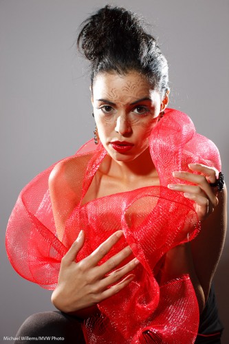
Tara Elizabeth

Tara Elizabeth in Mono, 20 November 2010

It prompts me to talk about how to make a photo like this. You see, a photo is not just one thing. It is a culmination of things all coming together.

First you need a subject. Yes, the subject is important. When all else is equal, your subject makes the image. After all, it is an image of something. Photographers are often enough all technique, to the extent that they forget about the subject. In this image, model Tara is looking great; her clothing is avant garde, her make-up, by Make-Up Artist Tea, is superb. Tara’s expression is just right.

Composition is also important, even in a simple portrait. Uncle Fred puts the subject (Tara’s eyes) in the middle. I use the rule of thirds; off-centre composition. Balance the image.

Next, you need technique and technology. I used a Canon 1Ds with a 50mm prime f/1.2 lens set to f/8 at 100 ISO and 1/125th second – pretty standard “studio” settings.  Pocket wizards were used to fire the flashes. A digital Rebel with a 50mm f/1.8 would have done the same here.

That brings me to the next factor: you need light. We used three speedlights. Two on the sides, with grids: edge lighting is always good. And one behind us, on our left, the fil-from-the-front light, down two stops, and fitted with a Honl Traveller 8 softbox. See that wonderful round catch light in her eyes? (yes, that is important.) The edge light also separates Tara’s arm, on our right, from the background.

Finally you need to simplify. A good photo is a simple photo. We used a simple white wall. I zoomed in enough to have nothing else in the picture. I used no background light or gels. Sometimes simple is better.

And there you have it, a photo worth using!

I encourage you to do the same kind of analysis on your own images. Always good to see what you are doing – it may remind you to think carefully about the image. And that will make it better. Promise.

High-key black and white

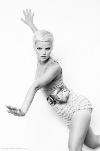
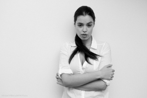
One of my favourite photo styles is this: high-key black and white, against a simple white background. This reduces the clutter to a minimum and starkly emphasizes the subject. Like in this image from the 20 November Mono, Ontario all-day workshop:

Tara, by Michael Willems

What I would say if I were to discuss this:

  • The image screams out “black and white”.
  • Clothes (white)  and wall (white) both disappear. I like the emphasis this gives the subject and the pose.
  • I like the 1970s feeling. I added a little grain to this image in Lightroom to emphasize that.
  • Slight, very slight, soft beautiful shadows are important.
  • Light is simple: one flash bounced behind me.
  • Of course you use exposure compensation and the histogram to check your exposure. But you knew that. Hit the right side (just).

Try a portrait like this! All you need is a white wall, a camera, an on-camera flash, and a model in white.

Opportunity for Ontarians

My speedlite (580XE II) malfunctioned Saturday. Shame but – oh well.Nothing lives forever.

Amazingly, I saw today, as I was buying a replacement, that the price was dropped for a special sale at Henrys from around $550 to around $350.For a few days only!

Those of you who need a Canon professional flash, go get a 580 EX II flash tomorrow. The sales ends tomorrow, so it’s your last day.

My flash could not have broken at a better time!

Michael