Simplifying and diagonals

In a photo:

  • Simplifying is good. Often very good.
  • Diagonals can also be very good.
  • The Rule of Thirds is also often very good.
  • Tilting the camera is a way to simplify.
  • Tilting is also a way to create diagonals.
  • And to help you get to the Rule of Thirds.

So it stands to reason that if you tilt and simplify a the same time, you may end up with some reasonable images.

A few examples from the other day – taken with the Fuji X100, which is still a great toy. As you learn more about it it gets better.

Because this camera has a fixed lens (35mm, full frame equivalent) you end up tilting instead of zooming in and out – and this makes your pictures better.

Here’s me, the other day – and look at the texture and converging diagonals:

Michael Willems (Photo: Melony McBride)

Here’s a salad, served with colour and texture – and with a blurred background that “tells a story by making the viewer put it all together”:

Salad (Photo: Michael Willems)

And a few more food and drink snaps:

Bruschetta (Photo: Michael Willems)

Cheers (Photo: Michael Willems)

Acqua Minerale (Photo: Michael Willems)

And a non-food snap: the best calculator series ever made (you do not need an “=” button!)

HP11C (Photo: Michael Willems)

Can you see a pattern emerge?

Here’s your homework. Go shoot some pictures:

  • With a 35mm lens length (real 35, i.e. use 24mm on a crop camera).
  • Tilt to simplify or to get diagonals or to be able to compose with the Rule of Thirds.
  • Shoot at wide open aperture (low “f-number”).
  • Get close.
  • Use high enough ISO to get non-blurry images.
  • Use available light.

And have fun!


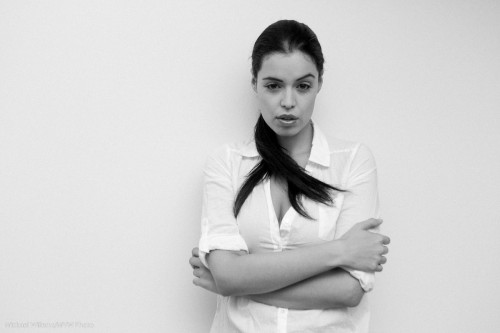
High-key black and white

One of my favourite photo styles is this: high-key black and white, against a simple white background. This reduces the clutter to a minimum and starkly emphasizes the subject. Like in this image from the 20 November Mono, Ontario all-day workshop:

Tara, by Michael Willems

What I would say if I were to discuss this:

  • The image screams out “black and white”.
  • Clothes (white)  and wall (white) both disappear. I like the emphasis this gives the subject and the pose.
  • I like the 1970s feeling. I added a little grain to this image in Lightroom to emphasize that.
  • Slight, very slight, soft beautiful shadows are important.
  • Light is simple: one flash bounced behind me.
  • Of course you use exposure compensation and the histogram to check your exposure. But you knew that. Hit the right side (just).

Try a portrait like this! All you need is a white wall, a camera, an on-camera flash, and a model in white.

Snapshot rules

Even when you take a simple snapshot, as a photographer you should think about how to do it. Almost subconsciously, I apply the same rules and the same thinking to a snapshot that I do to a photo I am paid for.

So I thought it might be worthwhile to discuss some of that thinking. In that context, here is a snapshot I took the other day of a friend:

Michael's friend Ninon, shot with a wide angle lens

Michael's friend Ninon, shot with a wide angle lens

In the second or two before I take that snap, what is some of my thinking, and what are some of the decisions I make?

  • Subject: What is this a photo of? (it is a happy snap, so “camera-aware” and a smile are just great). Check.
  • Light: Where is the light coming from? In this case it is from her front, indirect reflected light, i.e. nice flattering light. Check.
  • Lens choice: I want to use a wide angle lens here because this is a situational portrait, a city woman in her city. Wide angle lenses put a subject in context. I want a wide angle lens also because it creates those nice diagonals that converge on the subject, can you see them? Finally, I also want wide angle to show depth in the photo (a technique knows as “close-far”).
  • Depth of field: I want to draw attention to my subject by blurring the background, so I use Aperture mode (A/Av) with an aperture of f/2.8. Wide angle lenses are sharp all over, but by using a fast one (f/2.8) and by getting close I can still blur the background dramatically.
  • Composition: I am using the rule of thirds. “Uncle Fred” puts the subject in all his images smack bang in the middle: I use off-centre composition. In this case the centre of attention (her face) is one third from the right, one third from the top. And she is looking into the picture, not out of it.
  • Moment: you need to capture the right moment. I shot four times and by photo number four, her smile was best. Shoot a lot, even in a portrait. so you capture just the right moment. I also thought the right moment included the “suits” in the background. After all, King and Wellington, downtown Toronto, means suits out for (if not out to) lunch. So I was delighted to see them approach and took the four shots just as they passed behind her.

That is, in a nutshell, what I thought in the seconds leading up to this picture.

That is my thinking. Yours may have been different, and that is of course perfectly OK. There is not one good picture: there are 100 billion. The essence here is not what my conclusions were, but the fact that I was thinking at all, instead of just blindly snapping.

Light, moment and composition/subject, that is what makes up a picture. So think of those every time you take one, and your pictures will get better.

Fill the frame

Another “fill the frame”-shot here for your edification.

Shot while I was having dinner at a wedding – I was one of the two photographers but we were fed, at a very nice table in a good position. And even there I was shooting. Like the arrangement at the centre of the table.

MVW_0165

You can get good pictures anywhere you try. The closer you get, the easier it is. I used my 70-200mm lens for this. So whenever you think “what do I shoot now”, you can always pick some interesting item, zoom all the way in on it, and shoot.