Crop, or not?

There is a decision you need to make both when shooting and later, when cropping in “post”. Namely, how to crop.

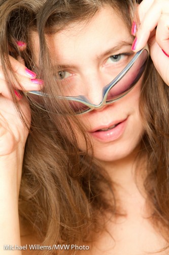
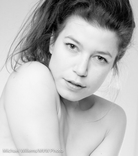
Perhaps you “fill the frame”: often  good technique to add quality to a picture. Yes, you can cut off heads, etc, as in this recent shot of my favourite model:

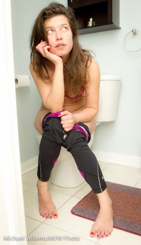
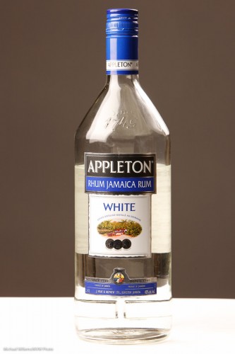
Or you frame carefully to both include the subject and to exclude the distractions that make an image look amateurish – this, you often do in post. In order to simplify, I cropped out some small distractions in the following set-up shot in post-production in Lightroom:

In both cases, keep one thing in mind: you may want to crop to particular aspect ratios. Like 5×7, or 8×10. In that case if you have shot too close, you cannot print at your selected ratio without losing essential elements.

That is why

  • I sometimes shoot a little wide, so I can crop later.
  • On the other hand, I am not bound to using the aspect rations the frame industry wants me to use.

Your choice – as long as you know what the consequences are!


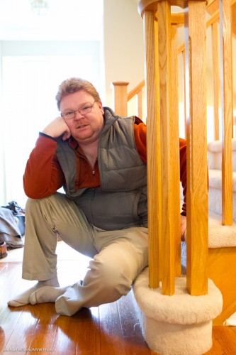
Self portrait

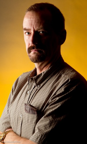
The other day I decided to do a quick self portrait. And instead of the normal “traditional” portrait, I did the following:

Moody, dark – I don’t smile much in pictures and life is serious! And as you see, lighting is all about what you do not light.

I made this picture as follows:

  1. I put up a grey backdrop.
  2. Using paper tape, I put a cross on the floor where I was going to be standing.
  3. I put a light stand there.
  4. Having put the camera on a tripod, I aimed at the light stand and focused on it; then set the focus to “manual”.
  5. I set the camera to self timer.
  6. I selected 1/125th second at f/11 (you want f/5.6 – f/11 for these shots normally).
  7. Using my light meter, I set my main light, which I fire with pocket wizards, to these values. That main light is a Bowens strobe with a softbox.
  8. I added a background light: a speedlight with a Honl Photo grid and a Honl Photo Egg Yolk Yellow gel. I set this to quarter power (experience). The speedlight was also fired via pocket wizard; if you have a Nikon speedlight you can use SU-4 mode (cell).
  9. I pressed the camera shutter button and took the exact place of the light stand. 10 seconds later: flash!

And that was that – simple once you know. Now you try!


Panta Rhei

Thought for today: Greek philosopher Anaximander said “Panta Rhei” – everything flows. The river constantly changes: we can never stand in the same river twice. We, too, are like that river. That is why we should be photographed – often, and well. If you are not having proper photos made of yourself and your loved ones, or if you are not doing it yourself: start today. Panta Rhei.


Not too shallow

I hear people say sometimes that “you cannot shoot portraits at wide open apertures”.

So then how this available light portrait, shot on a full frame camera with a 50mm lens at f/1.2 (yes, f/1.2!)?

Well yes, it is shallow, but not too shallow.  Because I have enough distance.

Remember: depth of field (“DOF”) is a function of three things: aperture, distance, and lens focal length. The closer I get, the lower my f-number, and the more I zoom in, the more I get shallow depth of field.

So  portrait like this, with the person small enough like this, gives me plenty of DOF. Of course I would not want to do a full headshot at these large apertures, but in this type of portrait the shallow DOF is not too shallow, and the super blurry background makes things better.

So  -get yourself an affordable 24- 35- or 50mm lens!


Fear not – use high ISO when needed

Here’s a snap of my friend and student Ray, taken Saturday night:

As you can see, he is backlit – and I used whatever light was available.

This means that to avoid the usual “silhouette”, I needed to expose very long – 1/25th sec at f/2.8, using 6400 ISO; using the 24-70 lens set to 25mm, which on a 1D is 25 x 1.3 = a “real” 33mm. (See how nice the “real” 35mm is? That’s why some cameras, like my Fuji X100, have fixed lenses of that focal length).

So – 6400 ISO? Is that doable?

Sure. Of course if we were to zoom in all the way we would see grain, but this image is pretty OK – especially after a little noise cancellation in Lightroom.

The moral: do not be afraid to go to high ISO values when needed. It’s better than not getting the shot.


High key fun

When I shoot glamour portraits, I like to use black and white, and I like to make them high-key, as in this example below from a few days ago.

Model Kim (Photo: Michael Willems)

Why high key b/w?

  • First, because I very much like the look.
  • Second, because by using high key B/W, I ensure that attention is drawn away from everything except the face – that is what we end up looking at. Eyes, face.
  • And high key minimizes facial flaws, wrinkles, blemishes: the lighter you make it, the less these will show up. I set my TTL flash to +1 stop FEC usually, or more.
  • And B/W also offers the option to reduce blemishes: just increase the relative luminance of the red channel (like using a red filter in the old days).

That’s four good reasons to do this if you want someone to look great and flawless. And who doesn’t want to look young and flawless?


Cool colour

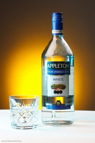
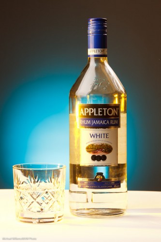
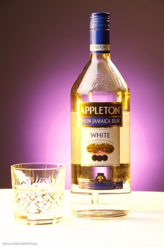
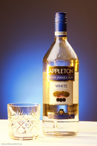
I shot some demo product shots with my student Merav today, and I thought I would share them here to underline the importance of colour.

Here’s one, a simple one. Lit by a softbox on the leeft, an umbrella on the right, and against a grey backdrop. That gives us this:

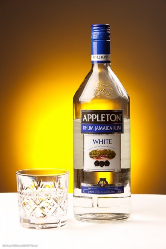
Bit boring? Yes it is. So I add a gridded, “egg-yolk yellow” gelled speedlight aiming at the background. (I use the excellent Honl Photo grids, gels, and other small flash modifiers):

Product Shot (Photo: Michael Willems)

Much better. Then we added another light – a green-blue gelled speedlight shining in from the left:

Product Shot (Photo: Michael Willems)

Then we reversed the gel colours:

Product Shot (Photo: Michael Willems)

Then, tried another background colour, rose purple:

Product Shot (Photo: Michael Willems)

And finally got to a background coloured Just Blue, which had been Merav’s idea all along:

Product Shot (Photo: Michael Willems)

Which one did you prefer? Can you see how different they all are?

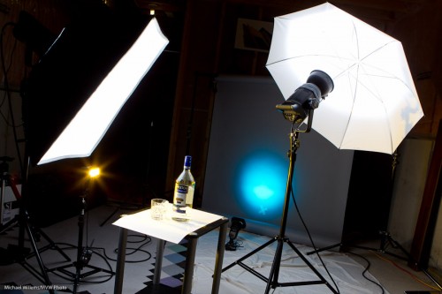
To shoot this I used this setup:

Product Shot Setup (Photo: Michael Willems)

This works as follows:

  1. Put the bottle on a table, with white paper underneath
  2. Put up a grey backdrop, far from the bottle so it does not get any light
  3. Get the main lights right – use a light meter to set them to your desired values (I used f/9 and 1/125th second at 200 ISO). Main strobe is fired with Pocketwizard; secondary strobe by its cell.
  4. Add a background light: a small flash also fired by a Pocketwizard, through a Flashzebra cable. Set to 1.4 power. Equipped with a 1/4″ Honl grid and a gel.
  5. Add a side light: a small flash also fired by a Pocketwizard, through a Flashzebra cable. Set to 1/4 power. Equipped with a gel.

Simple. Once you know!

Why the rum? It was the only bottle I had in the house. Amazingly, for the first time I can remember, I had not a single bottle of beer or wine or anything else available in the house. Time to hit the liqor store!


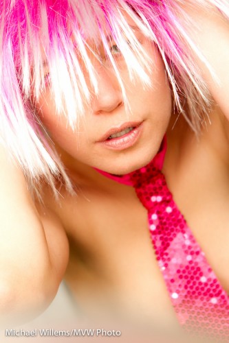
Look at this image I shot just the other day – yes, it is another post in my recent model portrait series, this time to show you a simple creative technique you can use in camera:

Pretty in Pink - Kim Gorenko (Photo: Michael Willems)

Pretty in Pink (Photo: Michael Willems)

Namely.. the blur at the bottom.

This surely looks like something I did in Photoshop – perhaps even Lightroom? But no – I did this while shooting, using the camera.

How?

Here’s how. I simply placed an object (a mirror, in this case) in front of me, very close to my lens, and shot right over it. That blurs the bottom of the image, because the mirror is completely out of focus.

And call me crazy, but I like doing things in camera when I can. This image is basically “straight out of camera” (“SOOC”). Shot using a Canon EOS-1D Mark IV, 1/60 sec at f / 5.6, ISO 400, and lit with two speedlights, one on camera, one off camera. Using TTL, with flash compensation set to +1 stop to expose high-key. This is visually stunning, and also smooths skin.


By the way – I blurred to make it a “work safe” image. If you want to see some of my art nudes, head over to my occasionally-updated Tumblr site at http://mvwphoto.tumblr.com

Off centre

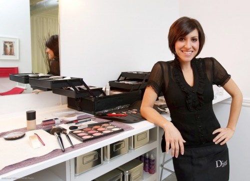
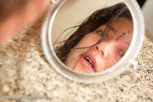
Remember, everyone: use off-centre composition often. Like in these portraits, where I am using the rule of thirds, roughly:

Richard Dawkins (Photo: Michael Willems)


MUA (Photo: Michael Willems)


Kim in a mirror (Photo: Michael Willems)

In all of these, I am using the Rule of Thirds to create a visually pleasing composition. (And do you like the reflections in the latter two shots?)

Remember:

  • If your subject is in the middle, dead centre, you must have a good reason for this.
  • In the absence of such a reason, place your subject off-centre
  • Have any “motion” (eg where your eye is drawn because this is the direction the subject is looking in) happen towards the centre!

The rules are just guidelines – but again, use them if you have no specific reason not to.

And in doubt: shoot two, and select your favourite later.

.