Kiss

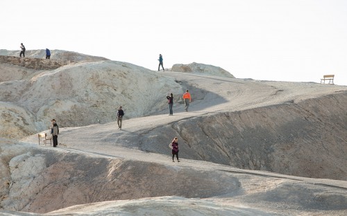
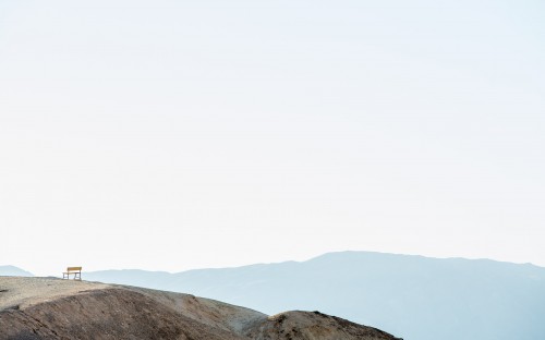
Keep it simple. A theme you have heard from me many, many times. Simple, like this picture, of Zabriskie Point in Death Valley, that uses “negative space”:

“Negative space” does not necessarily mean there’s nothing in the picture. It means there is “no further information” in most of the picture.

Nor does “simple” mean there is nothing:

Simplicity simply means that everything that is in your photo is there because you want it to be there; because it helps tell the photo’s story. If it doesn’t, it should not be in the picture.

It’s as simple as that.

___

Michael writes photography learning books: his seven e-books are available at http://learning.photography.


Air

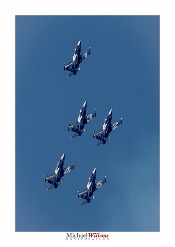
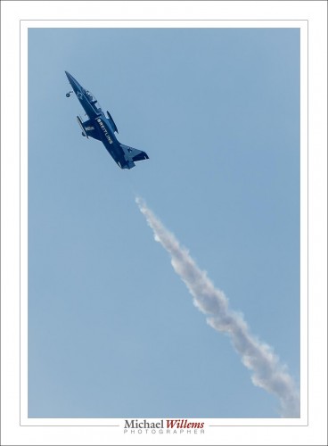
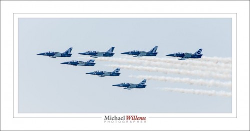
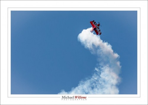
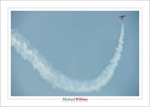
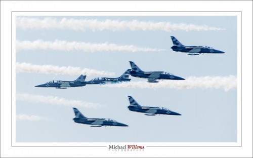
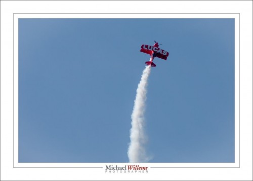
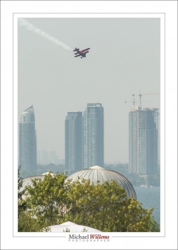
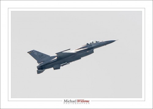
Here’s a few shots from Monday’s Toronto airshow (view at full size for detail):

What did I use?

  • A 1Dx camera, but the 7D would have worked as well, if not better (it’s a crop camera, unlike the 1Dx).
  • A 70-200mm f/2.8 lens
  • A Yongnuo 2x lens extender, making that lens an effective 140-400mm f/5.6 lens.
  • My settings were: 400 ISO, 1/800 sec, f/7.1

Pretty much the same settings throughout the shoot. Watching, of course, for light changes.

Why those settings?

400 ISO to get a fast enough shutter speed. f/7.1 in case I get focus slightly wrong. 1/800 sec to freeze motion.

A few more:

You need to pan with the aircraft to keep them sharp. Set IS/VR to mode 2/active, if you have that option, and pan (move the lens with the object you are shooting).

Which way was I panning here?

A few last ones:

Only a little cropping was needed here, due to the tele-extender. The 7D crop body, as said, would probably have been even better (another 60% range!).


Happy Happier.

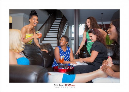
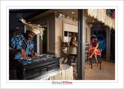
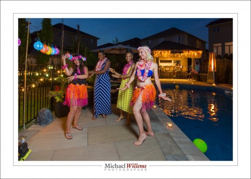
So yesterday was a lifestyle shoot. That means…

Happy:

Colourful:

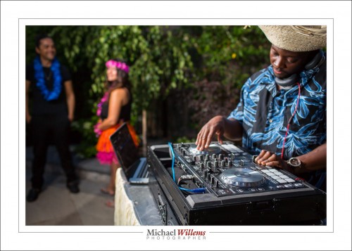
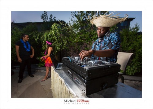
Musical:

…Hawaii-themed:

It also needs careful lighting: yesterday for me was about composition and light. Two speedlights, one in an umbrella, that’s all I used. Everything in manual; flashes operated by pocketwizards. And careful balancing of foreground and background light. And saturated colours as a result.

A shoot like that also needs design, storyboarding, props, models, and timing. Everything is designed. And a photographer who knows what is required. I can shoot in any style required, and for this style, colour is the big requirement: colour and happiness and interaction, communication, “party”. It’s great when everything comes together, and yesterday’s shoot, for a mobile spa, was one of those.


Mood. Moody. Moodier.

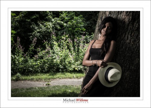
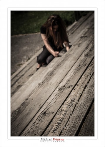
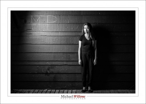
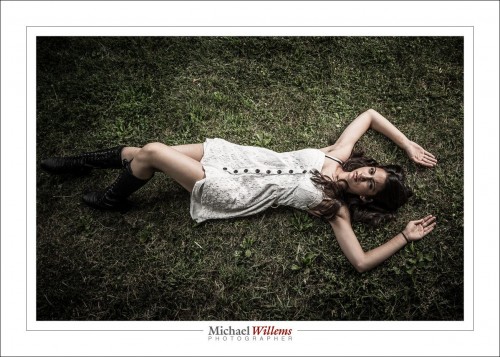
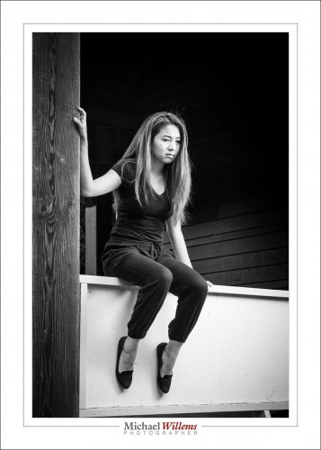
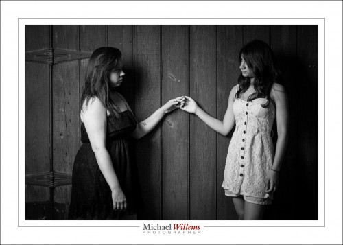
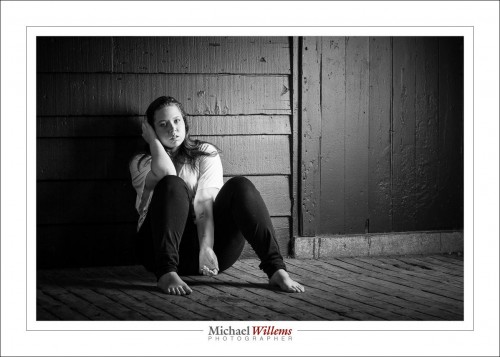
Feelings. Mood. That’s what we are all about, and that’s what series of photographs can also be all about. Like these, from a theme shoot on Saturday: can you tell what mood they portray?

That’s right: Sadness. Depression. Desperation. Suicide.

And the trick is to portray that without totally spelling it out. You do that by such things as:

  • Using appropriate facial expressions.
  • Using appropriate body language.
  • Lighting carefully.
  • Using harder rather than softer light.
  • Desaturating the colours.
  • Sharpening.
  • Using black and white.
  • Using shadows.
  • Vignetting slightly, perhaps.
  • Increasing contrast.
  • Increasing Clarity.

And that’s when you can show moodiness.

The above (best seen at full size) were taken during a charity shoot Saturday. A shoot for a mental health charity that concerns itself with depression, suicide, addiction. Hence the long faces on the part of the models, who all volunteered their time, as did the hair stylist and make-up artist.


Story, story, story.

When shooting an event, always tell a story. People do not want to just see random images; since Gilgamesh and Homer, people like to hear stories.

In practical terms, for you as a photographer that means:

  1. Start with an Establishing Shot or two, to establish where the event is taking place
  2. Make sure that before you present the work to your friends, your relatives, or your client, you arrange (not: shoot) the event in (chrono-) logical sequence. In Lightroom, use a collection, and sort it manually. When exporting, use the sequence number in the export filename, so your sort order is honoured.
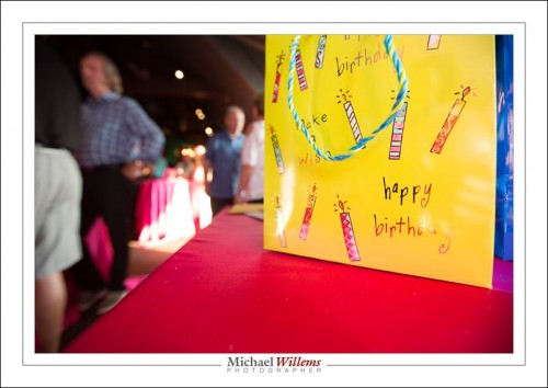
  3. Shoot a “B–roll”, including decorations and food. B-roll pictures are the background. The decorations. The food. The small details. You can shoot those before, during, and sometyimes even after the event.
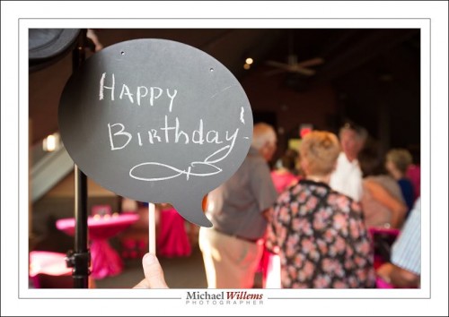
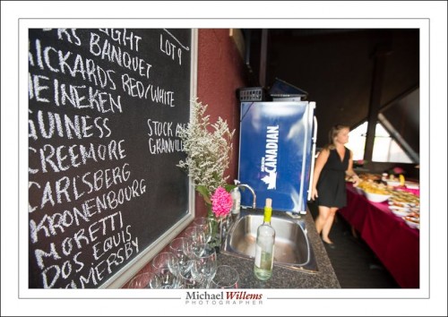
  4. Include signs that have names and details of the event.

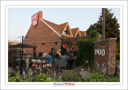
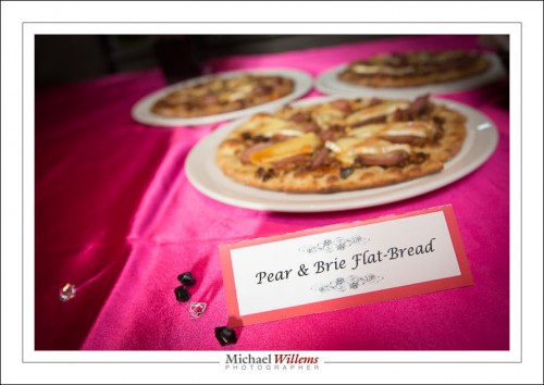
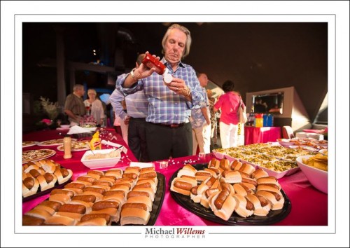
Let’s look at some examples from the event I co-shot Saturday night. So these are not the event pictures (those feature people); these are the “B-roll shots” that act as glue to keep the people shots together.

These are examples of the kind of shots that make random people pictures into a story your friends or customers want to see. It’s easy, it’s fun.

(All images except the first one: camera on manual; flash on TTL; flash bounced behind me at a dark ceiling, so 1600 ISO was needed to get enough bounce.)


CEO

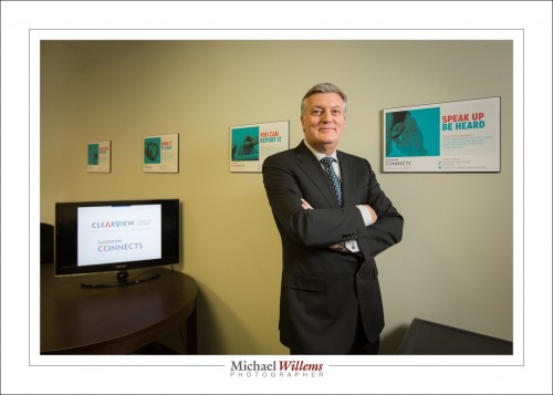
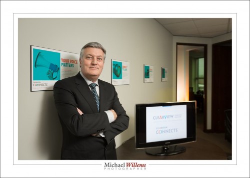
So today I did yet another CEO shoot. I do love environmental portraits.

So what do I look for in such a portrait? How do I make one? I thought it might be interesting for you to follow along, so to speak, with my process.

It starts with the lens. I start with a wide angle lens, because I will probably want the person “surrounded” by the rest of the shot. By their environment, in other words. Probably, not necessarily: so I also bring lots of other lenses. If I do use the wide lens, I am careful not to get too close to my subject: distortion is always a possibility.

Then the light. I will usually start with one off camera flash in an umbrella. So, since it is a flash picture, I start with the ambient light. 400/40/4 is a common start point. Whatever it is, I continue until I am happy with the ambient light, that I typically want at –2 stops, and only then go on to flash. For the flash, I ensure it is aimed at the subject’s face from the right direction, at the right angle (e.g. 45 degrees off-centre, 45 degrees up).

Then the location. I look for something that is typical for the person I am shooting. An office, for instance. But I also look for good composition. The rule of third, for instance. Leading lines, diagonals converging where the subject is, leading the eye there, are good.

I watch carefully for reflections in glass, and position lights and subject accordingly. I check that the subject’s clothing and hair are all OK.

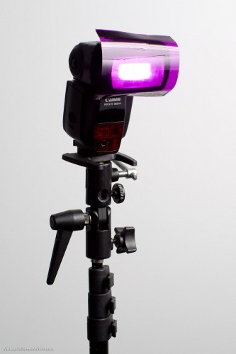
An extra flash or two, with gels, are always ready to be used. A dash of colour here and there is great.

And now: in practice. Can you see how I applied all these techniques to today’s CEO portrait shoot?
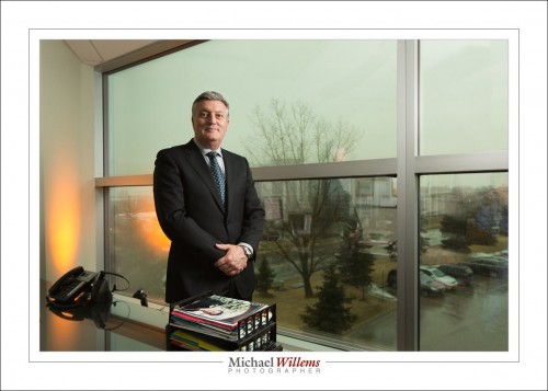
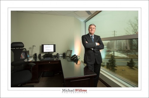
Of course I also use all other standard composition and portrait and technical rules. But it’s not about those; it’s about showing something of the subject’s world, and of his or her personality.

 

Tell stories

Even in the smallest ways, you can tell stories, and even in snapshots there is thought, Like tonight, as I walked to class. I shot a little four-image story.
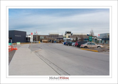
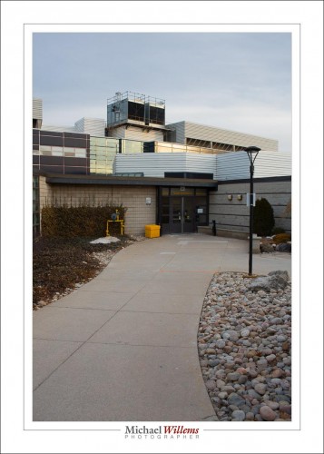
First, the all-important overview “establishing shot”:

Shows where we are going. Namely Sheridan College, where I teach several photography courses. I used the “Sunny Sixteen Rule” to set the camera without using the light meter. Partely overcast at 7pm, that is about 3 stops down from sunny at noon. So, 400 ISO, 1/400 sec, f/5.6 (5.6 being three stops down from “sunny” 16).
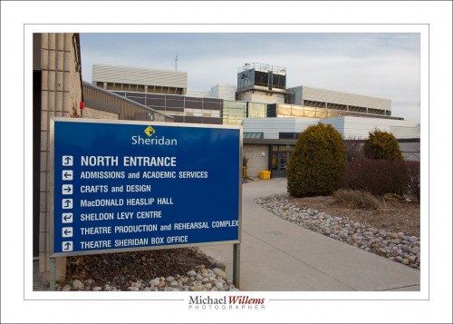
Then, let’s add some depth, some 3D, and at the same time let’s tell the viewer where we are:

Showing depth? That’s done by using “close-far”. A close-by object very close to you, with the background showing far away. That shows us there is depth in the photo; that it is not flat, in other words.

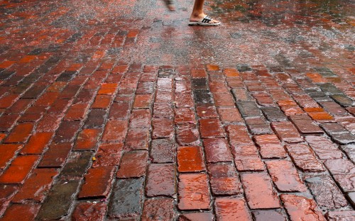
That being done, now let’s use a nice curve, a converging one at that, to imply that we are going in, by showing “the path”:

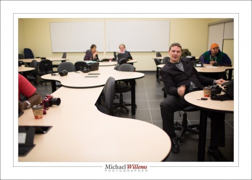
And now that we are there, let’s see the class, during a break:

Again, nice S-curves lead the viewer’s eye into the photo. Focused on the person closest to us. Using the Rule of Thirds.

The point? The point is that you can, and should, apply “high rules” to “low snaps”; and that this makes them better. Enjoy!


Colour. Just because.

That is often my answer when someone asks “why did you use those gels in that picture?. “Because I could”., “Why not”.  And you start adding colour here, there and everywhere. Consider this:

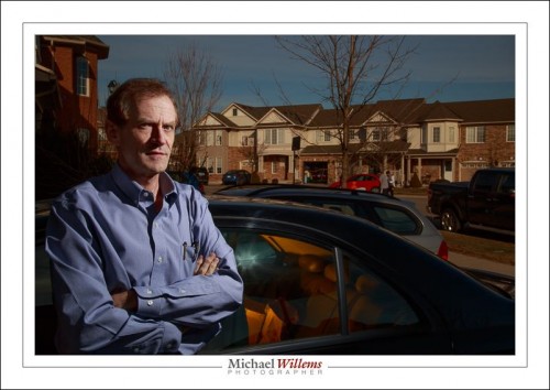
(100 ISO, 1/20 sec, f/16, 24-105 f/4 lens).

Private student Tim made the picture yesterday. And I put the yellow gelled flash inside the car why, exactly? Because otherwise it would be dark. A little colour adds a lot: think matching, or opposite, colours. Deep blue skies go well with yellow: blue and yellow, like red and green, or green and purple, constitute one of nature’s favourite combos.

And it’s so simple, with a Honlphoto gel:

Just strap it onto the speed strap and bingo. (If you do the Honl photo modifiers thing, go http://www.honlphoto.com/?Click=2032 and don’t forget code word “Willems” at the end to get another 10% off. Look at the kits: they rock, especially the last one).

I use gelled speedlights to:

  • Add opposites to relieve boredom
  • Warm up cold subjects (half CTO gel does wonders)
  • Get creative
  • Add a little red to skin in low key portraits
  • Correct colour when shooting in tungsten ambient light
  • Turn backgrounds blue

…and so on. Once you get into the habit, you’ll see how good your photography gets. Speedlights, and easy-to-use, sturdy gels, make all this not just possible. They make it convenient and affordable, too.

This site is called the speedlighter for a reason: speedlights unlock the potential. Just get another flash or two, get some gels and other modifiers, and get creative.


Wall Art

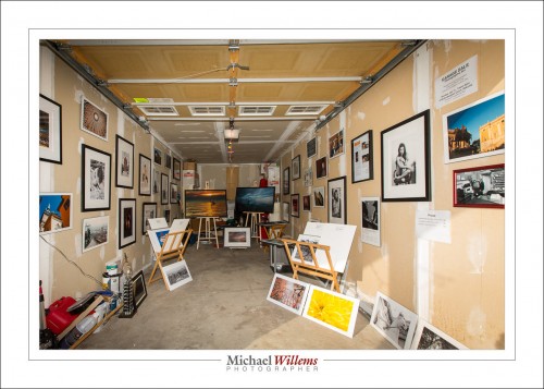
I held a Photographic Art Garage Sale today at my home. And it was literally a Garage Sale:

This taught me a few things. First, how important it is to have prints made of your photos. The tactile experience of holding a print is something special. Prints go on walls and add something when they do. Prints do not get lost when a hard drive crashes. They do not need batteries. They can be seen by many people at once. They have a certain value that an LCD display cannot approach.

Also, it reminded me that there is benefit in starting a wall art collection and adding to it over the years. Add a little here and a little there and before you know it you have a great collection. And it is “a little bit here, a little bit there” because there is a cost involved in prints, especially in framing.

Third, I was reminded how nice a wall looks with prints. Even my garage wall. Any wall livens up with prints, and its character changes completely when you switch the prints around. And the more you have, the more switching around you can do. Do not keep the same prints in the same place forever.

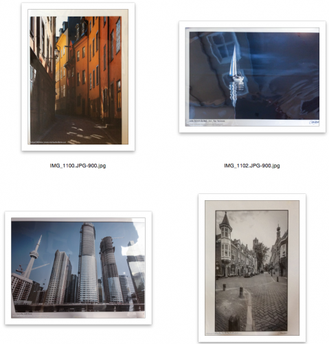
Fourth, I learned again how taste differs and how you cannot argue over taste. Sold prints included:

A sailboat and three urban scenes: Old Stockholm, Toronto under construction, and Utrecht. I can see the attraction of putting major cities on your wall in suburbia. But there are some prints I think are great that attracted no-one; conversely, there was a lot of attention for some photos I thought interesting.

In fact most people looked at the black and white photos, but bought colour photos. perhaps B/W is more artistic, but colour fits better in most people’s homes.

In conclusion, prints have something special, and I strongly recommend you buy, make, and shoot for prints.  You will not regret it.


Did you miss the sale? If you live in the Toronto area, come for a private viewing: the prints are still available.


The Camera Puts On Ten Pounds

…or so it is said, in the case of TV, where the camera does really put on ten pounds. Why? Because TV is made with wide angle lenses.

To illustrate this, let’s make a portrait using a 200mm lens:

An undistorted view of the subject. Now let’s zoom out to 35mm. But then, wait….  the subject will be small, very small. So we will have to get closer to keep the subject the same size. It is that closeness that causes the subsequent distortion:

All distorted, and again, this is not because of the wide angle; it is because of the closeness that the wide angle necessitates. That is why we say:

“Do not use a wide angle lens for portraits”.

What we really mean is:

“Do not use a wide angle lens for portraits where the subject is large, because then you’ll have to be too close and you’ll get distortion as a result of that closeness.”

That does not sound quite so punchy though, does it?

Sometimes we can use that distortion for a deliberate comical effect:

I suppose the one thing you may want ti take away from all this is: know your lenses and when to use which one. Pay attention in particular to:

  1. Depth of field.
  2. Perspective distortion.
  3. Susceptibility to (or resistance to) motion blur.

All three of these have something to do with focal length. When you are learning photography, it is your job to figure out in which way.