Timing is everything

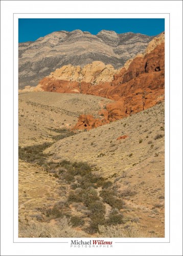
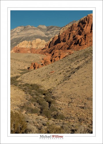
Not everything, but it is certainly something you should be aware of. Look at the difference in these two pictures of Red Rock Canyon, Nevada, yesterday morning:

Majorly different, no? And why? Because I took them about an hour apart. 9am (first) versus just before 10am (second). And that darn sun had shifted. See? Proof that it turns around the earth.

Both acceptable pictures (note the curves, and the other compositional elements described in Impactful Travel Photography?), but both different. See the differences?

Light really is very important and as a photographer you should always be aware of the nature of the light: where is it, how contrasty is it, how bright is it, what colour is it.


Simple, innit?

Today, I present you with one page from my next upcoming book, “Mastering Your Camera”, a no-jargon guide to using any DSLR.


Simplifying.

When people ask me “what is the difference between my snapshots and a professional picture?”, I most commonly say “the pro simplified her picture”. Simplifying your images is probably the most important thing to not forget.

“Simplifying” does not necessarily mean “removing everything but your subject from the photo”, although that is one way. More accurately, it means “ensuring that everything that is in your photo is in your photo because it should be in your photo”. If it shouldn’t be there, it shouldn’t be there!


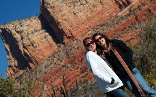
Sedona, AZ: Tilting Away The “Stuff”

Take the picture above. I tiled this image because next to the girls, there was a garbage can. That garbage can did not belong in the picture – it was not a picture of “two garbage cans in Sedona, AZ” – so I wanted it gone.

How can you simplify a picture? There are many ways, and you can come up with them yourself. They include:

  • Move: you do not have to take the image from right where you are. Often, moving to a different location makes all the difference.
  • Wait: Often, distractions disappear. The photo of the guard at The Alamo earlier in the book had three tourists right behind his neck: I waited until they were thus invisible, and then pressed the shutter.
  • Viewpoint: shoot from a different angle: a circle has 360 degrees, not just one…
  • Zoom: filling the frame is also a good way to get rid of distractions.
  • Blur: blurring the background by using a low “f-number” is also a great way.
  • Tilt: see the example above!
  • Selective light: only light the objects you want to see; keep the rest in the dark.
  • Move the subject or the offending objects. If you are not a photojournalist (for whom this is taboo!) then you can ask the subject to move, or move the distracting objects.

That is a partial list: you can come up with more ways yourself. The key is just to remember to do it.


Leave some space!

One reason we use negative space is to show a subject in isolation; small person or object versus big world. But there are other reasons, like this one. We do it also to allow the placement of text, like this:

And that brings me to a related subject. OK, not all that related, but whatever. Namely this: If you are interested in shooting any kind of magazine cover page, I have a few tips for you.

  • First of all, be very sure that your work is 100% technically correct. Focus, lighting, exposure, grain: all have to be perfect, or forget it.
  • Ensure that your work is in keeping with the magazine’s culture and audience.
  • Shoot RAW. That way, colour space choices (sRGB, AdobeRGB, etc) can be deferred until later.
  • Shoot vertical (portrait orientation). Magazines are vertical, after all.
  • And finally: yes, do leave blank space. Text has to go somewhere.

Want to be in magazines? Start by creating a portfolio of great work. Then do the legwork – and there’s a lot of it to be done. And meet all the tech requirements, or you are wasting your time.


Fill The Frame

One thing I see very often in students is a reluctance to fill the frame. Get close, exclude everything that is not your subject.

And yes, sometimes you should include lots of other stuff. But often, getting close is a great way of getting intimate with your subject. And yes, you can sut through heads.

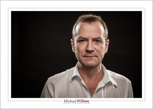
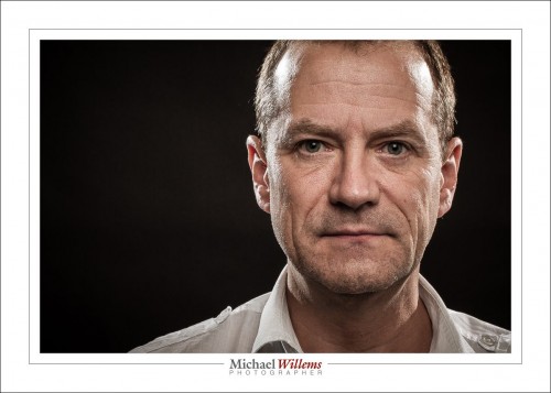
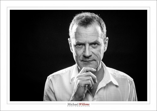
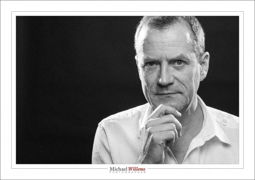
Consider these two self portraits:

The second is more powerful. Sure, sometimes you want “everything in the picture”; but often enough, getting really close makes for a better picture. Go try it now. Take a portrait photo like the one at the bottom and see how you like it. It may surprise you.

Here’s a couple more self portraits to finish on:

Enjoy your day!

___

Have you bought both my ebooks yet, at 50% off for Cyber Week only? If not, head on over to yesterday’s post: http://www.speedlighter.ca/2013/12/03/cyber-week-sale/

Trixie

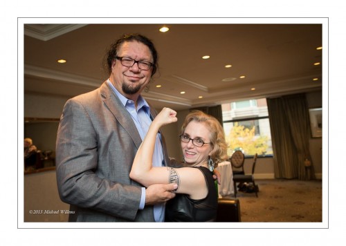
Look at this recent photo of Penn Jillette and a fan:

Now, you need top know that Mr Jillette is a big guy. Very big. Very tall, in particular. And his fan is not all that tall. So the height difference is enormous.

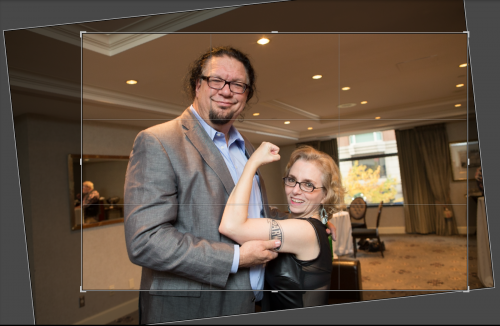
And hence, I did what I often do: I tilt a little. When I shot, but also in “post”:

As you can see, the difference is more pronounced in the original. Without making it ridiculous, you can manage to reduce such height differences by using this simple technique. While shooting or in “post”: tilt a little. Keep strong verticals out of the image if you can, tilt, and Bob’s your uncle.

History

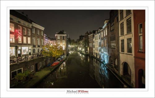
I am in the city of Utrecht, which is generally thought to have been founded around 50 AD. And tonight I walked around a little in the dark. And, as you would expect of me, I brought my camera.

To do this, I used a wide angle lens – the 16-35 (on a full frame camera, so it would be the 10-200 for you).

Why wide angle?

  • For the composition;
  • So that I can shoot at 1/15th second handheld (no tripod);
  • So that I can shoot at f/2.8 while still getting extended DOF.

I needed 3200 ISO or more to achieve that, but that is fine with a modern camera like my Canon 1Dx.

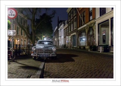
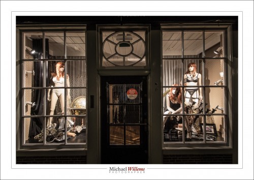
What do you look for? Local things. Typical local things. Like the car above, or this lingerie shop window:

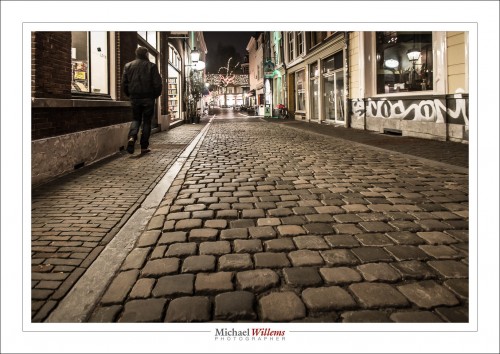
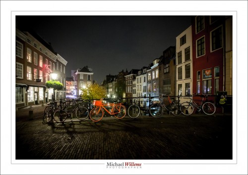
And things that show context and age, like the cobbled stones. With angles that emphasize your subject:

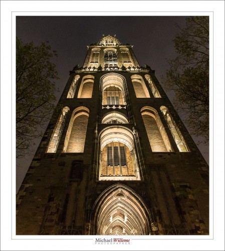
And light, like the lit Dom church tower (which since a tornade in the 1600s is separate from the main body of the church):

Even on a short walk through town you can come home with some nice pictures – provided that you bring a camera and use your knowledge of aperture, shutter, and ISO (and perhaps, unlike me, bring a tripod).

And do remember to, when in The Netherlands, shoot pink bicycles.


Hide!

Hide the unwanted reflections, that is.

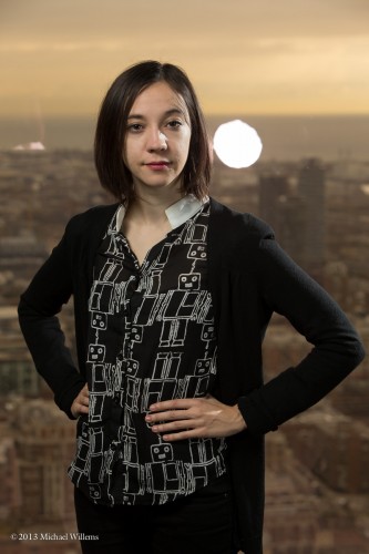
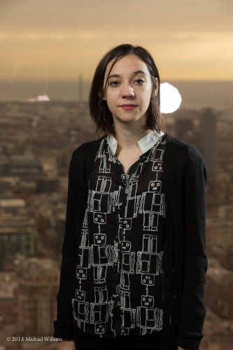
This photo was taken -by me- in front of a window, Wednesday morning (as set for a corporate shoot: Denise was my assistant).

I lit that with an umbrella on the left, a little Honl photo softbox on the right, and later a rim light right behind. So when we started, we had this, of course:

Moving the umbrella (to the left, where there was more space) and my tripod fixed that. But the fill light was more problematic:

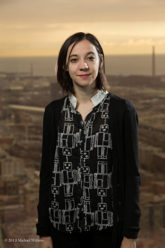
Solution? move the subject a little…

A little more…

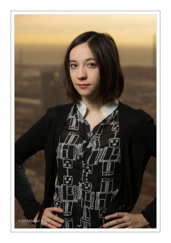
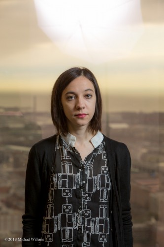
There we have it. Portraits resulted:

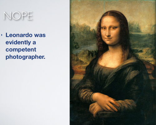
By the way, it has been pointed out to me that my assistant, here she is again…:

…looks like the portrait below. So, is all this light stuff new?

Nope, it isn’t. The similarity in colour and composition, and the enigmatic smile.. indeed, similar.  You recall my recent post about colour? (If not, scroll down a week). That’s the importance of colour. When you check images with Google, google uses colour and tone to find “similar images”.

ADMIN NOTE: I am on my way to Europe, and posts may be sporadic for the next week. But keep checking back. And press the “like” buttons above if you like my posts.


Real Estate Tip

Warning: do not look at http://terriblerealestateagentphotos.com/ because it is extremely dangerous to your health. Laughing so hard that your stomach muscles cramp up can cause lasting damage, even heart attacks. These images are hilarious.

So today, a quick tip or two about Real Estate photos.

Do not shoot snapshots. One way to avoid them is to not shoot from eye level.

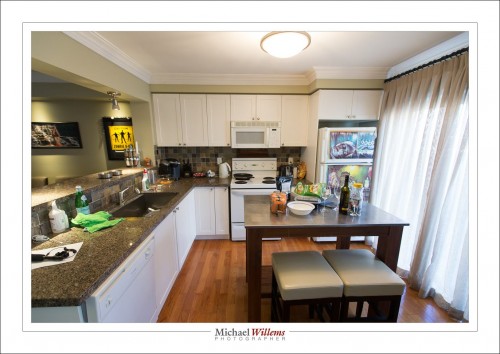
This was shot from eye level, using the wide lens you need for real estate photography:


As you see: diverging verticals and worse, a snapshot look.

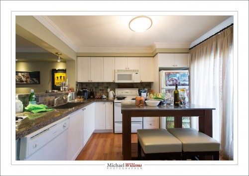
Now go down to 4-5 feet above the ground:

Much better. Be  careful that you do not look straight on to tables, and that you do not look at the bottom of kitchen cabinets, of course.

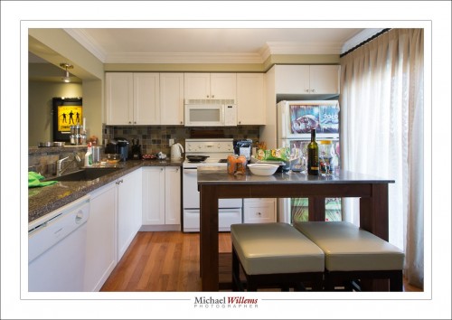
Can we go better? Sure thing. A lens needs to be wide, but not always wide all the way. The shot above is too wide. Look at that diswasher. Stretched beyond recognistion. So shoot a little less wide:

Is that perfect? No. The stools are still a little large, and the clutter is unforgivable. So this cannot be used as a real estate photo. But remove the silly yellow picture and the fridge pictures and get rid of all the clutter, and back off the chairs just a little, and it’s perfect.

And that’s just one tip for real estate photography. There’s a lot more, some other time. Or come to me for private training: it’s what I do.


The emotion of colour

Colour brings with it a whole set of feelings and emotions. We talk about “warm” colours, “cold” colours, and we tie colours to things we have experienced.

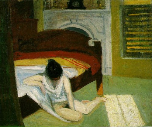
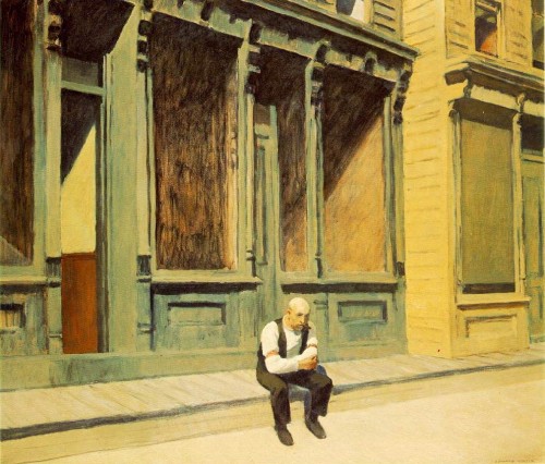
One of my favourite artists is the late Edward Hopper (1882-1967). He of the Night Hawks, yes. But also, and especially, he of the stark room settings, and of the amazing summer colours.
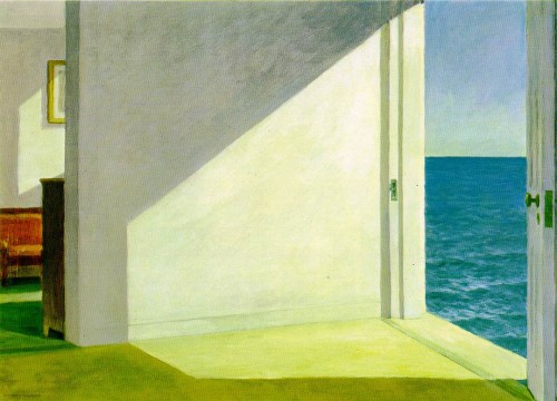
I love the way Hopper perfectly captured the summer colours. And not by making the image red, as might be expected, but rather, by giving it that wonderful olive greenish cast. I can feel the weather, I can hear the sea, I can sense the afternoon.

If I take a summer image and set white balance to “auto”, I get a very correct image, but not one that speaks to me:
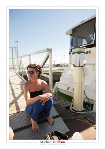
If, however, I select the right white balance setting, I get:
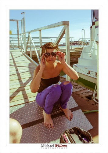
That yellow-green look, almost like a faded polaroid, speaks to me of a lazy, warm, long-lost summer day. I can almost feel the sun.

Hopper was a master of this. Here’s his Summer Interior:
And “Sunday”:
And this:
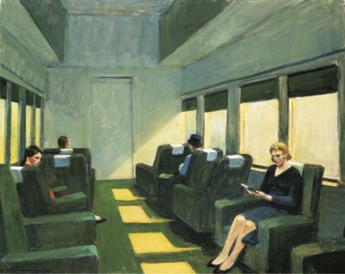
And one more:
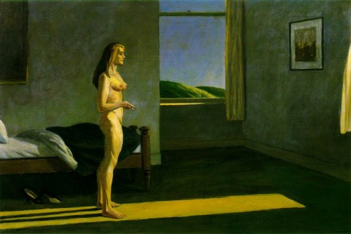
All those speak to me of the same warm summer afternoon feeling. So I try sometimes to recreate the same feeling Hopper evokes. Like here:
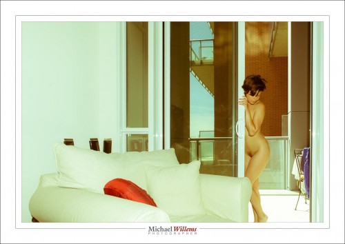
Compare that to the first Hopper, and you will – if you are me, anyway – get the same kind of green/yellow summer feeling. And that is the power of colour. So think about it carefully. Colour, like other aspects of light, is an interpretation as much as a fixed value. Look at artists who inspire you, and ask “what were they doing with colour and how does it affect me?”.

 

That’s a wrap

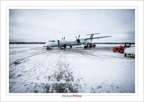
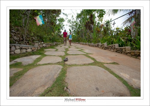
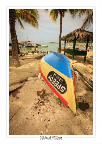
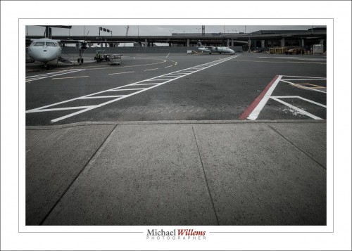
No no, no fear, I am not stopping this blog. I am, instead, talking about the “wraparound” effect a wide angle lens can give you. Wide, like 10mm on a crop camera or 16mm on a full-frame camera. That angle looks like this (Timmins Airport, the Bob Marley mausoleum in Jamaica, and Philipsburg in St Maarten, respectively):
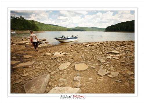
As you see, the picture seems to wrap around you, giving an effect of “being there” and of perspective and depth. That’s why so much photojournalism, and so many National Geographic images, are made this way.

But to really get this effect, you need to have a few things in place.

  • You need a wide lens, zoomed out (10mm/16mm as said);
  • You need to be close to something, like the ground in this case;
  • And also – and this took me years to figure out – this effect depends to a large extent on lines converging. That means you need some kind of pattern or texture or parallel lines in the close-by area so you see the lines converging.

The stones here seem to wrap around; without stones, no wrapping:

And the lines are clearly converging, leading to the same – and again, without lines, no wrapping:

So if you like that look, now you know how to get it.

___

Oakville “Flash” Courses 9/10 November: EDIT: Saturday Nov 9 is AVAILABLE, but Sunday Nov 10 is FULL. I am limiting the number of students in each class to no more than 4-5, so do get there first.  See the syllabus here, and book via the link at the bottom of that page – indicate your desired date!