A few Lightroom Starter Tips

Since I am often asked: here’s a few Adobe Lightroom starter tips to get you going. (Lightroom is the app for photo asset management, editing, and output generating).

  • Set up your files using dated folders (named “year-month-day-subject”), in folders per year, with all those year folders under one master folder. That way, if you move them, it’s just one click to tell Lightroom where they now live, or you can move specific years to off computer storage. See this video.
  • Turn on solo mode in all sidebars, so you see only one pane at a time.
  • Learn abbreviations, like D for “Develop” and G for “Grid”.
  • Turn on the XML files (in “catalog settings”):

  • Realize that each module works differently, including many of the keyboard shortcuts.
  • Back up your catalog file (or files): the “.LRCAT” file(s).
  • Learn how to make presets for things you do often (edits, exports, logos, etc).
  • In Develop, press “i” repeatedly to turn on/off the screen info about your image.
  • Learn collections and smart collections.
  • Start keywording your images. (See “smart collections” as to why!)
  • Look at all the menus and read what they do. So often I am asked “how do I do xyz?”, when the answer is right there. You wouldn’t drive a car without at least looking at the controls first, right? Often, people say “wow, you’re a guru”, when all I have done is spend an hour or two looking at the options.
  • Learn the terminology (“panes”, “HSL”, “Module”, for instance) so that it’s easy to google for answers when you are stuck.
  • Use the histogram when editing.
  • Always select sRGB for exports unless specifically instructed to use AdobeRGB.

There’s a whole lot more, but these may help. Also, see my new YouTube channel with tips and tricks. They’re usually about 5 minutes each: watch them all!

___

I teach this stuff. Have me set up your Lightroom and teach you how to use it most efficiently – and we’ll do a photo critique of your work while we’re at it; and I’ll show you how to get the most out of your photos. Contact me for information.


Zombie Text

Zombies text, too…

Have you always wondered how to get a nice frame like that? It can be done in Lightroom. Learn all about it here:

Like that? Then you should sign up to my YouTube channel, which will have more content on a regular basis: https://www.youtube.com/user/cameratraining

___

I do private Lightroom training and coaching: a few hours and you will know Lightroom, and more importantly, you will have it properly installed and set up. Contact me to hear more.


Zombies ‘R’ Us

Last night I held a little zombie party. And that prompts me to tell you about the importance of two things in photography.

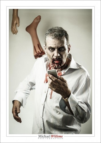
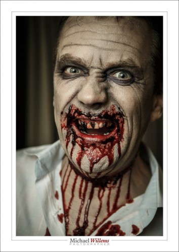
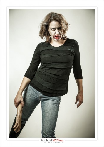
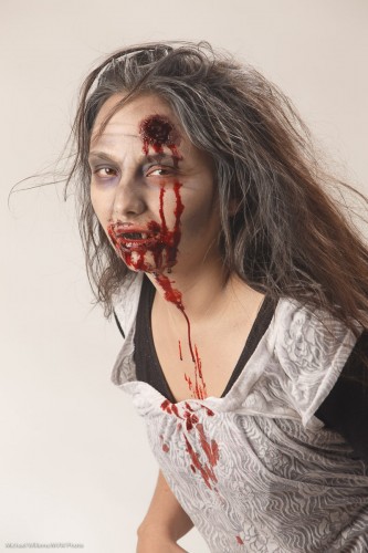
One is the make-up artist (the “MUA”), who is present at many shoots. Without one, you are limited. You cannot, for instance, change anyone into a zombie, like this:

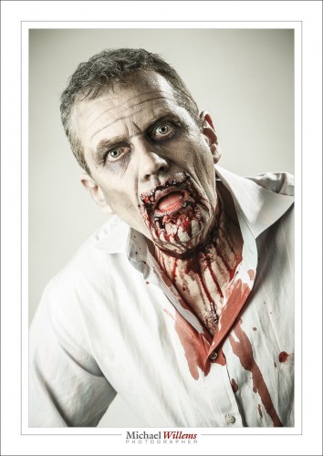
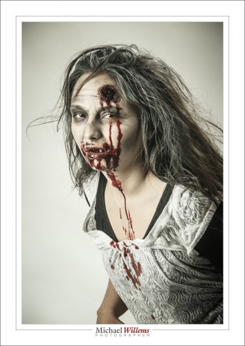
Or this:

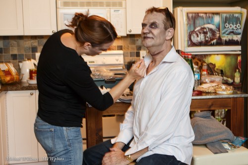
Here’s Melissa, last night’s MUA, working hard on making me ugly (not all that difficult, according to some):

But even for simple shoot, a make-up artist can be essential. Why does professional photography involve so much time (each make-up job took over an hour, in two parts: make-up, then blood and wounds) and money? Because doing a professional job takes real effort, knowledge, and time. Accept the extra expense and do it, next time you have a shoot that needs a professional look – whether that look is beauty or zombie. Same thing, for a good Make-Up Artist.

The second thing is post-processing. While I do what I can in the camera, some things cannot be done there. Like the “Walking Dead” look in these pictures. Here’s Melissa, the Make-Up Artist:

So to get this look I quickly created a Lightroom preset, which I call “zombify”. That makes image 1 below into image 2 below:

Lightroom “Zombify” Develop Preset, by Michael Willems:

  • Temperature 6150K (with my studio flashes)
  • Tint -44 (my version of “Walking Dead Green”)
  • Exposure +0.5
  • Contrast +12
  • Highlights +7
  • Shadows +11
  • Clarity +65
  • Vibrance -42
  • Sharpening 80
  • Noise Reduction 20
  • Post-crop vignetting -27 Highlight Priority

Do those settings (tune to taste), then save as a new preset and you are all set for Halloween. You’re welcome.

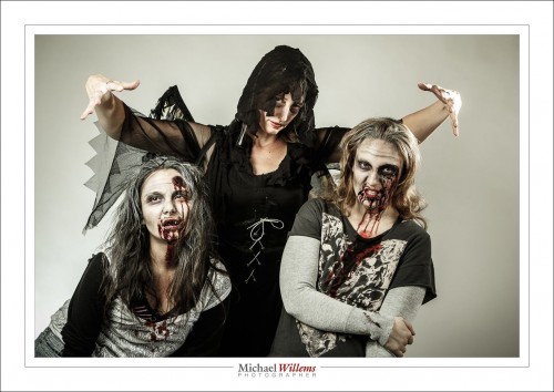
The Angel of Death is watching.

Enjoy your Halloween, later this week.

___

Come to me for a little Lightroom coaching, and I’ll set up your Lightroom structure professionally while we are at it, too. www.michaelwillems.ca

Upgrades, upgrades

A quick note for you this morning.

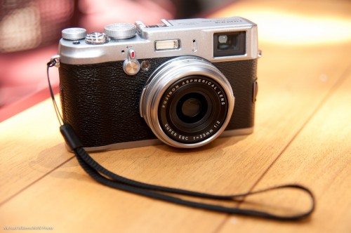
Those of you with a Fuji x100 camera: the new 2.0 firmware is out!  Faster AF and a host of other little improvements.  Go here for the download and details.

Fuji X100 (Photo: Michael Willems)

Those of you with a Mac and who also use the apps, namely Pages, Numbers and Keynote: for the love of God, do not upgrade. The apps are now dumbed down to be compatible with the iPad and iPhone. Gone is that newt inspector (it was genius). And worse: all your documents are likely to need reformatting, often expensive reformatting. I am not about to spend the next month fixing all my documents: thanks a bunch, Apple. And the apps are so dumb now, I may switch to MS apps (the horror), or just back to OpenOffice.

The moral of today’s post: be aware of all updates and upgrades to software and firmware, but apply them with some caution, perhaps after browsing for reactions. Apple ruined my work apps, the apps I use every day, and I, like many others, are far from pleased. The only reactions I have seen are entirely negative.

The Fuji upgrade, by the way, works fine. Fuji is always quietly plugging away at making things better. Take note.

Postscript: About the Apple apps: Ars Technica, for example. says: “with the Mavericks updates to the iWorks applications, Apple has gotten so aggressively user hostile that I’m rethinking some of my habits”. Read the article here.

Postscript: the good news? the new apps have an “export to v.09” option, and the old apps are still present on your Mac. There you go. Bye bye, new apps, until Apple fixes them.


Metallic Prints: when?

A friend just asked (and I paraphrase): “I have a picture: should I have it printed on metallic?” He went on to say that it has shiny stuff in it. His picture is here.

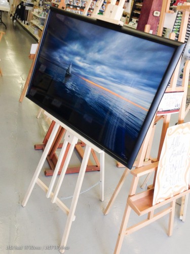
And I do like to have my work printed on metallic, for the large prints. Like in this one, which will be for sale at the Oakville awards ceremony this Thursday:

Good question. When do you use the following?

  • Normal paper;
  • Matte paper;
  • Glossy paper;
  • Natural fibre paper;
  • Metallic paper.

Well, here’s my rules of thumb. Very basically:

  • Normal paper: run of the mill paper, never. Make your images look great, and make them last.
  • Matte paper: when you expect reflections. When blacks need to be deep black.
  • Glossy paper: when you want your pictures to look like photos. When reflections will not be an issue.
  • Natural fibre paper: when you are using a pigment printed, and are less interested in the background being pure white, but more interested in long-lasting prints (think centuries). Pigment lasts centuries; natural fibre paper types such as the popular Hahnemülle papers will not fade, since they have no “emulsion” side to fade: “it is what it is”.
  • Metallic paper: when your prints need to “wow!” and they have shiny bits in them. Colours become vivid; black and white greys get this wonderful silvery sheen: strongly recommended. Also, when you want a light print. Silver paper mounted on softcore needs no glass; just a simple frame around the edges.

Based on the above, my friend’s print most certainly qualifies for a metallic print. I’d go and do it. If you (like him) live near Toronto, go to Fotobox in Etobicoke, and tell them I sent you.

One more thing. Settle on a few paper types. All papers have a clear range of things they do best; colours they can express; way with colour and with deep blacks; and so on. Pick a few, learn what they do (use the Soft Proofing function in Lightroom that I discussed here previously!) and then print accordingly.

Talking about prints: I also intend to sell smaller prints from www.michaelsmuse.com at this week’s event:

If you should be interested in prints for your home or office: I will honour the special Oakville Arts Council pricing until Thursday. Just saying.

___

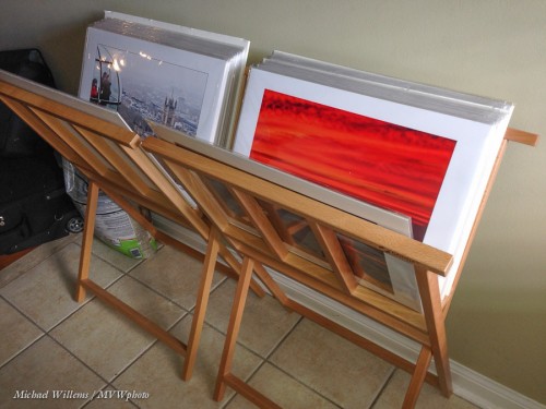
A Note for Oakville residents: I just bought those easels and print stands at Currys in Oakville (off Trafalgar Road). The store manager (I think that is what she was), when asked by the very nice cashier if there was a discount for taking the display items (they had run out of boxed items) grumpily looked at me and said “NO. There’s nothing wrong with them.” The brusque and rude way she said that, and the way that she then then went back to her work with clear disdain, apparent feelings of superiority, not liking me, and all sorts of other not-nice-to-customers feelings makes me not want to go back there. At Michaels art store, on the contrary, they were very nice and took all sorts of time even though I bought nothing. Just saying, everyone: avoid Currys Oakville if you want to be treated with respect. (And it’s not the discount: it’s the way she expressed it).


Print thoughts

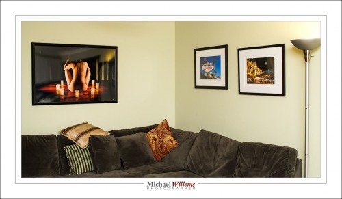
As I have said, printing your images is a great idea. Here’s a few on my living room wall:

It is also complicated – that’s one reason prints cost real money – and time-consuming. But – worth it. Here’s a few decision points for you, when you consider printing.

What tool? I print straight from Lightroom. No intermedia file with colour spaces to worry about, no loss of tines, and great functionality. More about that in future (and past) posts.

When you print, the first question is: “how large”. The two prints on the right in the image above were made on 13×19″ paper, and framed. If you use that kind of size, you will want to hang multiple prints. The image on the left is approximately 40 by 24″. That is suitable for a wall all by itself. Prints up to 13×19″ can be made on a printer like the Canon 9500 MkII.

The second question concerns the printer. Dye or pigment? Most inkjet printers are dye printers. A few, like my 9500 MkII, are pigment printers. The difference? Basically, dyes combine with the paper they are printed on; pigments form a suspension on top of it. The reason to go for pigments is that they last longer and will not fade or shift colour. Dyes, although they are getting much better, will usually fade within 25 years. When I sell, or hang, a work of art, I want it to last for centuries – which pigments will do. If you want your prints to last as long as photo lab photos, pigment is the way to go.

Then, the type of paper. Matte or glossy? That is often a judgment call. Glossy is “like a photo”, matte is “like a painting”. Some photos work best on glossy, some on matte. This is where taste and experience and preference all come together. I recommend that like me you settle on maybe four types of paper; learn what they do; and stick to those.

If you want resistance to fading, use natural fibre paper (such as the Hahnemülle papers). These are not coated, so they are not as white as brightened papers – but brightened papers will lose their brightness.

You can also, of course, go for metallic (like the print on the left in the image above). This is wonderful, sharp, glossy, with a great silvery shine. In addition, metallic prints do not need glass, so they can use a very simple frame. You can even wipe them.

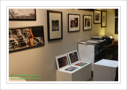
Then, the aspect ratio. No, no, no: your prints do not have to be 3:2 like they come out of the camera, or 8×10 because that’s the only frames you can find.  make your prints any aspect ratio that please you. Even square, or long and thin like the print on the left here, from a gallery exhibit I did last year in The Distillery District on Toronto:

Finally, then the frame. A photo, like a painting, generally looks much better framed. Be warned that framing is not cheap – but it’s worth it. A custom frame, with a custom-cut mat, means your print can be any size. You frame according to the print’s needs. As a result, you will have a unique work that reflects your taste, environment and needs.

Do have a look at some of the pictures I am currently selling in limited editions, all handprinted and individually autographed: www.michaelsmuse.com. Interested? I ship worldwide.


How much is allowed?

How much “editing” do we do as photographers? I don’t mean just editing some supermodel’s images, but I mean real people.

I do not call it “editing”. I call it “finishing”. Because I am on the side of “not much”: I hate making someone into something they are not. At the same time, however:

  • Temporary blemishes can be fixed, as far as I am concerned. They will not be there tomorrow anyway.
  • Anything I can do with light, I can do with Lightroom, I feel.
  • Anything a make-up artist can do with make-up, I can do with Lightroom, I feel.

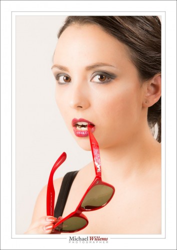
In the following portrait of the other night, of the lovely Liz Medori, I did little except:

  1. Adjust exposure – because my light meter and camera disagree with Lightroom.
  2. Adjust white balance.
  3. Crop.
  4. Remove stray hairs.
  5. Fix temporary blemishes.
  6. I also adjusted Lightroom’s “clarity” a little, however. This is akin to choosing a different, less contrasty film.

That led to this:

What I will not willingly do is change shapes (remove fat), move things (like noses) and change sizes of things (like noses and breasts). I think people look just fine the way they are, and I feel uncomfortable contributing to the fiction that the world’s actresses and models are perfect, while you and I and all other real people are not.

What do you think? When so much of the market demands changes, should we make them?


A little something, Nikon users.

I cannot escape it any .longer: I need to point out something to Nikon camera users.

When you adjust things like exposure compensation and flash compensation on a Nikon, you normally get adjustments of one third of a stop. So you would get

  • 1/3 stop
  • 2/3 stop
  • 1 stop
  • 1 1/3 stop
  • 1 2/3 stop
  • 2 stops

…and so on.

But on Nikons, this is shown not as fractions (“1/3”) but as decimals (which would be “0.3333”, but is expressed as “0.3”. So we get

  • 0.3
  • 0.7
  • 1
  • 1.3
  • 1.7

..etc. And the number of new Nikon users who get this wrong is incredible. I so often hear ” I cannot go to one stop, I can only go to 3 or 7 stops”

An easy mistake to make, if you overlook that “0.” preceding it.  But now you have been warned.