Backups

As you make more and more photos, backups become more and more important. And of course you make them. Diligently.

Right?

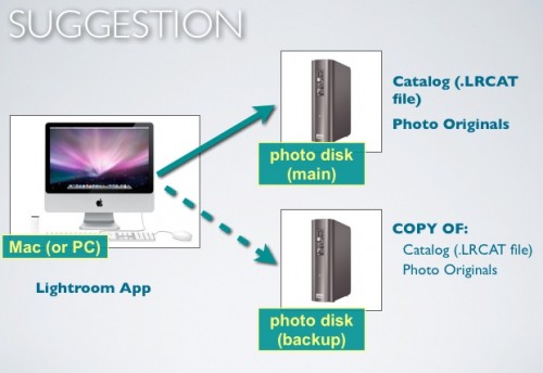
This is what I do:

Details:

  1. My photos live on a 5 TB external drive. When I add photos from a camera, they go there immediately, not to my Mac. Straight onto the external drive.
  2. My Lightroom catalog also lives on that external drive – that way, I can take that drive to anyone with Lightroom installed and I have all my work right there.
  3. I have set Lightroom’s “Keep presets with Catalog” option ON.
  4. When I am happy that the pictures and catalog are good, and ONLY then, I “intelligently” copy the new stuff to a second 3TB drive. I do that only once I am convinced it is good – no sense copying bad data. The script for that intelligent copy is here (link). Intelligent means the script checks all files on both disks, and copies over the differences (anything new gets added to the backup disk; anything deleted gets deleted from the backup disk also).
  5. I do not reformat the memory card until after this is done and verified.
  6. I also back up my regular Mac, using standard backup software – but since I keep little data on that Mac, it’s not critical.

OK, so I am pretty well backed  up.

Except I am not. All my data lives on the two drives attached to my iMac. That is very dangerous – many things can go wrong. Things like:

  • Lightning
  • Flooding
  • Fires
  • Burglary (you think the burglar would take only external disk 1 and leave the backup drive behind?)
  • …and more, too much to imagine.

To solve this, there’s a few things not to do:

  • I could back up to DVD drives, but that is very expensive, very slow, and very unreliable. Ditto for CDs.
  • Cloud backup – too early to be practical (making a full backup at today’s Internet network speeds would take months – literally).
  • Keep memory cards – way too expensive.
  • Drobo – this is a possibility (RADI drive), but the Drobo uses its own proprietary encryption.

So here’s the solution:

  1. Instead of more local backup, I use a third 3TB drive, and once a week everything gets copied to that third drive (again, using an “intelligent” script).
  2. And the key: this third drive lives off-site, not at my home studio. So come earthquakes, lightning, or floods, I’m OK.
  3. Finally, I have one more set of off-site drives, per year, which I make a full copy to at the end of each year.

A lot of work. But worth it, because I can sleep. Are your memories (or your business) worth less? I didn’t think so – so come up with an off-site storage strategy today. Every hard disk fails. Not “if”, but “when”.

 

Experiment with aspect ratios

Your camera produces an image in the aspect ratio 3:2 (or 4:3, if you use a four-thirds camera). But why not let go of that, and use your own ratios?

Like square.

Or like wide.

Or odd-shaped.

I am a firm believer in “make the picture whatever shape you think fits the picture best”. Not “whatever the frame-makers in China or the paper-makers in Switzerland have decided for you”. Make the picture the way you like, and then cut white edges off paper, and have custom frames made.

On that note: no, you cannot print a 4:3, say, on 3:2 paper without either cropping the picture or cutting off white edges. It’s the reality of life.

I have found that often, people do not understand this: “yes but I want my 4:3 picture to fit on this 8:10 paper and no, I won;t accept cropping or white edges”. Well, here’s news: you have to. To understand why, imagine you have a square picture. Try fitting that on an 8×10 piece of paper, and now you will see why it cannot be done. So you either crop to the paper aspect ratio prior to printing (Lightroom is very good at that), or you print with white edges, which you then cut off. It’s one of those “it is what it is” things.


Symbolism in your photos

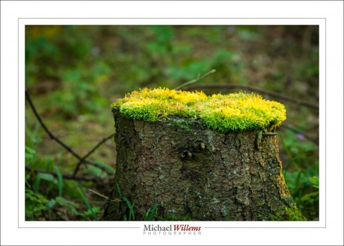
Photos tell stories. Some stories are good, or at least, are allowed. Like the end of the summer in the southern Netherlands, the other day:

All these help tell the story and are very evocative if you’ve been there.

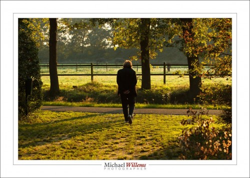
Other types of symbolism are best left alone. Like an 85-year old walking away into the sunset, and worse, unmistakably in the centre:

This is not the kind of symbolism you should strive for—at least not unintentionally.

The moral of today’s post: ask yourself: “what does my photo mean”? If you cannot answer that, you have a snapshot.

I would say more, but I am about to board a flight to Reykjavik and thence, to Toronto.


Starting With Greys

Greeting from The Netherlands, where my teaching tour continues Saturday. But for you, a note about photo post-processing, and about a popular technique, today.

The thought behind this technique is that the “blacks” in your picture do not necessarily have to be black; sometimes a little lighter is OK; the resulting “matte” look can be good.

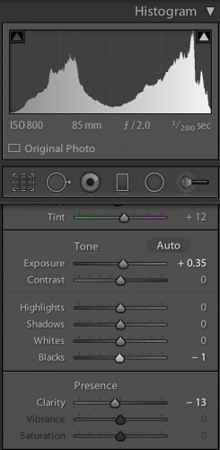
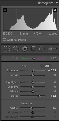
Look at this image and the accompanying Lightroom “Develop” settings in the “Basic” pane:

Now the treated version: where I made the blacks “not quite black”. The Basic pane looks like this now: look at the “Blacks” slider:

And as you see, the histogram no longer starts on the very left.

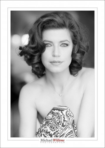
The very left of the histogram represents “pure black”; dragging “blacks” to the right makes the start point of the photo (the darkest areas) not “pure black”, but “slightly grey”. This leads to a matte paper type look:

The difference is subtle but clear, once you look at both side by side, or in succession—try.

And as said, this “matte paper” look is very popular among photographers now. I am not sure I am quite as enthusiastic, but hey, never too old to learn.


Add Light

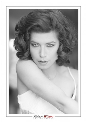
If there’s one thing I know, it is that there’s never enough light. So for a portrait like this, from April 2014, I need to add some.

1/200, f/2, 800 ISO.

So that is one and one-third stop more than the usual 400/40/4 (400 ISO, 1/40 sec, f/4); i.e. almost the same; except a blurrier background by using a larger aperture, and hence, the need for faster speed.

And the flash was pointed where?

Behind me.


History

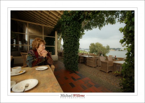
Here’s my mom, who is 85, at the Lek river, a part of the Rhine that flows in Holland from Germany to the estuary in Rotterdam.

(f/4.5, 1/250 sec, ISO 400)

The history part: the small town of Schoonhoven, miles from the nearest highway, is still, in my mind, completely a “Golden Age” 17th century town. Drenched in the history of The Netherlands.

As for mom, I lit her with a bounced flash: you can see the flash light on the wall reflecting in the window. So I started with te background; set it to –2 stops, and then added flash. That’s how flash works: you start with the background.

And the shutter is at 1/250 to get the most flash in (I.e I do not want to reduce aperture or ISO to get the background darker, because that makes the flash have to work harder too).

Are you in Holland? Wednesday I teach all three courses Flash 1, Flash 2, and Video/DSLR in one day, 9am-6pm, in Hendrik-Ido-Ambacht near Rotterdam. There are spots, so benefit now.  No longer three evenings, now it is one day. Sign up!


Iceland, 2

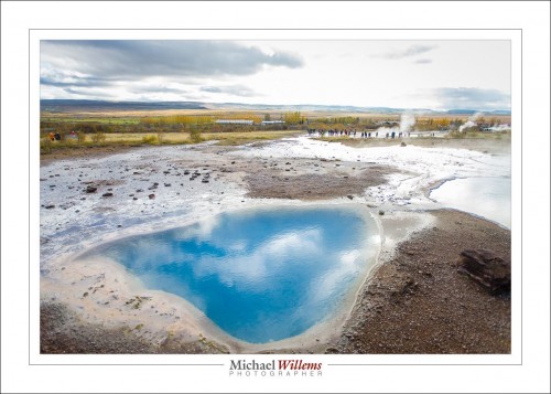
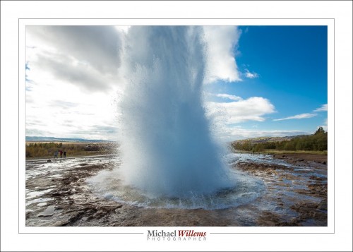
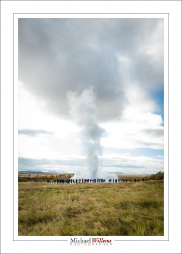
Iceland was a land, for me, of colours. The ones you saw yesterday, and blues, like here at Geysir.

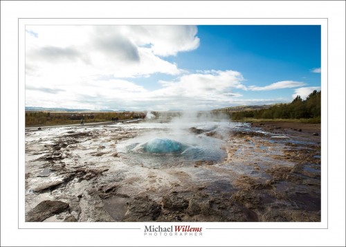
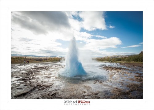
Strokkur is the geyser that erupts every seven or so minutes; the big one no longer does.

All taken at 1/320 sec, f/5.6, 100 ISO, manual.

For photos like this, you set the camera on manual and work out the exposure and leave it; and you set the shutter to continuous exposures. Then, click-click-click.

In an ideal world, I would have had no clouds. But we do not live in an ideal world. I had to be upwind of the geyser, of course.