Colours poetry

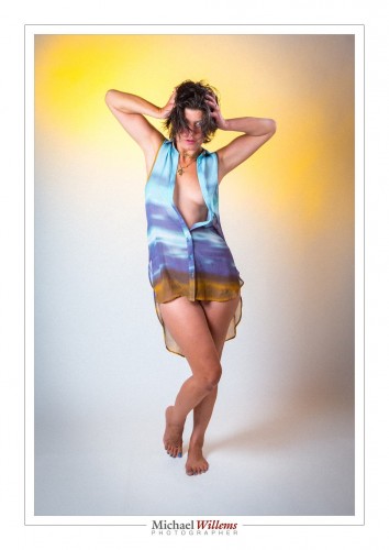
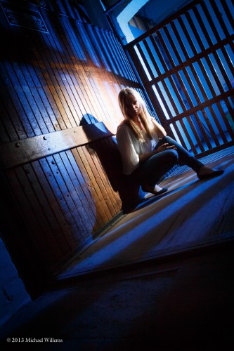
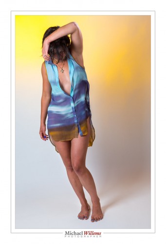
This picture, from the studio shoot on Sunday night, strikes me as one where the colours worked out just perfectly:

So what works here, exactly?

  • The rich yellow of the background is in separate areas rather than being homogenous. (That rich yellow is a Honl Photo “Egg Yolk Yellow” gel, by the way.)
  • It matches the brown/yellow at the bottom of the shirt perfectly. It also matches the cross.
  • The rich blue at the top of the shirt is in various shades and areas
  • It matches the blue-ish bottom of the image, and the blue toenails, perfectly. It also matches the fingernails.
  • The skintones tie it all together, as well.

To me, this image is like a poem in colour, a rhyme of form “ABab” going down, and the diagonal composition makes it also go left to right.

Here’s one more, where the yellows seem to line up with her elbows:

In both these images I had to set white balance very carefully, and I increased overall saturation and clarity a tad. Otherwise, they are the way I shot them.

 

Lens and perspective

A basic tip, to support my class today – I taught a teen workshop at the local library. Some amazingly talented young people, who, as a bonus, learn quickly, too!

The question: when do I zoom in, and when do I walk towards my subject instead? Similarly, when do I zoom out, or when do I walk away?

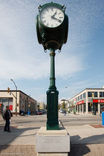
Take this clock:

With a 16mm lens. Wide angle lenses make the remote objects small, and hence enhances the feeling of perspective.

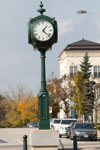
Now we walk back, all the while zooming in so that clock remains the same size. We end up at around 200mm, but from a “far away” distance:

Now look at the background objects. See?

A long lens makes background objects large, and hence compresses the feeling of perspective.

So the choice of what focal length lens to use is often not dictated by the need to get closer or the need to get more in, but instead, by creative needs.

A GOOD EXERCISE: Try to shoot some images today both “zoomed in and from afar” and “zoomed out, but close”. See what the difference is, See what works: try “close-far” in both cases: which is easier?

___

I am off to Las Vegas tomorrow morning for a few days, so posts may be slow for a few days. Stay tuned for some new Las Vegas photos soon, though.


Photo-graphy

Photography has at its root the word Photo, “light”. It’s so often all about the light.

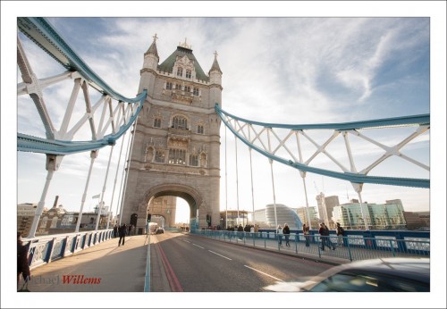
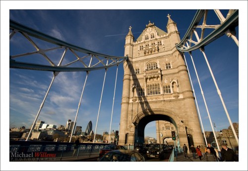
Here is London’s Tower Bridge, a few years back, from the north side:

And here it is again, exactly five minutes later, under identical conditions, but seen from the other (south) side:

Those look like they were taken on different planets, or were seriously enhanced in software. But no, they were not: they were both simple images shot “as they were”.. the difference is the direction of the light. Need I say more?

So when you make (not take – make!) a picture, one of the first things you should do is look at the light. Where is it coming from? Where would you like it to be coming from? Is there any way you can change it, perhaps by moving yourself, or moving or reflecting the lights, or using additional light?

Try it, and see how much difference it makes.


Composition tip: Negative Space

Another reminder of a basic composition tip: negative space.

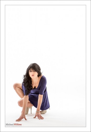
Negative space means space that is devoid of information. Empty, or perhaps with a subject or pattern or texture that is “all the same”. Your subject stands out against that space:

Your subject’s essence, isolation, even loneliness can be emphasized by this. Using Negative Space also, of course, allows you to get a nice off-centre composition.

Try to use this technique sometimes: you do not always need to fill the frame, and where isolation is called for, negative space can be just the recipe you need.


Travel Trick

A travel trick I have mentioned here before, several times.

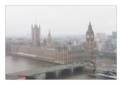
Say you have this.

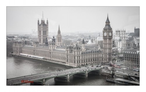
One solution is to electronically increase contrast:

But you can also put a sharp object in front of the hazy background. Like this:

This gives you the effect of 3D “depth” (the “Close-Far” technique), as well as what I would call “excusable haze”. meaning, the haze has an excuse; no-one will blame you for it. In fact it can help make your foreground object look even sharper.

Those images were from April 2008, by the way.


Group Shot Basics

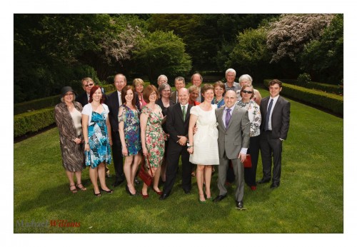
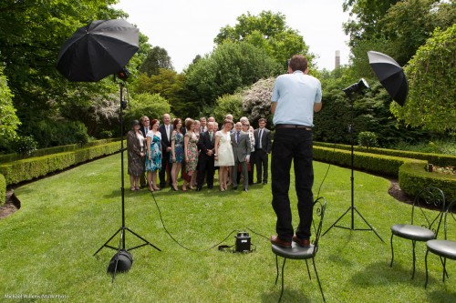
Another post on group shots. Here’s another take on a good group shot I made at a wedding:

I shot that as follows:

  • At 1/250th second, 100 ISO, f/8.
  • Using a 35mm lens.
  • Using two strobes (battery-powered) fired into umbrellas.
  • Using Pocketwizards to fire them.
  • Me standing on a chair.
  • Shooting into the sun’s direction (i.e. the group is turned away from the sun).
  • White balance set to “flash”.

That looked like this:

Shooting properly gave me a much better shot, wouldn’t you agree? I have saturated colours. The audience are the “bright pixels”. My perspective show everyone, not just tops of heads, and the backdrop is vegetation. Turning the crowd away from the sun prevented squinting.

And that’s how its done!


Group Shot Technique

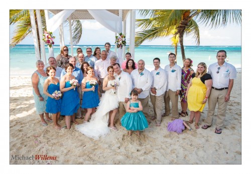
Ever had to take a group shot, like this one I toom of Kristen, Dan, and their wedding party in Jamaica last month?

You have heard me mention these many times. They are both fun and rewarding. And to do them, you need to be a people person:

  • Laugh. Smile. Joke. Tell your subjects to have fun, too.
  • Take charge, be in command, and have fun. Do not be quiet, do not be timid, and do not hesitate: if you hesitate, you will look weak and incompetent – and next thing, you lose the crowd and the shot is sub-optimal.
  • Tell them to look at your camera clearly: if they cannot see your lens clearly and fully, then it cannot see them, either.
  • Give them a count: “ONE – TWO – THREE – CLICK”. I say that every time so they know when not to blink.
  • Take each shot at least three times in case of blinkers.

Of course you are well advised not to start with weddings – they are way too important: leave those to the pros. But you may end up there, and in any case, the same techniques apply to back yard family shoots. Practice your people techniques when it’s not yet important, so you will be ready when it is.


Props To You!

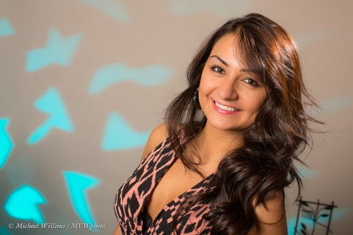
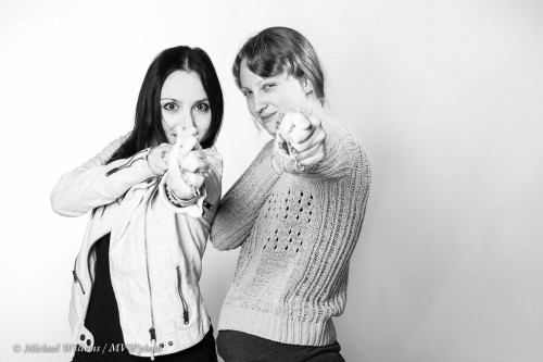
You can often make a shoot more fun by using props. Items. Even -or perhaps especially – in a studio shoot, like in the portrait shoot I did with a few young ladies the other day.

So, what props, and where do you find them?

Anything goes, basically. Anything fun. What you do is this:

  1. You look at dollar stores to buy props -these stores have fun items.
  2. You look in your studio (or home) for anything cool that happens to be lying around.

Like the rack, and the gobo with odd-shape cutouts:

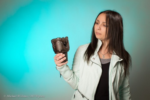
Or this primary drill bit, straight from the Libyan desert (I picked it up in the desert in the 1980s):

Or use the chains that happen to be lying around to hang works of art:

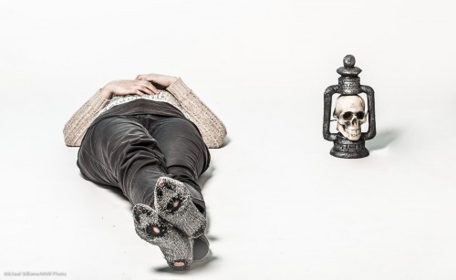
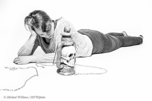
Or the fun (WalMart, cheap) skull lamp… and the models “holey” socks:

Or both the latter together in one shot:

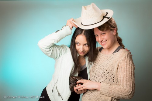
Or the stage cowboy hat:

The point about props is that they should be fun, and they should be visually interesting, and that they should raise questions, rather than spoon-feed the audience with answers. And you can find them anywhere!

So here is your assignment, if you want one: do a portrait with props, and spend no more than $10 on these props. The props should help raise a question in the viewer’s mind. Have fun!

___

Note to all Ontario readers: I am doing a portrait special in Oakville: on May 31/June 1, I will do your portrait for just $125. Check out www.mvwphoto.com/Special.html and email/call me to set up your time. I’ll even teach you some stuff about portrait photography while I make your portraits!

Shadows and creativity

Of course shadows can be good. As long as they are used well  – meaning not the “drop shadow on the side” you get when you use the pop-up flash on your camera. That one is a no-no.

But that does not mean direct flash is bad. Not at all.  Here, for example, the shadows really work to give an “in the spotlight” look:

Here, they add texture and liveliness to the subject:

Here, they add both spotlight shadows and strong patterns and leading lines:

Here, the shadows add to the otherworldly quality:

Your next assignment, should you choose to accept it: use shadows creatively in a photo.


FTF

..or “Fill The Frame”. We like photos to be good, whihc often means both “draw attention to subject” and “get close” as well as “simple, without clutter”.

Take, for example, this portrait photo, taken yesterday:

Not bad. But now, look at a closer crop:

I would argue that in this image, which is not an environmental portrait, the second image is by far the more powerful one.

Oh, and a vertical view can be good, too:

Matter of taste? Yes, but most people’s tastes agree. So next time you shoot, crop closely and see what happens.