B&W tip

Have you ever thought that a nice black and white photo was very worth looking at?

That is because in B&W we do not get distracted by colour: we see the pure image. A photo is composition + moment + light, and in some cases colour just distracts from that.

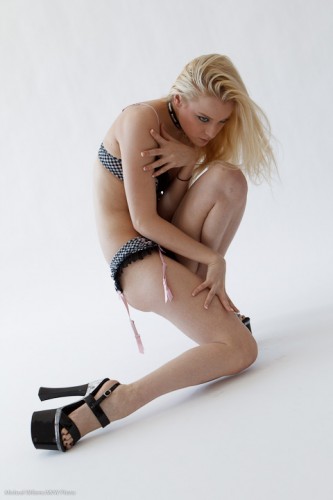
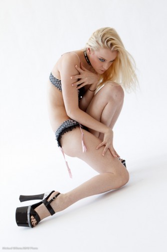
So this one-light image, from the other day, is fine:

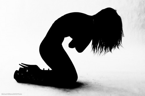
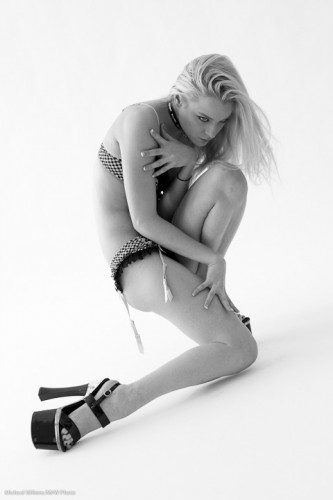
But this image is simpler, and, I think, more powerful:

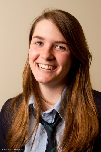
Plus… there are fringe benefits. Doing a B&W conversion I can selectively increase or decrease colour channels. And by slightly, every so slightly increasing red, orange and yellow, I can:

  • Fill in shadows;
  • Make skin even smoother;
  • Increase the brightness of teeth.

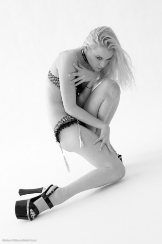
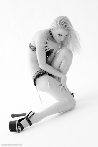
Now of course a teenager needs none of these, but you can nevertheless see this is a better image:

And this only took a few seconds in Lightroom, which has en excellent B&W conversion tool.

And we do this in Lightroom, not in the camera, because  that way:

  1. It saves time;
  2. We can change our minds;
  3. We can do a selective per-channel conversion as described above;

When you shoot B&W, do feel free to set the image style to B&W on your camera if you shoot RAW (because in that case you are still saving all colours; it is only the preview that is shown in B&W), but see that preview just as a rough idea and convert properly in Lightroom on the computer.

TIP: if you want to see where someone may develop skin issues decades from today, convert to B&W and then pull red up and pull orange down in Lightroom. You wil now see someone with any skin imperfections magnified hundreds of times. I wil not do it to this lovely young lady, but to see the effect, do it to a picture of yourself.

 

Tools for jobs

When you need to do any kind of job, you use the right tool.

For photographers, that right tool today is Adobe Lightroom, more often than not. Non-destructive editing. Applying edits to multiple images. Super-quick edits for common tasks. If you own one piece of software, it should be Lightroom (or if you prefer, Aperture, its Apple-only equivalent).

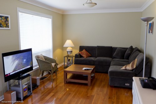
But sometimes you may need Photoshop. I use Photoshop for perhaps 0.5% of my images. Like this one, of my living room part finished, earlier today:

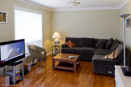
That is fine, but since I had to tilt the lens down a little, the verticals diverge at the top. This is inevitable – it’s physics.

But it is not nice. And the good news: it can be fixed in Photoshop. See here, where the verticals are now once again vertical:

You do that as follows:

  1. From within Lightroom, when looking at this image select EDIT IN.. and choose Photoshop (in my case, CS5). Your image now opens in Photoshop.
  2. Duplicate the background layer.
  3. In the new layer, in the EDIT menu, use function TRANSFORM, and within that select DISTORT.
  4. You can now pull out any corner or side any way you like. You may want to use rulers to see when vertical is really vertical, and horizontal really horizontal.

Now accept the edit, and save the image. You are back in Lightroom looking at your new image.

That’s a quick, simple edit, and one you can only do in Photoshop. From within Lightroom.  The right tool for the job.


Colour space

I am often asked “should I use sRGB or AdobeRGB or some other colour space when I shoot a picture, or when I export a file?”

Yes. To sRGB, that is. Choose sRGB in your camera, and choose sRGB when exporting a file from Photoshop or Lightroom.

There is a lot of ‘religion’ and a lot of misinformation here.

  • Colour spaces are conventions for how a file describes colours. There are many colour spaces.
  • sRGB is designed to be usable for cheap screens, cheap printers, etc, and has somewhat fewer reproducible colours in its colour space.
  • Strictly speaking, AdobeRGB and others are “better”, therefore.
  • But… they are not supported by all devices and by all software.
  • So if you use these, your viewer may not be able to see them properly!
  • sRGB is therefore the safe option and it should always be chosen unless you know the viewer can definitely see other colour spaces.
  • When you shoot RAW, the camera saves all colour info, so the setting is not important. It is only when you expert from Lightroom or Photoshop into a JPG file that you need to choose.

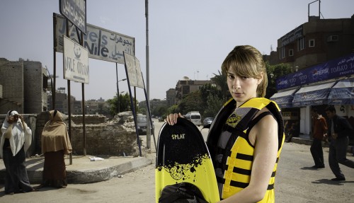
The following two images are ProRGB and sRGB outputs, respectively:

ProRGB:

Jenna Fawcett in a virtual Egypt (Photo: Michael Willems 2011)

Jenna Fawcett in a virtual Egypt

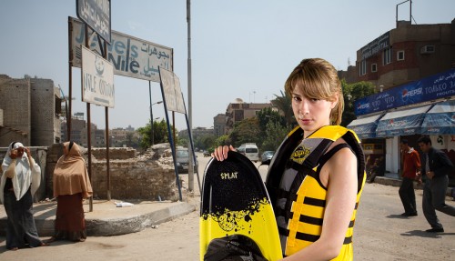
Now the sRGB file:

Jenna Fawcett in a virtual Egypt (Photo: Michael Willems 2011)

Jenna Fawcett in a virtual Egypt

Now on my Mac, the second image looks great but the first image looks very flat and desaturated.

You may see the same files – if so, lucky you. But would you really want to put up, or send, a file when a large part of your audience will see flat colours? I did not think so. So – choose sRGB.


Lightshop? Photoroom?

Yesterday, a reader asked:

Just wondering…what are the benefits to using Lightroom over, say, Photoshop?

Good question. And an easy one to answer, for someone like me who spends many hours like this, in both those applications:

Adobe Photoshop (CSx or Elements) is good for “deep-editing” one image. If you want to spend an hour on one image, because you are an illustrator, say, or because you are producing Vogue’s next page, then you should probably use Photoshop. Photoshop is for these photo editors.

Adobe Lightroom is different. It is aimed at people who have a lot of images to organize and edit, like, say, photographers. In Lightroom, you:

  • Organize images. Full asset management, including ranking, choosing, keywording, storing, rating, organizing, sorting, and comparing your images. (You store the images where you like, by the way: nothing is dictated to you.)
  • Do things to multiple images at once (like set the white balance all at once for all images in a shoot).
  • Edit quickly and conveniently – more so than in Photoshop. Although the tools are not quite deep, they cover most of what  a photographer needs. I go into Photoshop (from within Lightroom which keeps managing everything) for around one in 300 images.
  • Never touch the original image – Lightroom does “virtual editing” without touching the original. Ever.
  • Get production functions like publishing to web sites.
  • Get a wonderful print engine.

Lightroom has an Apple equivalent, Aperture. But like many photographers, I use Lightroom even though I have a Mac.

Lightroom takes a few days to learn. But Photoshop takes many months to learn. Any photographer who does not have Lightroom, ought to download it and try it out for free for 30 days. You’ll never look back.

Cockroaches…

…and noise. They have something in common.

Namely, that they both hide in the dark. (As do politicians: Almost three thousand years ago, Greek comic writer Aristophanes wrote “under every stone there lurks a politician”).

Noise hides in the dark – or more accurately, it comes out in the dark – because of what we call the “signal to noise ratio”. Engineers know what this means-  it rules their lives. In practical terms, basically it means “if the signal, the thing that carries the information, like a radio signal, or like the light in a photo, is strong compared to the noise in that system, then you won’t hear much noise. If the signal is comparable to the noise, however, then you’ll see or hear a lot of that noise”.

The noise (electronic noise, in a sensor image) is pretty constant, and at a low level. So when the picture is bright, the low level noise is not noticeable because it is so much weaker than the bright bits. But in a dark image, it is very noticeable. This is one reason flash pictures are so good: nice bright light makes the noise hard to see.

This brings me to today’s reader question. Reader Deborah (who I know understands ratios and math) writes:

Saturday’s workshop was a real step forward for me… I won’t bore you with the long list of things that clicked into place for me. Suffice it to say that it was a really happy moment early Sunday morning when I took 10 shots of my cat in my kitchen and got about 8 decent if not good images. And he wasn’t blinking in one of them.  …now if you’d only run a model training workshop for pets, all of my cat images would be great 😉

One question is bugging me if you have time to explain it:  Flash is often used in combination with high ISO. I usually avoid high ISO because of the noise, but I’m wondering if horrible amounts of noise come not so much from increasing the sensitivity of the sensor but just in general because I only use extreme ISO in very low light conditions where noise/signal ratio is already impossibly bad. So does it make sense that if flash adds a significant amount of light, the poor quality of high ISO won’t be nearly so bad as it might be without flash? In other words, does flash allow us to push the ISO up without sacrificing quality (as much)?

Indeed it does.

First – flash is used in combination with higher ISO -not necessarily high. 400 ISO is not high, and that is a good starting point. Remember, the starting point for indoors flash would be:

  • 400 ISO
  • f/4.0
  • 1/30th second

And in studio flash, it is as low as you can go – 100 ISO, say. So I would not say necessarily very high, But yes, flash does tend to be bright and that means a high signal to noise ratio where you aim the flash. It is also brief, and that means no motion blur. If you like your pictures to be great quality, use flash.

Indeed, turning up ISO in low light causes exactly what you would expect: even more visibility of the already present noise. That is why in night photography, for instance, turning up the ISO is not necessarily the thing to do.

So yes Deborah, your conclusion is correct.

Oh, and that cat? Catnip. One of the great secrets of cat photography.

Lightroom Rules

Prompted by the work I did today for this past weekend’s Music and Dance School shoot, I think today I might once again point out how great Adobe Lightroom is for a photographer’s workflow. It is no exaggeration to say that Lightroom has enabled my business to exist. I can now organise and edit, as well as produce output, in batch mode; quickly and efficiently.

One thing I do in Lightroom is organize. Here is my workflow:

  1. Import the images and have Lightroom copy them to a location of my choice.
  2. Select the images I think are good enough to use (e.g. I exclude blurred images or images where people blink).
  3. Make those into a collection.
  4. Edit them in that collection.
  5. Sort the collection.
  6. Make outputs (eg large JPG files for printing, or direct prints).

And a few tips for you:

  • One thing I always do is pick winners. To do that I use the compare view (the X/Y “candidate” view in the Library module) as well as the “Survey” view, in the same menu.  If you are not used to using those, please start. They are fabulous.
  • If you use more than one camera, to facilitate sorting, ensure they are set to the same time.
  • If, however, they are not, no problem. Activate the filter bar (“\”) and by selecting one camera, filter to see just the images from the camera that has the wrong time. Select them all (Command-A). Now from the menu select Metadata and Edit Capture Time. You can now select “Shift by set number of hours” and select +1 or -1, say, if you have forgotten to adjust your camera.
  • Learn the shortcuts. Like “G” for “switch to the Grid view in the Library”, and “D” for “Switch to Develop”.

If you ever come home with a few hundred pictures at the same time, then every hour you invest in learning Lightroom will pay back manifold.

Finally, a couple of images from this weekend’s shoot.

Low contrast – now what?

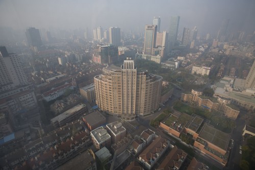
So you have a low-contrast, hazy image like this.

Shanghai Morning 1

Yup, it is a hazy morning in Shanghai. Now what?

You have several options.

  • Live with it. Haze is not always bad! Sometimes (“foggy mornings” come to mind) you want this sort of low contrast.
  • Put a sharp object in front. This is a very powerful technique: it makes the haze into a benefit, as in the boat image below.
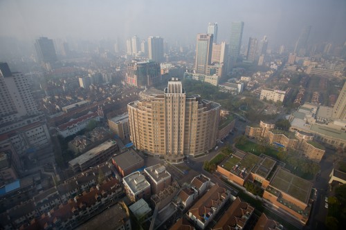
  • Finish in post-production. In the last image below, I increased exposure until the histogram hit the right side of its box; then I pulled down “blacks” in Lightroom to make the blacks black – i.e. until the histogram hit the left. You can use “Levels” in Photoshop to achieve the same result.

Like this:

Hong Kong Harbour

Shanghai Morning 2

And.. you are shooting RAW, right?

A Lightroom effect

You all saw my silhouette pictures recently, and some have asked “how do you do that”.

Sometimes these are fortuitous. Sometimes, as in my case, they are my standard process for a picture where the flash failed to fire (becasue someone else just fired it). In those cases I know I can get a contrasty silhouette out of it.

I use Adobe Lightroom for this. In Lightroom, an underexposed picture from Sunday’s shoot necessitated adjustments in the following order:

  1. Set white balance
  2. Set exposure to +4 stops (!)
  3. Set Fill Light to +13
  4. Set Blacks (a key adjustment!) to +17
  5. Now set Brightness to +103
  6. Set Contrast to +50
  7. Select “B&W” (Black and White) mode
  8. Curve adjustment: darks down, brights up
  9. Noise reduction

That resulted in this pretty good, if I say so myself, image:

Kassandra Silhouette

Of course I could have removed the “grunge”, as the model put it, on the floor and on the right, but no I like it. It’s part of the fun.

Remember, a good image makes the viewer do some work, “trying to put it all together”.

Lightroom post note

So you have a nice image – now you need some post-production work done, since the image out of camera may well need a little bit of need cropping and other adjustments. But you want to do these adjustments quickly and well.

What adjustments? Well, let’s take this example out of the camera. I shall show you how I do one.

Here, an image from last Sunday’s workshop. Model Kassandra lit using available light, and using a paper backdrop. First I crop, and then here is the image:

I am after a high-key look to make her eyes stand out. But it is a little dark, because the model was pointed the wrong way (available light comes from a direction, in this case the camera’s left side), and because my camera told me the wrong exposure (yes, I should have probably done this in the camera, but even when you do, the RAW file can turn out different from the camera’s histogram).

So using the histogram to guide me, I dragged the white area to the far right. And here it is, with exposure corrected (up half a stop):

Now the next adjustment: using the HSL/Color/B&W tool, click on B&W to make it black and white. (Important tip: ensure you set white balance correctly before you do this).

Mmm. That is “vanilla” black and white. But now the trick. Go into the B&W adjustment in Lightroom, and drag the luminance of orange and red (but mainly orange) up to, say, +20 or more (in my case here: +39, and red to +20). This gives clearer, smoother skin:

Now use the healing tool to cleak a few skin blemishes on the model’s left knee (and I turned up the exposure just tad more):

And there we have it, in a few seconds, an image that was a bit dark has been made into a great black and white image.

Ways to think about ISO

ISO, sensitivity, gives you the ability to shoot at high shutter speeds, but at the expense of quality. It is therefore important to choose judiciously. Hence this post.

There are several ways to think about ISO, and I thought I would run them by you again in these dark days of December (and I added “Studio”, as per reader Ray’s suggestion):

1. By absolute starting points:

  • Outdoor: 200
  • Indoor: 400 (but in a studio, 100)
  • Difficult light: 800

And you go up if and as needed, and down if able.

B. Simple, by situational starting points:

  • Normally, outdoors: Auto
  • When using a tripod: 100
  • When in bright conditions: 100
  • When in a studio: Indoors: 400
  • Sports, night clubs, museums: 800-1600

C. By consequences:

  • Motion blur: Increase the ISO.
  • Shooting art, or for a magazine, or in a studio, or for large prints: decrease the ISO.
  • Getting very fast shutter speeds, faster than you need: decrease the ISO.

By understanding those three lists, you will be able to choose the right ISO at the right time. And that is an essential if simple part of making a good picture.