Screen tip

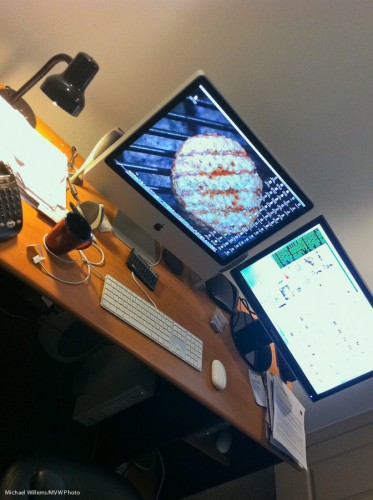
I have two screens connected to my computer. Or rather, since the Mac is integrated with one screen, I have an extra screen connected, see the right side:

You can connect an extra screen to most computers, Macs as well as PCs.

Why? Here’s why.

  • More real estate (space, in English) is always good. Make things bigger.
  • I can open a browser and drag it to screen two, while sending an email about what I see on screen one.
  • I can have my calendar open on screen two while I write an invoice on screen one.
  • I can open Photoshop on the left while I use a command line on the right
  • I can always use Twitter, Facebook, etc on the right screen while I work on the left screen.
  • And importantly, when using Lightroom, I can use it in two-screen mode. That makes it possible for me to have a grid open on the right while I edit in detail on the left.

There is no limit to what you can do – and your productivity goes up.

And yes. My desktop background this month is a barbecue hamburger.

Finishing

Today’s post is about finishing faces. It has no illustrative photo, for a reason.

You see, when you shoot a portrait, with today’s multi megapixel cameras and great lenses, you can zoom in to pore-level. And when you do that, even Angelina Jolie is human rather than angelic.

So it behooves us to be a little easy on the skin. To go easy on imperfections. But in a subtle manner.

Here are a few things to make things look better after the fact:

  1. Use a softening filter. We rarely do this anymore in the Photoshop age.
  2. Select a soft image setting in our cameras. This too is unnecessary.
  3. Use the “Clarity” setting in Lightroom, and set it to, say, -15. This is mathematical magic worth trying.
  4. Use Lightroom’s (or Photoshop’s)  healing brush to permanently remove temporary blemishes – such as pimples, bruises, etc.
  5. Use Photoshop’s Healing Brush to move wayward hairs into place.
  6. Use the same Lightroom Healing brush to make slight facial adjustments (I have been known to ever so slightly move an eye).
  7. Minimize permanent features – Healing brush set to an opacity of 33%, say.
  8. Use the HSL tool to increase the luminance of orange – this is kind to skin.
  9. Optimize the exposure of skin – the brighter, the smoother.
  10. Slightly vignette the image.

And with some simple tools like the ones above, carried out in seconds, we can subtly impriove faces until the subject loves the image without knowing quite why.

And that is why I am not illustrating this with an image. I would rather keep everyone guessing.

Why we shoot RAW.

What’s this RAW thing we keep hearing about? Should we shoot in that RAW format?

Um, yes.

And here’s why.

For two reasons.

  1. First, while JPG is like a Polaroid – all your settings are applied to the data – the RAW format is more like a negative – the settings are merely attached, so you can change stuff before you use it. White balance, colour space, and more. (Hands up, everyone who always gets every decision right? Yes, I thought so.)
  2. Second, there is more data – 14 bits versus 8 bits per colour channel. So you can fix under- or over-exposure more often.

What does that mean?

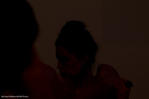
Let me give you an example. Say that I shoot Tara – but the flash does not fire. Result: a dark picture, totally unusable.

Tara - but no flash

Ah. But I shot RAW. So now I can do something wedding photographers do when a picture is unusable but they shot in RAW:

  1. Increase exposure in Lightroom by the maximum.
  2. Add fill light to the maximum.
  3. Convert to black and white.
  4. Increase luminance of red and orange (skin colours) to the maximum.
  5. Crop.
  6. Decrease noise.
  7. Add photo grain (looks great and moody).

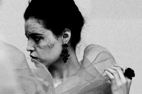
And that gives me:

Tara - but no flash (fixed)

Wow. Like I intended it to be all trendy and moody and old-fashioned black and white and stuff. And this is with a picture that is underexposed by six, seven stops!

Case closed. Yeah?

Rescue!

Black and White, as I mentioned yesterday, can also, as an additional benefit, come to the rescue when an image is not very good. Like in this image of Tara, where the flash failed to fire (my 580 EX II malfunctioned).

So since it is RAW, I can  convert to black and white, push it – wait for it – a full 3.5 stops (!), remove noise, crop, then add some film grain – and hey presto, a usable image:

So when you have a not-very-good image, try to convert to black and white, and see what you get.

Chances are, a very usable image.

The lesson: do not throw away “bad images. Shoot RAW. And convert to B&W when all else fails.

Black and white

Black and white is often under-appreciated. You are taking stuff away, after all.

Yes. Colour. Of course. But you are also adding stuff.

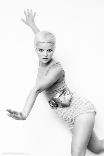
Model Lyndsay in Mono (Photo: Michael Willems)

Lyndsay in Mono

As advantages of a black and white image, you get:

  • Shades of grey. Everything becomes shades of grey. So while in a colour image you may have various little groups of shade, in a colour image, all becomes grey. So you automatically get shades all the way from black to white, if you like.
  • Emphasis on texture. Textures, which can be lost in colour photos, are seen clearly in black and white.
  • Emphasis on shape. The same is true of shape. You are not drawn to colour, so now the pure shape is what draws you attention.
  • Emphasis on light. In the absence of colour, it is all light. You can light dramatically, softly: Light is seen clearly, not as colour, but as light.
  • Ability to tweak. You can tweak colours in post (or when using film, by using filters. Like in the example that follows below.
  • Ability to create mood. You can add shade. Drama. Even grain, to create an old film look. I do this a lot nowadays.
  • Simplicity: it is also easier to shoot. No white balance to worry about.

So today, let me show you just one trick: the above-mentioned ability to selectively change colour.

An original image of a student the other day:

Student in colour

Student in colour

Now converted in Lightroom to “neutral” black and white:

Student in B/W (Neutral)

Now, I used the HSL/Color/B&W tool in the Develop module to selectively increase the brightness of her shirt:

Student in B/W (Light shirt)

But of course I want to de-emphasise the shirt, so her face stands out! Here’s the version I prefer, with a darker shirt:

Student in B/W (dark shirt)

Can you see how much more this emphasises the student, while in the original image, the colours stand out instead?

Here is one more example of how colour can distract, and how in the black and white version that distrction disappears.

So: I recommend you try some black and white. (And do it in “post”, not in the camera. Otherwise you lose the ability to tweak. You can set your camera to B/W as long as you shoot RAW, so you retain all the information).

To delete or not to delete, that’s the question

And I say “not”. Especially when you are learning to photograph.

Never mind what other leading photographers say: I am not a fan of deleting images in your camera. And I do not think you should be, either. And here’s why not.

  1. You are using up your camera’s battery.
  2. You are using time that can be used better in other ways.
  3. You are looking elsewhere than at your subject, so it stops you from taking pictures.
  4. You will delete the wrong picture – or rather, the right one, by mistake. It is not a matter of “if”: it is a matter of “when”.
  5. The bad image may not be as bad as all that – or it may be the best image you are going to get.
  6. Most importantly: if you are learning, you need those bad images. You need to hold them by the good ones and look at the EXIF data, and determine why you went wrong. How you can do better What modes work, and which ones do not. By deleting the bad,you are depriving yourself of a great learning opportunities. Delete them when you have done the learning – on your computer.

That is why I am not a fa of deleting images “in camera”.

Kiss kiss.

Another message I iterate often is the need to keep it simple.

A good photo is often distinguished by its simplicity. Everything in the photo is there for a reason – or it’s not there.

Simple can be achieved by:

  1. Filling the frame (zooming in or stepping closer)
  2. Changing your viewpoint
  3. Blurring the background
  4. Moving things or people.

An example of blurring and subsequent cropping:

Before:

Tree and ball

And after:

Tree and ball

As you see, a simple crop makes the picture better. The crop tool in Lightroom should be your best friend! An even tighter crop would be even better, I bet.

View the picture at full size and you can see me taking the shot.

Confusion reigns…

…but I am here to help you sort it out.

I hear a lot of beginning (and some advanced) students who confuse white balance with exposure.

This confusion is not surprising, since both have something to do with “this picture of a white wall, say, is not white enough”, and they both occur together very often.

So here’s the summary:

  • White balance is about the colour (it ought to perhaps be called “colour balance”).
  • Exposure is about the brightness.

So ask yourself what you mean when you say “that white surface is not white enough”!

  • If it looks too yellow, say, then it is white balance you need to adjust (the WB setting on your camera).
  • If it looks too dark, it is exposure (the +/- setting, “exposure compensation”).

And of course since they occur together,you may well have to do both. Get the colour right first, then the exposure.

Confusion lessened?

RAW or DNG?

A student asked a question (you know who you are, Alan), that I thought I would answer here.

But there is not much to answer, since Alan has masterly answered most of his question himself. Here is his question in its entirety (except I removed the name of a book):

I’m learning Lightroom – what a fascinating system. It’s going to take some time to get used to having it manage my photos, instead of doing it myself. But I can see the benefits. Thank you again for recommending it.

Now — what about the whole RAW vs. DNG thing? The book I purchased, “[Book Title]”, strongly and repeatedly recommends converting the CR2 files to DNG, and then discarding the CR2.

I understand that DNG is just another type of RAW file, but it makes me nervous:

1. CR2 is, well, really RAW. It’s the original file.

2. A “benefit” of DNG is that it doesn’t have the separate XMP sidecar files, but instead writes the sidecar-type metadata into the DNG file. That means that every time I edit a picture, I’m editing the DNG file. What if that leads to corruption? The constant modification of the DNG seems contrary to the philosophy of never altering the digital negative.

3. Since the DNG keeps changing, that means that my Time Machine backups will have to keep backing large DNG files. By contrast, the CR2 file is backed up once, and never touched again. The only thing that Time Machine has to backup is the very small XMP.

I have hundreds of CR2 raw files (I only keep the good ones, maybe 10-20 per shoot), and am really unsure what to do here. (I searched your blog, didn’t find this issue addressed.) Do you stick with the CR2 files, or convert to DNG?

I removed the name of the book because this way I feel free criticising its advice.

Alan is right. All his arguments are spot on.

And let’s expand the first one: a RAW file is the original negative, and a DNG file is an interpretation of that file. It is not a straighforward process. You have to interpret the CR2 file and make it into a DNG using your interpretation of what the bits mean.

Because of that and the other reasons Alan has worked out, my advice is to keep your original RAW files and not to convert them to DNG.

Questions

Reader questions today:

I was searching your blog to see if you had anything with output sharpening for printing from LR2 and did not come up with anything. I have read or been told at one point that you want to do some over sharpening of your images when you go to print them to compensate for the process of putting ink to paper and having that ink spread?

Is this something to worry about, and if so any suggestions for settings?  I have the basic LR2 sharpening output features and the mogrify add on has some output sharpening options as well.

There are two reasons you may need to sharpen images.

  1. “In-image sharpening”: a DSLR has an anti-moiré filter in front of the sensor which unfortunately blurs the image a little. A little sharpening (edge detecting) afterward helps bring back the optimum sharpness. Usually not a big worry.
  2. Output sharpening: Plus, when you decrease an image in size – e.g. to bring back a full-size images to 1024×768 size for your iPad, or to 800 wide for an email – you lose sharpness. Sharpening brings back the original sharpness.

Good news: if you use Lightroom, this is taken care of.

If you want additional in-photo sharpening (type 1), select this in DETAIL in the Develop module.

And if you want output sharpening (which as you correctly surmise, you do!), just select “standard” when producing your output or print (and select what the image is for). It is in the export and print dialogs. Lightroom automatically takes care of the right amount of sharpening, given the output parameters. This is really very clever. In the Photoshop world this was a lot more work.

Another thing I have heard was that for guys like me who don’t have an expensive printer at home, you can download or get printer profiles form local printers and adjust your images accordingly so you can see how they will turn out from their printer.  Any experience on this subject.

Yes, and it is true. For anyone. Download, install, and use the right printer profiles for whatever printer and paper combinations you use. Check with your printer and your paper manufacturers!

Printing is black magic – but once you have a certain print type –  printer – paper combination sorted out it will always work.