Is Lion really a Chihuahua?

Apple new OS, Lion is the talk of the town, of course. As of last week, Finally, it is here.

With a whimper. And it has, to me, looked a little like a Chihuahua instead of a ferocious King of the Jungle.

Roarrrr.....

Since I always want the latest, I upgraded my Macbook Pro and my Macbook Air. But not my iMac – and I am not going to, at least not for now.  And that’s a first for me, not upgrading. Almost like Vista, in the Bad Old Days.

First, because there is nothing very compelling in Lion for me. And second, because there are a lot of problems.

Like Windows, Apple’s OS X  is basically just a shell around a “real” OS. That real OS, in this case, being the best OS there is – UNIX. That is why I switched to Mac in the first place. And I still use the command line often – I have written scripts that cannot be done using a GUI.

But the latest shell is not so intelligent – it is dumbed down. It appears that Apple wants to make the OS foolproof – simple enough to be used by anyone’s grandparents. A noble aim – except when it kills usability in the process. Foolproof becomes foolish.

Take the following example. I have a document I want to adapt for a new client. Easy in Snow Leopard: I open “Quote-Fred.doc” and use SAVE AS to save it as “Quote-Joe.doc”. Then I simply edit that (simple, because I am in that file already) and I am done. Safe – I never end up with the wrong file – and quick.

Not in Lion. There is no more “save as” function in most of Lion’s apps. To do this, now I need to create a “Duplicate”, then go to the finder to rename that, then open that in the app. Of course I need to have “state memory” in my head while I do that (rename the right one, find it, remember what I was doing in the first place).

Then there are many other annoying GUI functions.

  • Scrolling the wrong way around – up is now down. This might make sense when you are touching the screen, but not when you aren’t. And your Lion computer is now fundamentally different from every other computer (Linux, Mac OS, Windows) out there. Well done, Apple. Like Ford issuing a car whose steering wheel needs to be turned left in order for the car to turn right.  Dumb move.
  • And the new app-based paradigm. Instead of clicking on a file, to edit it, you can now do it by (and will increasingly be steered in the direction of) clicking on the app, in the launch pad that looks exactly like the home screen of an iPad (and has the Apple apps on the first page, of course). App-based computing… wow. Back from Windows 95 to Windows 3.11. Back to the future.
  • Disappearing scroll bars: another poorly thought out move. You look at a folder that shows you 16 files. Unless you start touching that folder to move things around, you do not see the scroll bar that tells you there are actually hundreds of files in that folder! What were they thinking?
  • Another odd choice is the new spell check that increasingly interferes by correcting my spelling, unasked for. Fine, but if you speak multiple languages, uh oh, Apple is too dumb to realize that quickly.
  • The user’s Library, where many important system files are kept, is now hidden. Huh? Come on, Apple. A heavy user needs to go there quite often.
  • Mail now shows mail in “conversations”, but it cannot handle forwards. So you are perpetually looking for emails. Dumb.

But wait – there’s more!

Half my JPG files, on the Macbook, now say they are “Documents” instead of “JPGs”. The extension is the same, but the Mac now thinks it does not know what they are, for some odd reason. So I get no thumbnail previews and cannot sort by kind. Well done, Apple, you ruined that, too.

Mission Control – don’t start me. Spaces was good, although it would have been better with a “cube” interface like in Linux. But it was good. Its replacement, “Mission Control”, is poorly designed at best.

Full screen apps. Riiiight… so now how do I drag a file into an email, if the email app is full screen? The whole point of windowed systems is that is makes multitasking computing easy. A fact Apple seems to have forgotten.

It seems to me that they were thinking “we want to make this into iOS. So we can control it. And make it suitable for extremely stupid people. At the expense of people who actually want to do sophisticated things with their computers, like organize files in file systems.” While I sympathise with the wish to not have support calls all day asking “where is the “any key”?”, I think they have gone too far.

This control freakery has already lost me as an Aperture client – I use Adobe Lightroom – much better app for photographers. For my production machine, it has now also lost me as a Lion client. Well done, Apple – woof.

The good news – many of these can be turned off. So your Mac starts looking like a Snow Leopard Mac again. Alas, quite a few cannot – and for now, the lack of “save as” and the failure to recognize my files, are show-stoppers.

I’ll have to do it eventually, of course. Just like bistro restaurants were replaced by McDonalds – dumbing down is inevitable. Apple will make sure that new functions work only on Lion, soon enough. iCloud needs Lion, and to sync calendars, after MobileMe dies, iCloud will be the only way. Apple has me by the short and curlies, as the Brits would say.

But I have a while of using Snow Leopard, an extremely solid OS that does what it should do, and does it well.  Perhaps during that while, Apple will make some improvements?


Background change

As you may know, I tend to not do a lot of post-work. I think often, editing in Photoshop or Lightroom is an excuse for not knowing photography very well.

But some adjustments are useful. And Lightroom can be super-fast with these. Let me show you one: “HSL”.

The wall in my dining room is this colour:

Michael Willems (Photo: Michael Willems)

But the HSL adjustment in Lightroom, with the dropper selector, allows me to make it darker (“Luminance”):

Michael Willems (Photo: Michael Willems)

Or to change its colour (“Hue”):

Michael Willems (Photo: Michael Willems)

Or to change its saturation:

Michael Willems (Photo: Michael Willems)

And that one I do a lot when using that wall as my background!

A quick, simple, one second adjustment. Lightroom rocks.


Focus Point Confusion

I get the following question rather  lot – so when another reader asked a few days ago, I thought “let’s answer for everyone”.

When shooting, I usually use the center focus point (Canon 40D) to select what I want to focus on, press halfway and then recompose. I have recently gone through some pictures I have taken with Aperture 3, and have clicked “show focus points” and it shows that my focus point was off. It appears as though my camera did not lock the focus. I have done some research on different forums to find out what the problem could be, and some people discussed the modes “AI Servo, AI Focus, One Shot”… Should this affect the focus lock? Would I be better off changing which of the 9 focus points I wish to use for each shot rather than locking and recomposing? (I would rather not since it’s more time consuming!)

A-ha.

You are fine. You are using “one shot”, or you would not see a focus point displayed. You see, the “display focus point” function is only useful if you do not recompose, since the computer doesn’t know you recomposed. So the computer shows which point you used, but not where it was when you shot.

I.e. There’s no problems. The image is sharp where you wanted, right?

Your other question: yes, although the centre point is more sensitive, and is sensitive to both vertical and horizontal lines, it is usually more accurate to move the focus point. You can make this easier on many cameras by custom functions. But unless you are shooting with very narrow depth of field, you can usually get away with using the centre point and recomposing.


Simplify.. did I mention?

An oft-recurring subject: simplify your images.

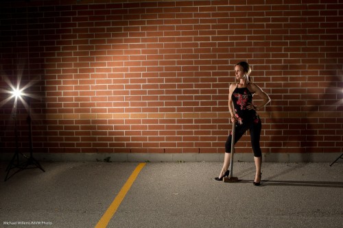
Here is a rough shot, to start, – rough meaning straight out of the camera (often expressed as “SOOC” – now you know more jargon):

Girl, wall and hammer (Photo: Michael Willems)

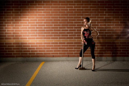
Now simplified:

Girl, wall and hammer (Photo: Michael Willems)

There was nothing wrong with the light on the left, and in some versions I left it in. But look at what I simplified other than that:

  • I fixed perspective;
  • I removed the light stand on the right;
  • I fixed a lot of the rubbish on the ground (view at original size to see the leaves, cigarette-buts, chewing-gum wrappers, and so on in the original image);
  • I removed the weeds growing at the bottom of the wall.

Not earth-shattering, but a tiny bit of simplifying makes a major difference in making your image more professional.


Lightroom tip

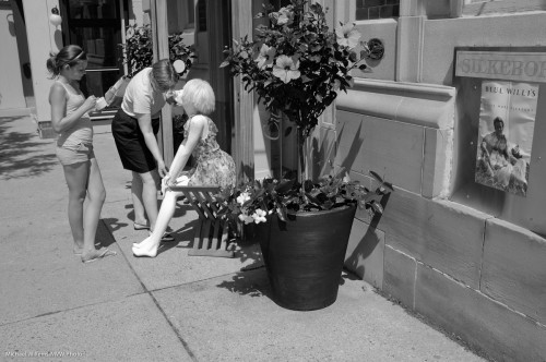
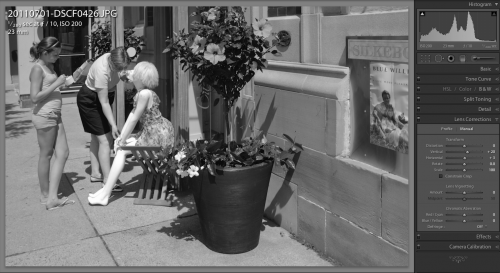
You know how you sometimes have to shoot with the camera slightly up or down? And how that makes the vertical lines converge or diverge at the top – i.e. they are no longer vertical?

Oakville street scene (Photo: Michael Willems)

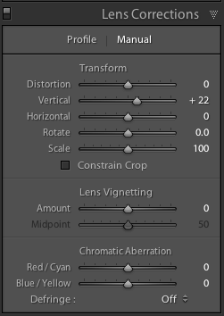
Enter Lightroom. Simply go to the Develop module, and the Lens Corrections pane. Select “Manual” and adjust “vertical” until the vertical lines are straight:

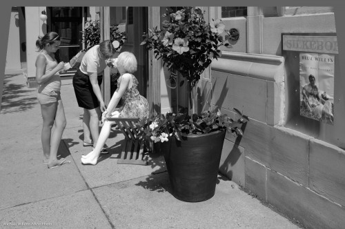
Now your image is straight.

If you forget to crop after the adjustment, you will have empty areas around one end of the image:

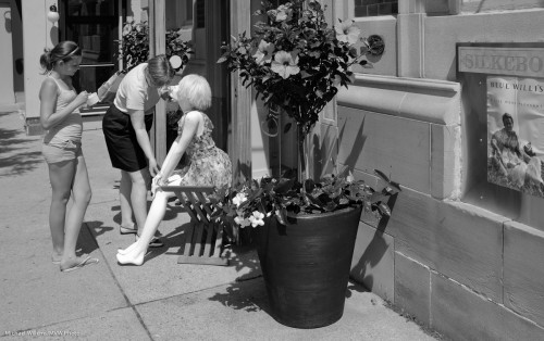
But crop so they disappear, and all is well.

Oakville street scene (Photo: Michael Willems)

Total time taken: Like, um, three seconds? Lightroom rocks not because of what it can do (I can do this in Photoshop as well) but because of how convenient and quick it is (in Photoshop, this would take me several minutes).


Lightroom tip: Recovery

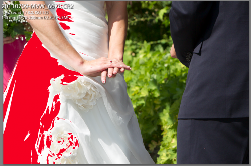
Yesterday I shot a wedding in broad hard daylight. That prompts me to write about a convenient Adobe Lightroom control you will need: recovery. Here’s how you use it.

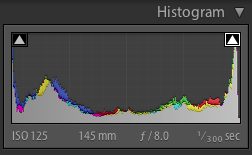
Look at the image. Then, in Lightroom’s DEVELOP module, turn on the highlights warning (on the histogram, click the right little arrow):

You now see the overexposed areas where there will be total loss of detail:

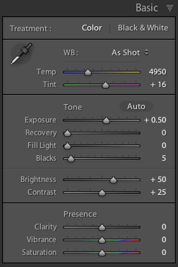
This is how the “basic” edit area looks:

Assuming you were sensibly shooting RAW, you can fix this.

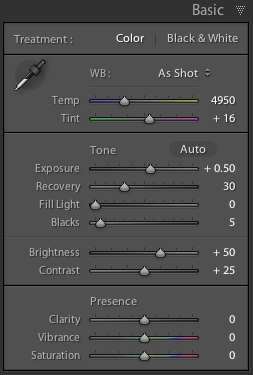
In that “basic” area, drag the “recovery” slider to the right until the red almost disappears:

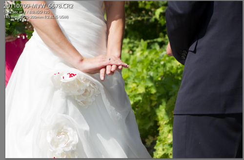
Now you see this:

And that means there is now detail in the dress. In the immortal words of George W. Bush: “Mission accomplished”.

Discussion:

Q: Why all the way to the right? A: Since the dress is pure white, we want its brightest bits to show extremely, totally, white. Hence the adjustment until the dress is only just showing some highlights.

Q: Could we have done this in camera? A: Yes, by decreasing exposure, but then we would have lost all detail in the dark areas. By slightly overexposing the very brightest areas and then fixing this, we are using the full dynamic range available to use – with the camera in RAW mode.

Q: Could we have done this by just dragging down exposure and increasing fill? A: Yes, perhaps – but in pictures where a small area is blown out totally – sunny day pics – the “recovery” slider is often the quickest, most convenient way to solve these issues. And speed matters when you have 300 images to finish!

Q: Doesn’t a high-end camera provide for this? Some kind of a highlights mode? A: Some do – but only if you shoot JPG, which kind of defeats the purpose of it all.


Solution to many problems: ISO

As you know, an exposure is determined by three factors:

  1. Aperture: the larger (ie the smaller the f-number), the more light gets in.
  2. Shutter: The slower the shutter, the more light gets in.
  3. ISO: the higher the ISO, the less light is needed.

So from this “triangle”, the following follows: if you want higher shutter speeds, either lower the f-number or increase the ISO.

And increasingly, the latter is an option.

In the last day or two, I shot the following as JPG images (imagine, me shooting JPGs) in the X100 camera. View them at original size (click, then click on the “full size” link (where it says “Full  Size = 1200×800”), then view that on your Mac or PC at full size).

Now realize, all I did to these is crop a little in a few cases, and resize for these web images – other than that I did not touch them. They were shot as JPG files with standard settings: no extra noise reduction or anything else. Just standard.

First… 800 ISO used to be high. Now it gives you this on a point-and-shoot. Admittedly, the Fuji X100 point and shoot:

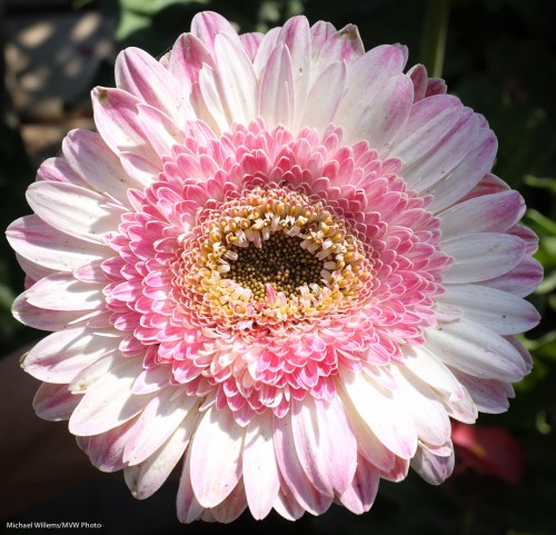
X100: Flower at 800 ISO (Photo: Michael Willems)

Indistinguishable from a 100 ISO image of just a few years ago!

320o ISO used to be impossible. Now look at this:

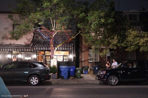
Little Italy, 9 July (3200 ISO X100 photo: Michael Willems)

(1/15th sec at f/2, 3200 ISO).

Little Italy (X100 Photo: Michael Willems)

(1/20th sec at f/2, 3200 ISO).

Little Italy, 9 July (3200 ISO X100 photo: Michael Willems)

(1/15th sec at f/2, 3200 ISO).

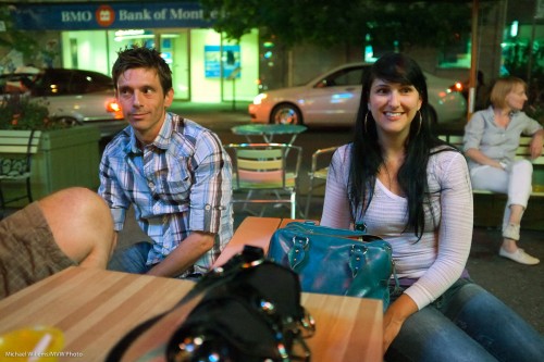
Couple in Little Italy, 9 July (3200 ISO X100 photo: Michael Willems)

(1/80th sec at f/2, 3200 ISO).

Wow, what quality! Surprised to see the pic, the couple remarked “but I did not see you flash”. Yes, that is a big benefit of high ISOs.

And let’s take it up one more notch. Here’s 6400 ISO:

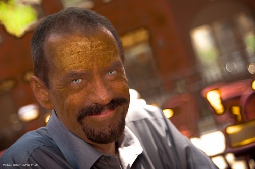
3200 ISO: X100 owner in Mississauga (Photo: Michael Willems)

Wow. That is 6400 ISO? Yes it is. Can I make an 8×10 print from that? You bet, and more.

So what does this mean?

It means that I can now shoot at 3200 and above wherein the past 800 was the absolute limit. That is 2-3 stops of extra light.

This in turn means that with a fast moderate wide angle lens I can now shoot pretty much in the dark: an outdoors restaurant, where amazingly, the camera actually sees more than I do, and it does it with great quality.

So, with the right equipment you no longer need to be afraid to shoot at high ISO values. And that means hand-held night photography now becomes a real option. I urge you to take advantage of that. See how far your camera can go and use it.


X-Ray Vision?

When you shoot people, you often need to clean up their skin just a little.

Permanent features can be lightened a little, while temporary blemishes can be removed. Don’t get me wrong, I am not advocating changing people into something they are not, but a little work is often the secret to a good photo.

So here’s a Lightroom trick that helps you see where problems are likely to occur. This is not always easy to see, but with my trick it’s a doddle.

Take a RAW image into Lightroom. Ensure that exposure etc are good. You should see something like this:

Looks good (and being a photo of me, that is rather an achievement).

Oh yeah?

Then take this into Lightroom’s Develop module, and:

  1. Go to the HSL (Hue, Saturation, Luminance) section.
  2. Ensure you have selected the Luminance controls.
  3. Now decrease the orange luminance all the way (-100).
  4. Red and/or Yellow can go to -100 also, but sometimes work better at 0 or even at  +100 – try it to see. (And in people with different skin colour, different directions and amounts may be needed for all three orange, red and yellow – but it’s still those three).

You now get this rather disconcerting view:

Light is fine; dark is fine: but the areas with rapid transitions between light and dark are the possible problems.  These “mottled” areas show you two things:

  1. Where you may need to concentrate your Lightroom or Photoshop efforts;
  2. Where this person may develop skin issues in later life.

On that last point: as a photographer, I see the damage the sun causes. My skin is relatively clear (I grew up in the Netherlands and the UK), but still, as you can clearly see there’s likely to be areas I can be slightly improved.

Anyway – this technique should speed up such “improvement” work as you may want to do.


An underestimated mode

One mode is underestimated today – black and white.

As I have pointed out here before, black and white can make your images much more powerful by allowing the eye to concentrate on your subject – not on coloured objects.

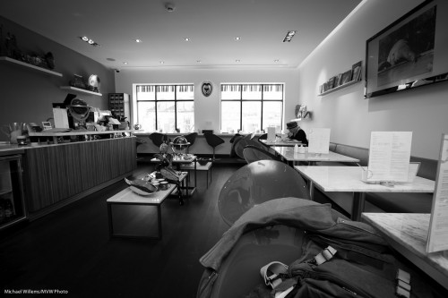
This image works better in black and white:

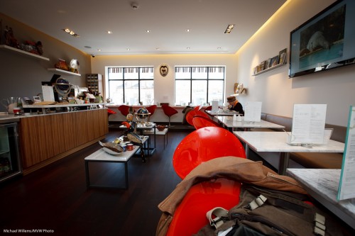
Because in colour, the red chairs draw the eye towards them instantly. You do not see the forest for the trees:

So when your subject is not the colours in your scene, consider using black and white. When colours would distract, use black and white. When you want to convey a certain mood, use black and white.

And when you use black and white, convert afterward, in Lightroom. That way you can tune the relative brightness of colours – this is like using filters in the old days.

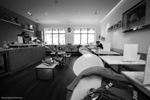
So by using the HSL control to tweak the red colour, you can, if you wish, make it look light like this, say:

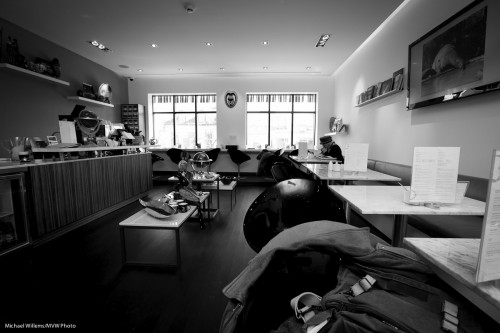
Or dark like this:

And the same goes for all other colours.

All those reasons are why if you are not yet using B&W, you should start. Shoot RAW and do the conversion later. And have fun.


Set it yourself

Each light type has its own colour temperature (the redness or blueness of the light, where redder is “warmer”, and more blue is “colder”, in photographers’ terms). This colour is expressed as a temperature, which is measured in degrees Kelvin (after Lord Kelvin). Physicists and engineers know this.

Our cameras need to adjust to the light’s colour temperature. In the film days we used to do this by selecting the right film, which is sensitive to match the colour temperature of the light used (Tungsten film for incandecsent light bulbs, daylight film for daylight).

On digital cameras we use the White Balance setting. Set it to “Tungsten”, “Fluorescent”, and so on. Or we can set it ourselves, and that is today’s tip of the day.

On many cameras you have a “K” setting. You can now adjust the white balance by setting it to the colour temperature of the light used:

  • Blue sky: 10,000K
  • Shade from blue sky: 7,500K
  • Daylight shade: 6,600K
  • Summer daylight: 5,500K
  • Flash: 5,500K
  • Mid afternoon daylight: 4,500
  • Evening sunlight: 3,500K
  • Tungsten light: 3,200K
  • Sunset 2,500K
  • Candle light: 1,600K

So setting those white balances makes light look white. Is that what you want? Then set that white balance to match the light. That is the simple method: to get white to look white, select the colour temperature of the light illuminating your subject. And by using the Kelvin scale, you can make this pretty exact. So if a light is too red for you, adjust K until you are happy.

But there is another method: If you do not want white, then set the white balance to a different value from the value of the light hitting your subject. I.e. you can shift white balance. So if I set my white balance to 5,500 on a sunset evening, I get not white, but red  – which presumably is exactly what I want for a sunset.

Yes, you can do this on your computer if you shoot RAW, but I still recommend getting it right in camera.

And that was today’s tip!