Trixie

Little trick.

Look:

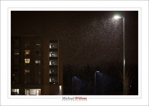
20160208-MW5D6464-1024

Outside my Sheridan classroom, Monday night.

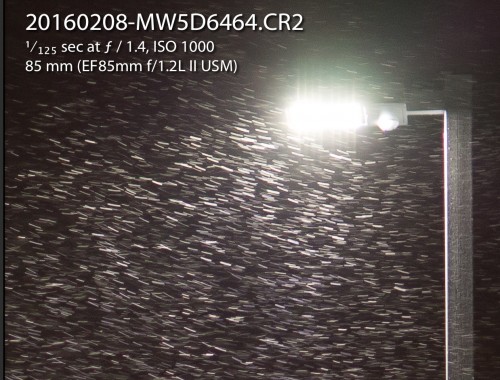
So. I am curious. How fast was the wind blowing?

snow speed

Based on that, I estimate with a fair degree of accuracy, based on the light stand width, that those snow trails are 5cm in length (that’s about 2″).

So. Snow (and thus, the air) travels 5cm in 1/125 second.

That is 625 cm in a second (5 x 125, since the shutter speed is 1/125 sec). In other words, 6.25 m/s (metres per second). That’s how scientists and engineers express speed.

That is 6.25 x 3600 m per hour, i.e. 22,500 metres per hour.

In other words, 22.5 km/h. (=14 mph, or 12.5 kts).

That is a Beaufort scale force 4 wind, or “Moderate breeze”.

And all that because I have a camera. A curious mind is, well, fun.


Learning Lightroom!

A quick reminder: if you want to learn Adobe Lightroom, watch my Lightroom TIPS videos:

https://www.youtube.com/user/cameratraining/videos

Most videos on that channel are Lightroom Tips. You will no doubt find them useful.  Also, come to me for private lessons and setup (in person or via Google Hangouts, worldwide), if you want your PC or Mac set up right, once and for all.

Have fun watching!


Books on your iPad?

Want my e-books on your iPad after you buy them?

There’s probably many ways to achieve that, but here’s how I do it:

  1. Make sure iBooks is installed on your iPad. (free).
  2. Install Dropbox (also free) on both your computer and your iPad.
  3. Get a dropbox account (also free) and sign in on both devices.
  4. On the computer, drag the PDF file into Dropbox.
  5. On the iPad, open it.
  6. Then click on the export icon (the square with an arrow emanating from it).
  7. There, select “Open In…”.
  8. After the choice is presented to you, select “Open in iBooks” or “Copy to iBooks”..

The file has now been copied to iBooks, and you can read it there any time, very conveniently (it has been formatted to be read easily on an iPad).


Whatever works.

We spend a lot of time getting rid of, and better, preventing, “noise”. Grainy pictures due to extra amplification of signal that should not be in the image. Noise is worse at high ISOs and at low light levels. The signal-to-noise ratio is the important number, and exposing to the right, among other things, minimizes noise.

In fact, you can do a number of things to reduce noise:

  1. Use a modern camera.
  2. Use a large sensor.
  3. Use low ISO.
  4. Expose brightly (“expose to the right”).
  5. Do after-the-fact noise cancellation using, for instance, Lightroom.

But is grain always bad?

Surprisingly, the answer is “no”. Film grain gives your photos that old film look:

If you view that full screen, you see that it looks like old Kodak Tri-X film. And that can add to the mood you want to convey. It is for that reason that Adobe Lightroom has “Grain” as an “effects” setting in the Develop module.

This type of grain also enhances apparent sharpness, and hides skin blemishes. So go ahead: if the mood calls for it, add some grain when you like.

So: do not obsess. Noise bad, but sometimes noise good. Often, noise is not as bad as at first we think.


Mirrorless Tip

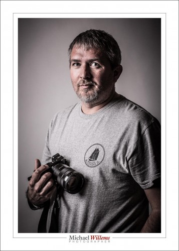
When you use a mirrorless camera, like this one, held by a student at this past Saturday’s Meetup Seminar…:

…then you need to be careful with your camera’s settings.

Often, mirrorless cameras have a way to make the picture that you see through the viewfinder look exactly like the picture you will be taking. So it looks like the “finished product”.

That sounds like a plan, eh?

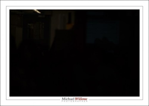
But it isn’t. Not always, in any case. In particular, when you take flash photos. Because when you take a flash photo, the camera has no way of knowing this, and of knowing what the photo will look like. All it will show you is what the ambient part of the picture will look like.

And in a studio picture, that is usually something like this:

Why?

Well, when taking a studio shot, the ambient light should not show at all in your photo. Only your flashes should. Therefore, you would usually use a standard studio setting like 1/125 sec, f/8, at 200 ISO.

So if you tell your camera “show me the ‘finished product’ through my viewfinder”, you will see nothing.  So you cannot even focus, or compose the photo.

Therefore, I strongly recommend that you turn that feature off. So that you see the same thing you would see through an SLR’s viewfinder: a bright picture, or at least a picture that looks similar to what you are seeing without a camera. In flash photos, I would say that is a very good thing.


Sharp!

Sharpening is often a mystery. And Lightroom does it very well.

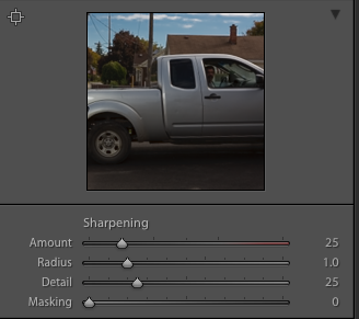
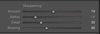
You have four sliders: Amount, Radius, Detail, and Masking.

Amount determines how much sharpening you apply. I set this between 25% (hardly any) and 50% (a lot), usually,

Radius determines how close to the lines it is applied. 1.0 pixels is the system default: a pixel either side of lines. I usually leave it close to that default. Avoid going too high.

But sharpening means the introduction of grainy noise.  And the next two sliders have something to do with that. For these as well as the other sliders, holding down Alt-Option while sliding shows you the effect.

Detail means the amount of sharpening applied to the edges; in practice this also means “how much noise is introduced:”. I leave it in the 20-40 range, usually.

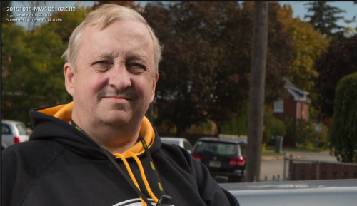
The image without sharpening:

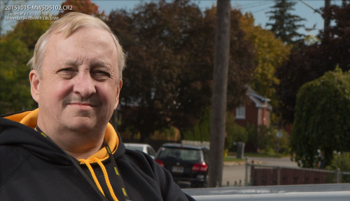
Now with various amounts of sharpening:

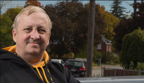
Now some more, but with more of a mask, so it is not applied everywhere:

Masking means “where the sharpening is and is not applied”. White means “it is applied here”, black means “it is not applied here”. I leave this between 0 (everywhere) and “whatever is needed”. Press Alt/Option to set this so that the maximum is applied where the sharpening is needed, without adding noise to areas like the sky.

By judicious use of these sliders, especially the masking and amount sliders, you can apply sharpening just where it is needed.

The result: a very sophisticated sharpening tool, which equals what Photoshop can do.  Worth learning the details.


Digital Camera Straps?

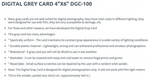
I am struck today by yet another ad for a “digital” device, This time, a grey card.

Here’s the online product description:

Let’s parse that, shall we? Read all the bullets and you see that they are either circular (it is for digital because it was “designed for digital”), or irrelevant. Or dumb (“susceptible to damage”: what, digital photographer damages cardboard more than film photography did?)

The only “advantage” that has anything to do with anything is “spectrally uniform”. Well, so are the old pieces of cardboard. There is really nothing in there that has anything to do with “digital”, so why they say “these will not work for film cameras” is beyond me.

Or rather, it is not beyond me.

It’s called “marketing”.

Companies want you to buy things, and re-labelling everything “digital” takes advantage of gullible innocents, who think they must buy new UV filters, grey cards; anything they can stick the word “Digital” in front of. Soon we will have digital camera straps!

So, my advice: when something you already own is re-marketed with the word “digital”, be very suspicious. It’s quite probably just a money grab.

___

Those of you who live in, or near, Brantford: I am holding a meetup Saturday, 10AM… read all about it here. There is still space.

The studio

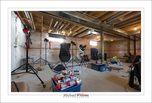
A studio is all about convenience, I find. I can work without one, but in a studio I have everything set up and ready to go. This is my Brantford studio a day ago, before I had finished tidying:

Notice that a studio need not be tidy. It needs to be well organized, large, and it needs all the equipment ready to use. All the equipment being

  • Cameras and lenses
  • Backdrops,
  • Many small flashes, many strobes
  • One or two hotlights (for video)
  • A host of modifiers
  • Light stands
  • Reflectors
  • Gadgets, like brackets
  • …and so on.

In my studio, I have two stations set up permanently. One for traditional portraits like this:

(Standard Studio Setting: 100 ISO, 1/125 sec, f/8)

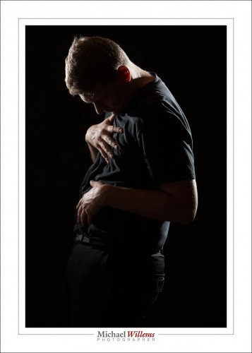
And one for edgy portraits like this, of my friend Adam pretending to be a pregnant woman:

(Standard Studio Setting: 100 ISO, 1/125 sec, f/8)

So do you need a permanent studio? Of course not. But it sure makes life easier and shoots faster to carry out. And it takes the guesswork out of photography.

My Brantford studio is now open for individual and class training, and portraiture. Just 20 minutes west of Hamilton, Brantford is centrally located, between the GTA, London, and Kitchener/Waterloo/Cambridge/Guelph. Come see me if you need a portrait for LinkedIn, a family portrait, or any form of photography training.


Make it better.

Here’s a typical outside flash shot. (Taken by the über-talented photographer Lisa Mininni while I was teaching her flash tricks yesterday):

What did we do to make this?

[A] Take the shot:

This was a flash shot, of course. So outside in bright sunlight the settings are very, very simple.

  1. Pocketwizard on camera.
  2. Second Pocketwizard connected to the flash by means of a “Pocketwizard to hotshoe”–cable from www.flashzebra.com. Modify with a softbox or umbrella (the latter is smaller but will blow over more easily in the slightest breeze).
  3. Flash set to manual, half power. (Be ready to increase to full if you need to—but the flash may overheat, and recharge time between shots will be long).
  4. White balance to “Flash”.
  5. Camera manual, 100 ISO, 1/250 sec.
  6. Then, determine the aperture you need for a good background. Start at f/8—and then vary from there. On a day like yesterday, I needed f/11 to f/16.
  7. Once your background is right, look at the flash part. If the flash is too bright, reduce its power level or move it farther away from what it is lighting. If the flash is too dark, increase its power level or move it closer to what it is lighting. Or add a second flash, Worst case, use direct, unmodified flash.

[B] Finish the shot:

That finishing (not “editing”!) is just as important as taking the photo, and it consists of:

  1. Verify exposure and tweak if necessary. (If you have taken the shot properly, this should not be needed.) Pay attention also to “highlights” and “blacks”.
  2. Set white balance to “Flash”, if it wasn’t already. (Ditto).
  3. Correct lens and “architecture”–distortion.
  4. Crop and rotate if/as needed.
  5. Sharpen if/as needed.
  6. Perhaps add a very slight post-crop vignette.

Those steps are pretty much standard, and a typical picture takes me less than 30 seconds to finish.

[C] Options

I could of course add another flash, for the background. Set that to quarter power.
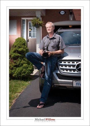
OK. How was this shot lit, then? Here’s how:
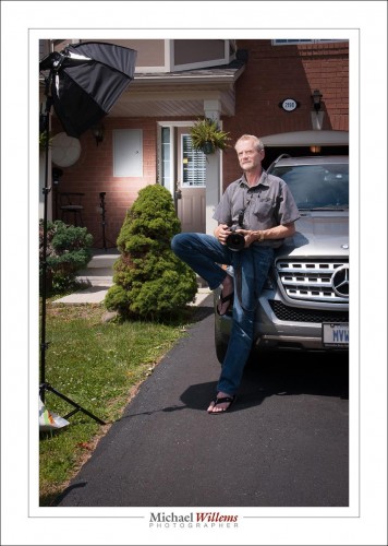
That’s right—always make a pullback shot, where you can see the lighting setup. You’ll forget. I used a third pocketwizard connected to the second flash via a second hotshoe cable.

Is this rocket science? No. But it is fun and it does open up untold creative possibilities.

___

Come to me for a private lesson and I will teach you how to do this, how to use modifiers, how to balance light sources, how to use gels, and much, much more,. You don’t need much, other than an SLR, a flash, and knowledge of the basics (“what is aperture and shutter speed and how do they work”)—but I can even teach you those if you like. See http://learning.photography or give me a call on +1 416-875-8770 and never look back. I can teach you remotely, too, using Google hangouts, too, even if you are in, say, Australia.

Back to the future

The best computer UI (User Interface) that I have ever experienced is that of the Compaq Concerto I used to own. This computer, which was decades ahead of its time, was powered by Windows for Pen computing and by, as I just found out, Wacom pen and screen hardware. Hardware that today looks like this:

Not surprising. The intuitiveness was amazing. I regret that this disappeared: we lost 20 valuable years.

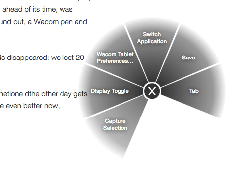
But we are back: back to the future. The Wacom tablet I mentioned the other day gets me back there. The pen feels the same, and the functions are even better now than in the Compaq days. Like the radial menu:

I assigned this to a pen button, so now by clicking that button I get this menu (where I can set functions for each of the pie segments)—and what’s more, it pops up where my pen is at that time. Ridiculously simple, and such a time saver. I grabbed that picture by selecting the “Capture Selection” segments. That’s one way to have me remember those combined buttons (try to remember Command-Shift-$). You can even assign hierarchal sub-menus.

And what’s even more: the pen and button functions can be set differently for each application. The tablet senses which app you are in, and you get the applicable settings for that particular app.

I think it is a good bet you will be hearing more about this particular piece of hardware here.