Split personality? No

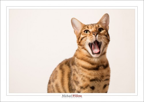
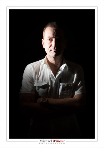
But split lighting? Yes. This is an example – made just now during a flash workshop – of split lighting.

Split lighting means you light half the face, and the other half is not lit. Simpl.

To make this picture:

  1. Set your camera to 100 ISO, 1/125th sec, f/8. This will make the room dark.
  2. Put a flash in the side.
  3. Put a Honl Photo 1/4″ grid on the flash’s SpeedStrap. This stops the light from reaching the wall and other areas.
  4. There you go!

You can meter manually or using TTL. I used manual and Pocketwizards, but TTL is fine too (as long as you disable the on camera flash except for commands).

Tomorrow, another flash workshop. I am pumped! But Shiva is less than interested:


Touristy Haze

Have you ever looked at something vast, like the Grand Canyon, or Cologne Cathedral, and thought “WOW”, only to have your pictures turn out “Blaah”?

One reason is haze. Grand things are big things, and big things involve distance, and distance involves haze. And haze makes for “blaah” pictures.

Unless you make that haze into a benefit. Make lemonade out of lemons. Like here:

London is hazy, foggy (what else is new), but by placing a sharp object in the foreground I have made this haze into a benefit. The haze now accentuates the foreground object and makes it look extra sharp. At the same time, we no longer “blame” the photo for having haze in the background. This is a trick, in other words, to have the viewer “allow” haze.

Easy, no? Use any foreground object – preferably, of course, one that is relevant to the photo’s setting. But it can be as simple as your travel companion, your car, whatever – and you’re done!


The emotion of colour

Colour brings with it a whole set of feelings and emotions. We talk about “warm” colours, “cold” colours, and we tie colours to things we have experienced.

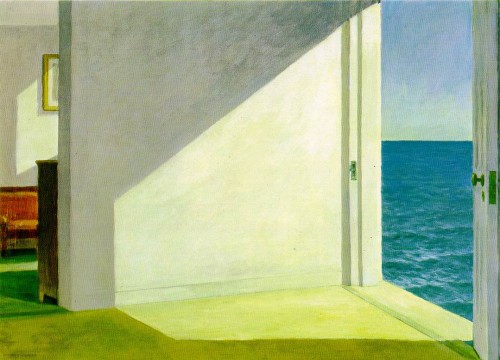
One of my favourite artists is the late Edward Hopper (1882-1967). He of the Night Hawks, yes. But also, and especially, he of the stark room settings, and of the amazing summer colours.

I love the way Hopper perfectly captured the summer colours. And not by making the image red, as might be expected, but rather, by giving it that wonderful olive greenish cast. I can feel the weather, I can hear the sea, I can sense the afternoon.

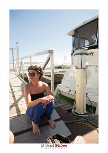
If I take a summer image and set white balance to “auto”, I get a very correct image, but not one that speaks to me:

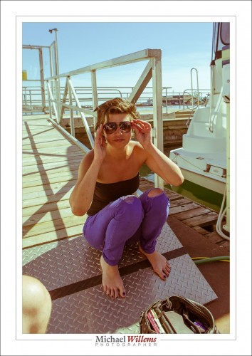
If, however, I select the right white balance setting, I get:

That yellow-green look, almost like a faded polaroid, speaks to me of a lazy, warm, long-lost summer day. I can almost feel the sun.

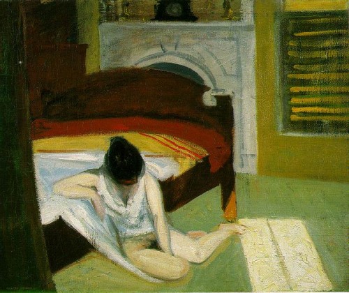
Hopper was a master of this. Here’s his Summer Interior:

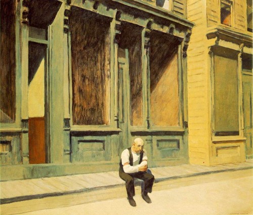
And “Sunday”:

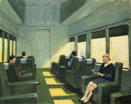
And this:

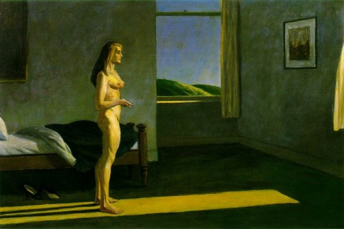
And one more:

All those speak to me of the same warm summer afternoon feeling. So I try sometimes to recreate the same feeling Hopper evokes. Like here:

Compare that to the first Hopper, and you will – if you are me, anyway – get the same kind of green/yellow summer feeling. And that is the power of colour. So think about it carefully. Colour, like other aspects of light, is an interpretation as much as a fixed value. Look at artists who inspire you, and ask “what were they doing with colour and how does it affect me?”.


Typical shoot, untypical subject

Last night I photographed an event featuring funny-man, atheist, magician author Penn Jillette. And let me tell you, having talked with him and listened to him at some length, he is as intelligent as he appears, and then some. He was also a friend of the late and great Christopher Hitchens (a fact I was aware of) and a very good friend of the late and great Lou Reed (which I did not know). I think I am the only person alive who remembers Mr Jillette when he used to write a column for PC/Computing Magazine in the late 1980s: I used to read that mag for that last page.

The first part of the event was in a hotel. Here, balancing (a) ambient, (b) outside light coming through the window, and (c) my bounced flash was the challenge.
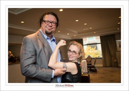
For these, 1/40th sec, f/4, 800 ISO was required.
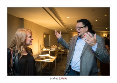
Then, the event in a University of Toronto theatre. Unfortunately, the stage lights were not available (it was Saturday, and of course staff deserved their weekend off), so it was general (and hence ugly), dim, fluorescent lighting.
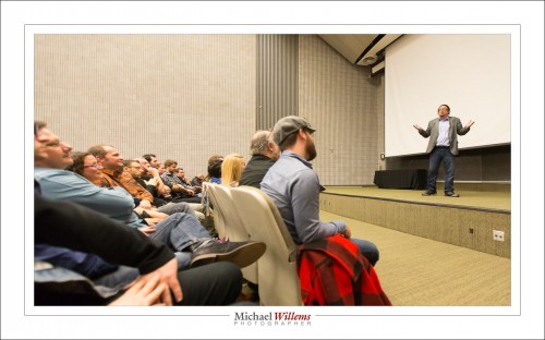
Here, of course, flash is out of the question, so I shot at 1/100, f/2.8, 5000 ISO.

The event was, of course, sold out:
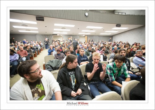
Careful white balancing leads to good light even under those circumstances, but I restricted myself to using the 1Dx. I do not like to use the 7D over 1600 ISO.
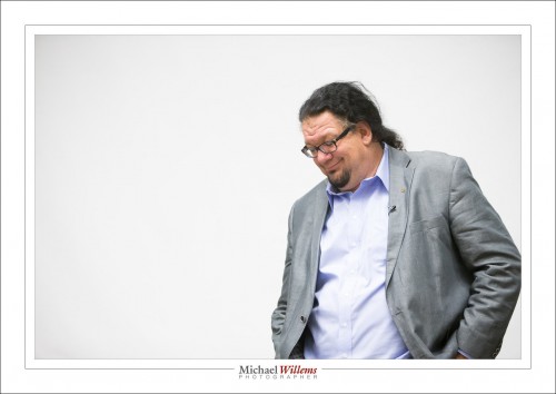
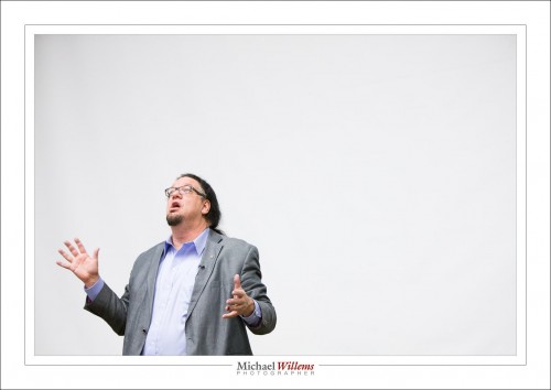
Now it’s all about expression, moment, composition.  I like Negative Space, and the screen behind him gives me plenty of that if I use the 70-200mm lens:
This time, I even have a photo of myself with my subject. For this, I put the autofocus to “camera chooses” and asked the volunteer to “just click”.
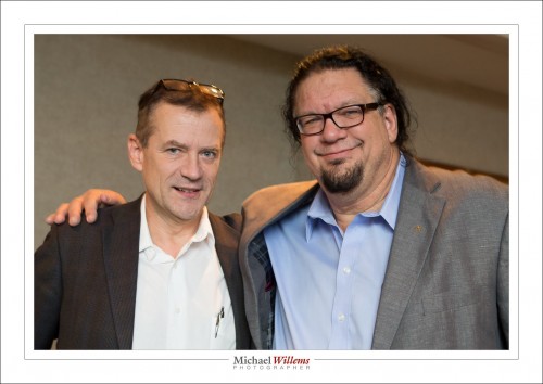
That was a fun shoot.

___

Do you have an upcoming event? I photograph them, and I do it well – that way, your event lasts forever, and all the effort and money you are spending does not end on the night. www.michaelwillems.ca

A few Lightroom Starter Tips

Since I am often asked: here’s a few Adobe Lightroom starter tips to get you going. (Lightroom is the app for photo asset management, editing, and output generating).

  • Set up your files using dated folders (named “year-month-day-subject”), in folders per year, with all those year folders under one master folder. That way, if you move them, it’s just one click to tell Lightroom where they now live, or you can move specific years to off computer storage. See this video.
  • Turn on solo mode in all sidebars, so you see only one pane at a time.
  • Learn abbreviations, like D for “Develop” and G for “Grid”.
  • Turn on the XML files (in “catalog settings”):

  • Realize that each module works differently, including many of the keyboard shortcuts.
  • Back up your catalog file (or files): the “.LRCAT” file(s).
  • Learn how to make presets for things you do often (edits, exports, logos, etc).
  • In Develop, press “i” repeatedly to turn on/off the screen info about your image.
  • Learn collections and smart collections.
  • Start keywording your images. (See “smart collections” as to why!)
  • Look at all the menus and read what they do. So often I am asked “how do I do xyz?”, when the answer is right there. You wouldn’t drive a car without at least looking at the controls first, right? Often, people say “wow, you’re a guru”, when all I have done is spend an hour or two looking at the options.
  • Learn the terminology (“panes”, “HSL”, “Module”, for instance) so that it’s easy to google for answers when you are stuck.
  • Use the histogram when editing.
  • Always select sRGB for exports unless specifically instructed to use AdobeRGB.

There’s a whole lot more, but these may help. Also, see my new YouTube channel with tips and tricks. They’re usually about 5 minutes each: watch them all!

___

I teach this stuff. Have me set up your Lightroom and teach you how to use it most efficiently – and we’ll do a photo critique of your work while we’re at it; and I’ll show you how to get the most out of your photos. Contact me for information.


Zombies ‘R’ Us

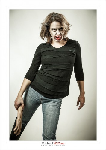
Last night I held a little zombie party. And that prompts me to tell you about the importance of two things in photography.

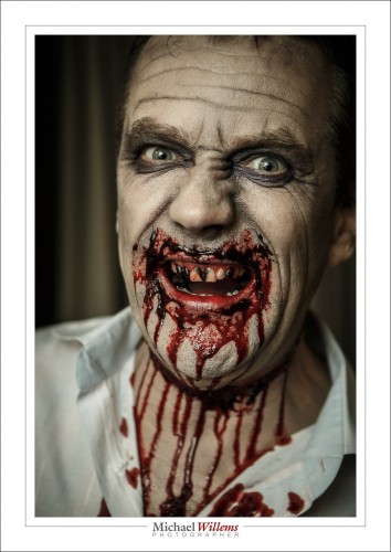
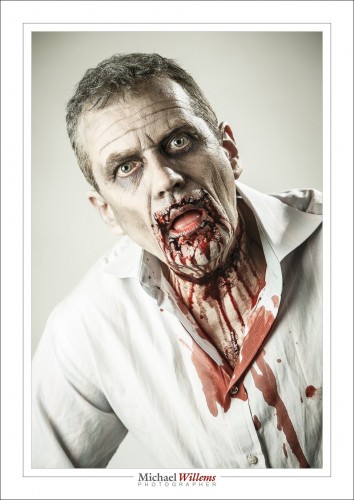
One is the make-up artist (the “MUA”), who is present at many shoots. Without one, you are limited. You cannot, for instance, change anyone into a zombie, like this:

Or this:

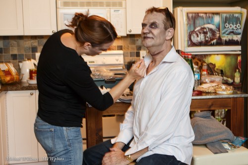
Here’s Melissa, last night’s MUA, working hard on making me ugly (not all that difficult, according to some):

But even for simple shoot, a make-up artist can be essential. Why does professional photography involve so much time (each make-up job took over an hour, in two parts: make-up, then blood and wounds) and money? Because doing a professional job takes real effort, knowledge, and time. Accept the extra expense and do it, next time you have a shoot that needs a professional look – whether that look is beauty or zombie. Same thing, for a good Make-Up Artist.

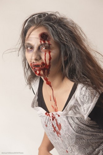
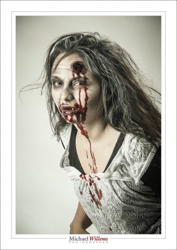
The second thing is post-processing. While I do what I can in the camera, some things cannot be done there. Like the “Walking Dead” look in these pictures. Here’s Melissa, the Make-Up Artist:

So to get this look I quickly created a Lightroom preset, which I call “zombify”. That makes image 1 below into image 2 below:

Lightroom “Zombify” Develop Preset, by Michael Willems:

  • Temperature 6150K (with my studio flashes)
  • Tint -44 (my version of “Walking Dead Green”)
  • Exposure +0.5
  • Contrast +12
  • Highlights +7
  • Shadows +11
  • Clarity +65
  • Vibrance -42
  • Sharpening 80
  • Noise Reduction 20
  • Post-crop vignetting -27 Highlight Priority

Do those settings (tune to taste), then save as a new preset and you are all set for Halloween. You’re welcome.

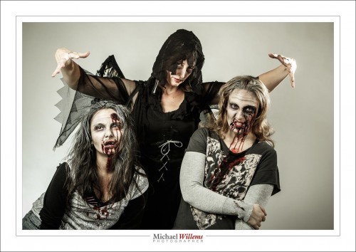
The Angel of Death is watching.

Enjoy your Halloween, later this week.

___

Come to me for a little Lightroom coaching, and I’ll set up your Lightroom structure professionally while we are at it, too. www.michaelwillems.ca

And then there was…

Light can be dark and dark can be light when you have a camera.
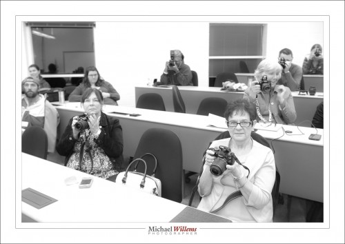
Last week’s class at Sheridan College:

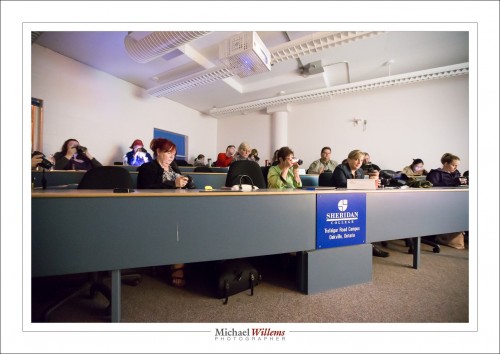
The classroom was brightly lit. But without changing that, by using low ISO/fast shutter/high aperture number, I got this – remember, this was a bright room:

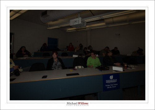
And then I turned the lights off. And now I chose slow shutter, high ISO, and open aperture (low number). Now I got this – remember, this was a very dark room:

Yeah, that is right, your camera is a light shifter, and don’t you ever forget it!


Consistency.

Is. Important.

And to get consistency, you usually want to do things manually in photography.

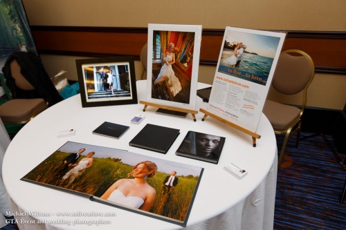
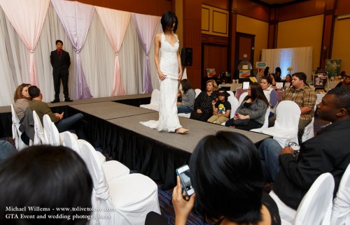
I shot a wedding show I exhibited at, on Sunday. Here’s my micro booth:

And here’s the kind of thing I shot:

And so yes, you can bounce in a big hall. But you may need 1600 ISO at f/2.8 at 1/125th second, that kind of thing. Which is what I used for that shot.

And then there was the show – again, all with bounced flash:

But here, I found TTL metering let me down a little. The bride shots were a little inconsistent. Metering off all these different moving things, with white dresses; well, that can happen.

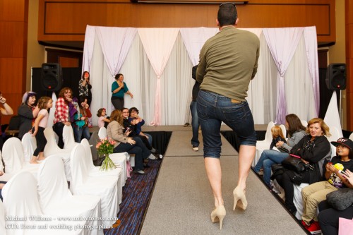
So that is when you think to yourself: go manual flash, too. After all, I am not moving and the runway isn’t moving, so the inverse square law is not going to get in my way. So I popped the flash into “M” (manual) mode and from experience, guessed 1/2 power would work. A quick check on the back (and the histogram) told me this was correct – so I shot all the other runway shots in that mode with that power setting, and hence they were all identical (and good).

Including this one:

Yes, much fun was had.


Trick

You know why I want people, and especially my students, to know all about flash? Because you never know when it will be needed.

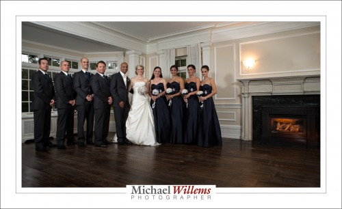
Take this shot, from the wonderful wedding of Stephanie and David on Saturday:

That nice fire in the fireplace, with its warm glow? The bride wanted the fireplace. And so we turned it on, of course.

Yeah right. There was no turning on – not possible. So that is a 430EX speedlight fitted with a snoot and a rust-colored gel (both Honl photo).

Same here:

The moral of the story: flash is not always used simply “to light a dark room”. In my world, the more common world is to do something creative. Take charge of the light, including its location and colour.


Light or dark?

When you need to decide what to make of a shoot, light is of the first importance. And sometimes that is the question: light or dark? Go for a high-key bright look, or for a low-key dark look?

I often do both. Let me share an example.

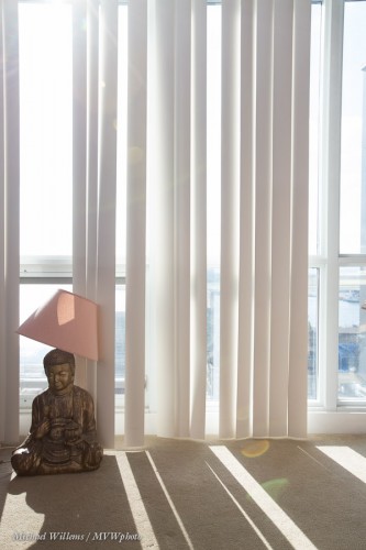
On a very recent shoot, just after walking in, I saw this:

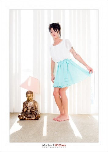
And that immediately made me think “the Buddha”, “pastel”, and “bright”, and “backlit”. So you go with the flow, and I asked the model to find a pastel outfit. The outfit was a skirt, which worked extremely well when she pulled it out to make it the same shape as the lampshade. I exposed highly (1/250th sec at f/6.3 at 400 ISO), and hey presto:

High key means everything is bright except the subject, which therefore stands out. Can you see how highly I exposed that? Basically, everything except the Buddha and my subject was flashing “overexposed!”. Get this right and shoot RAW. But it is not difficult at all, as long as you realize you can make things bright or dark at will with your camera. It is a light shifter.

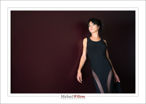
I had also seen a dark wall, a rich bordeaux, in a dark area. So hey, let’s use that too. But with this dark wall I thought low-key, i.e. everything is dark except the subject, which therefore also stands out. So, perhaps a dark outfit, which it just so happened she had:

Both made on the same shoot.  You can do this if you think about the light and use what you have, or what you can make under the circumstances.