Cheers.

The other day, before a course I taught, here’s a friend and student holding out his glass of Merlot – no, it was not a Merlot, it was an Italian red:

Bruce holding glass

Isn’t that a nice shot?

So here are a few notes, numbered for your convenience, to help you take the same.

    1. As I point out time and time again, a shot that “makes the viewer put it together” is often great.
    2. A blurry person is often also appreciated by… the person, if they are shy. When people (ladies and teenagers, often!) say a panicked “no pictures”, try this.
    3. I used a 16-35 mm lens set to 30mm on a full frame camera, set to f/2.8.  On a crop camera, you could use a 24mm prime lens, for example. On my 1Ds I could also have used the 35mm prime. This would have been my favourite lens for this shot.
    4. The wide angle gives you those wonderful converging lines.
    5. The wide open aperture of f/2.8 enabled me to shoot at 1/15th of a second using available light – at 3200 ISO.
    6. The blur also gives me a simple image with no distractions.
    7. It is very important that the lens is wide open. Look at the out-of-focus lights. They are circles. If the lens had been partly stopped down (to f/3.2, or f/4, say) you would have seen octagons or hexagons instead of circles.
    8. And yes, you can shoot at 3200 ISO with a good camera. Point-and-shoots will not do this, even with Lightroom noise reduction.
    9. That speed of 1/15th second is still a bit slow. You could easily get motion blur. So I took 3 or 4 pictures, of which this one was razor sharp.
    10. I focused carefully, using one focus point, on the glass.
    11. I had the subject move his glass forward, and I moved as close as the camera would let me focus. This makes the background go blurrier.
    12. Finally, I had to get the white balance right in post. This is very important with available light shots, which can otherwise take on an orange/yellow cast.

      A little work – some thought goes into even a simple snap. But do it, think, and you get nice shots where you would not have expected them. And that is what sets you apart from Uncle Fred.

      Be Not Uncle Fred

      You know Uncle Fred. He carries a camera and thinks he knows about photography, but he does not. None of you are Uncle Fred, or you would not be reading this.

      Uncle Fred takes snaps like this, where everything is wrong. See if you can spot the problems in this recent snap of a student:

      Uncle Fred Takes A Picture

      And there are many, including:

      • The picture is blurry (both out of focus as well as motion-blurred due to a slow shutter speed).
      • The orientation is wrong.
      • There is too much mess.
      • Fred puts the subject right in the centre and cuts off the bottom.

      Uncle Mike, on the other hand, does the following:

      • He turns the camera to a vertical position.
      • He gets closer.
      • He watches the background and simplifies.
      • He uses good composition rules, like the Rule of Thirds.
      • He uses a fast lens – a lens with a low “f”-number.
      • If he uses a flash, he bounces the light off a wall or ceiling behind him.
      • Using one focus point, he focuses on the eyes – the closest eye, to be precise.

      Uncle Mike Takes a Picture

      That is simple. None of this needs a lot of knowledge, does it?

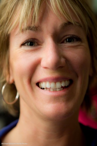
      Here’s another one, of a lovely student the other night,taken with a 50mm lens:

      Student Robbin

      So for your next portrait, please try to get close, fill the frame, shoot vertical, and use a fast lens, focused on the closest eye, using either available soft light or a bounced flash. See the difference!

      Elements of a picture

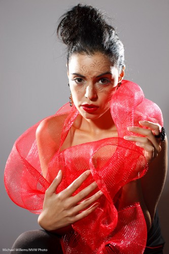
      This, another photo from last Saturday’s Mono workshop, prompts me to write today’s post:

      Tara Elizabeth

      Tara Elizabeth in Mono, 20 November 2010

      It prompts me to talk about how to make a photo like this. You see, a photo is not just one thing. It is a culmination of things all coming together.

      First you need a subject. Yes, the subject is important. When all else is equal, your subject makes the image. After all, it is an image of something. Photographers are often enough all technique, to the extent that they forget about the subject. In this image, model Tara is looking great; her clothing is avant garde, her make-up, by Make-Up Artist Tea, is superb. Tara’s expression is just right.

      Composition is also important, even in a simple portrait. Uncle Fred puts the subject (Tara’s eyes) in the middle. I use the rule of thirds; off-centre composition. Balance the image.

      Next, you need technique and technology. I used a Canon 1Ds with a 50mm prime f/1.2 lens set to f/8 at 100 ISO and 1/125th second – pretty standard “studio” settings.  Pocket wizards were used to fire the flashes. A digital Rebel with a 50mm f/1.8 would have done the same here.

      That brings me to the next factor: you need light. We used three speedlights. Two on the sides, with grids: edge lighting is always good. And one behind us, on our left, the fil-from-the-front light, down two stops, and fitted with a Honl Traveller 8 softbox. See that wonderful round catch light in her eyes? (yes, that is important.) The edge light also separates Tara’s arm, on our right, from the background.

      Finally you need to simplify. A good photo is a simple photo. We used a simple white wall. I zoomed in enough to have nothing else in the picture. I used no background light or gels. Sometimes simple is better.

      And there you have it, a photo worth using!

      I encourage you to do the same kind of analysis on your own images. Always good to see what you are doing – it may remind you to think carefully about the image. And that will make it better. Promise.

      High-key black and white

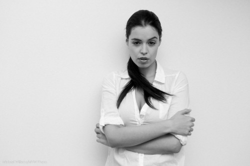
      One of my favourite photo styles is this: high-key black and white, against a simple white background. This reduces the clutter to a minimum and starkly emphasizes the subject. Like in this image from the 20 November Mono, Ontario all-day workshop:

      Tara, by Michael Willems

      What I would say if I were to discuss this:

      • The image screams out “black and white”.
      • Clothes (white)  and wall (white) both disappear. I like the emphasis this gives the subject and the pose.
      • I like the 1970s feeling. I added a little grain to this image in Lightroom to emphasize that.
      • Slight, very slight, soft beautiful shadows are important.
      • Light is simple: one flash bounced behind me.
      • Of course you use exposure compensation and the histogram to check your exposure. But you knew that. Hit the right side (just).

      Try a portrait like this! All you need is a white wall, a camera, an on-camera flash, and a model in white.

      Portrait tip

      As I said before, you can use just about any lens for portraiture.

      But there are certain guidelines to obey. Like: when using a wide lens, put the subject small in the centre. Then optionally crop.

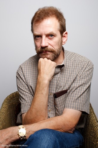
      To illustrate. This is a 50mm portrait of me just now:

      Michael Willems by Michael Willems (50mm)

      Michael Willems by Michael Willems (50mm)

      That is just about OK. Any wider and it would be too wide, and for a portrait like that, ideally I would like to zoom in more, to maybe 70mm, and then to stand back.

      But perhaps you cannot do that because there is no space. Or you want the environment in the image.

      Fine, you can use a wide angle lens. But be careful. If you put your subject too close, the nose will be too large and the face distorted. And if you put your subject near the edge of the image, it will be distorted also.

      Look at this 35mm portrait:

      Michael Willems by Michael Willems (35mm)

      Michael Willems by Michael Willems (35mm)

      Not good. But what if we put the subject smallish in the centre?

      Michael Willems by Michael Willems (35mm, subject in centre)

      Michael Willems by Michael Willems 35mm, subject in centre)

      That is fine, And optionally, then we crop:

      Michael Willems by Michael Willems (35mm, cropped)

      Michael Willems by Michael Willems (35mm, cropped)

      By cropping, we have now essentially made the 35mm lens into a longer lens. But even without cropping, it is the fact that the subject is in the centre and not very big that makes the composition fine.

      I can think:

      Michael Willems by Michael Willems (35mm, cropped)

      Michael Willems by Michael Willems (35mm, cropped)

      I hope this brief example helps dispel the thought that you “must” have an 80-135mm lens for portraits!

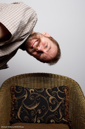
      And to finish, a silly image.

      Michael Willems by Michael Willems (35mm, silly)

      Michael Willems by Michael Willems (35mm, silly)

      Yes, I can be silly.

      Finally, a question for you to try your hand at, at home. Can you figure out how I lit these images?

      I got chaired!

      Plaid chaired, that is!

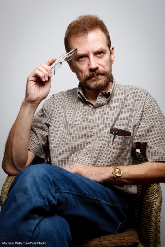
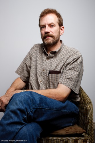
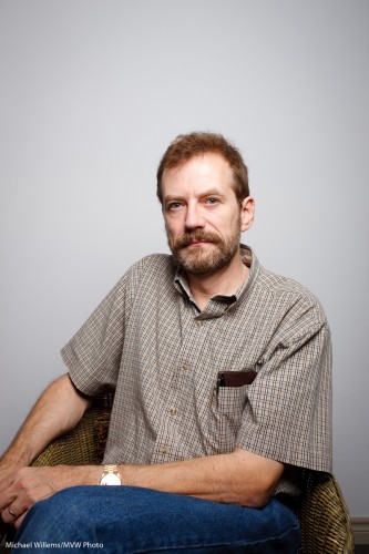
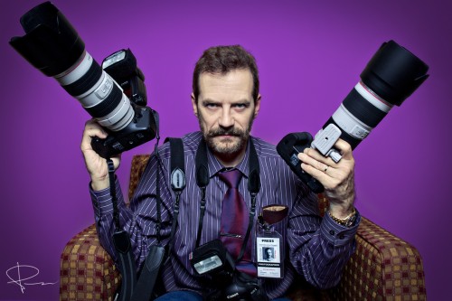
      Peter McKinnon, a friend, student, and most importantly, an incredibly creative and talented emerging commercial photographer, shot me tonight as part of his famous Plaid Chair Series. Check it out on his web site.

      An exclusive on this blog, tonight: here is the first shot. Michael the photojournalist.

      Michael in the Plaid Chair

      Michael in the Plaid Chair

      Serious, camera-equipped, concentrated: Peter captured my essence, wouldn’t you say?

      This was an incredibly fun experience; a cooperation between creative artist and subject where for once I was the subject.

      Soon, more. Now some rest before tomorrow’s teaching and shooting.

      Meanwhile, go check out Peter’s web site. And hire him.And when the Plaid Chair Series book comes out, buy it!

      Be invisible

      Sometimes you make interesting pictures by being invisible and using a long lens.

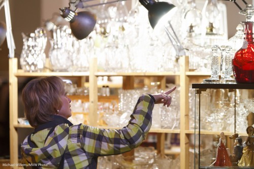
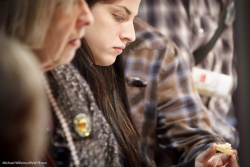
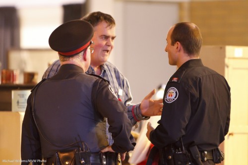
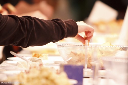
      I was at The Royal Agricultural Winter Fair today, as for the last few days and the next seven, and I grabbed a few quick people “moment” shots with the long lens, while I was invisible:

      Pointing

      Pointing

        Cheese Sampling

      Cheese Sampling

      Cops

      Cops

      Sampling

      Sampling

      The secret to grabbing pictures of “the right moment” is:

      • Get close. To do this, use a long lens. I used a 200mm lens on a crop camera; that makes it effectively a 300mm lens. This is long enough to be out of the way, unobserved, and yet close.
      • Use available light. Flash will not reach.
      • Do not be afraid to go to high ISOs. 3200 ISO is usable on a modern camera with a little Lightroom noise cancellation,
      • Use a stabilised (IS/VR) lens if you can,
      • Shoot a lot! You will get some interesting shots out of hundreds.

      Have fun. Go and try some moment photography!

      Wall and stairs

      Sometimes a picture can tell a story even though it is very simple.

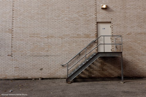
      Look at this image, taken during the Urban Photography walk last week:

      Wall and Stairs

      Wall and Stairs

      Now I don’t know about you, but to me, this tells stories.

      Or rather, it evokes them: I can make up my own stories.

      The stories in a simple image are often in the viewer. Where do the stairs go? What’s in the can? Where is this? It is depressing? Or funny? What is behind the door? What was in the bottle?  “You can’t help but wonder”, as a good friend just said to me.

      I therefore urge you to try the same: here is an assignment.

      Try shoot a few images with plenty of negative space (see a previous post) or patterns, perhaps, in an urban setting, that invite to storytelling.

      The key is not to tell it all, in the image. And – have fun!

      Oh daddy…

      …I know I shouldn’t have  crashed your plane!

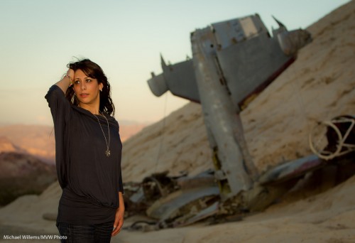
      Yasmin Tajik in Nelson, NV

      Yasmin Tajik in Nelson, NV

      This photo, which I took in Nelson, Nevada of friend and photographer Yasmin Tajik, shows how useful a flash can be when fitted with gels.

      I took the picture with a Canon 1D MkIV fitted with a 70-200 2.8 lens and a 580EX II flash. The camera was set to Aperture mode (Av), at f/4 and 100 ISO, which gave 1/320th second when I used -2/3 stop of exposure compensation.

      The light was a setting sun.

      But the setting sun was not lighting up Yasmin at all. So I used the flash.

      But to keep the “golden hour” light quality, I fitted the flash with a Honl Photo Speed Strap and a  1/2 CTO Honl Photo gel.  That made Yasmin look like she was in the setting sun. When in fact she was not.

      Snaps du jour

      Today, a few snaps of the day.

      From a recent walk through Oakville:

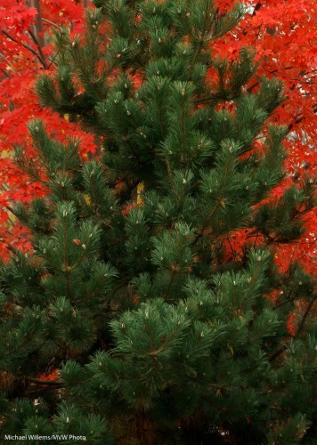
      Coniferous vs. deciduous in October

      Coniferous vs. deciduous in October

      Keep in mind here:

      • Red versus green is a good contrast.
      • Crop carefully.
      • Zoom in close to remove distractions (they were all around).
      • Foliage is dark; so underexpose (in this case by almost two stops).

      One more:

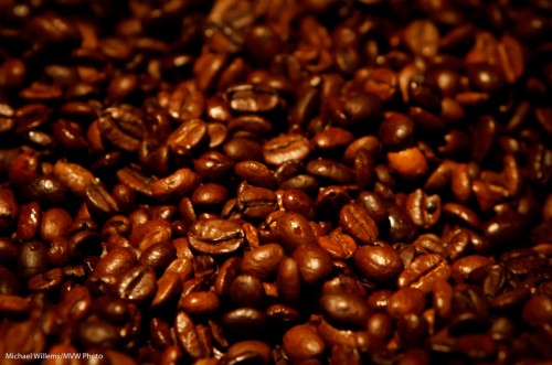
      Coffee beans

      Coffee beans

      The message here: get close and shoot detail.

      Just one more today, because my eyes are closing with exhaustion.

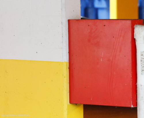
      Red, yellow and blue in a car park

      Red, yellow and blue in a car park

      Yes, you can find Mondrianesque art in a car park. Thanks, town of Oakville for the blue bins).